Uptempo
Client
Uptempo
Type
Branding, web design
Tools
Figma, Illustrator, Photoshop
Uptempo is a brand born from the merger of three heavyweights in the Marketing Ops sector: BrandMaker, Allocadia, and Hive9. This new entity needed a fresh brand capable of giving the right momentum to this new adventure. As you might have guessed, my job was to oversee the entire rebrand: from the logo right through to the website.
The brief was fairly clear:
"We’re aiming to define an impactful style that conveys Uptempo's principles with a touch of playfulness. Vibrant colours are welcome, as is a truly unique visual style."
Like Cinderella's slipper.
If you’ve read other case studies on my site, you’ve probably noticed how much I like to kick off a branding project by defining a clear rationale that ties all the visual elements together. The logo, illustrations, icons, and decorative assets all need to speak the exact same language.
This project, I’ll admit, gave me a real run for my money right at this stage. Here you can see some of the early logo explorations. How on earth do you visually translate keywords like connected, continuous, fast, and intelligent without being utterly cliché?

Inspiration struck directly from the name Uptempo, which has a clear musical nod... or rather, a nod to the design of sheet music. The latter serves as a clear, reliable guide for musicians: thanks to this simple tool, they can play in perfect harmony with the rest of the orchestra.
This also happens to be Uptempo’s mission: to offer reliable tools that guide marketing professionals towards their goals, allowing them to work in sync with the rest of the business.
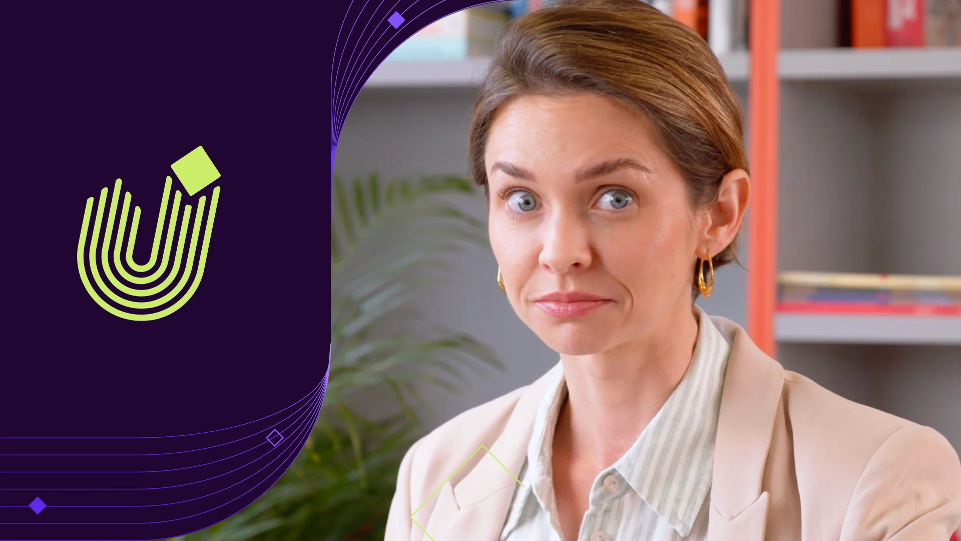
The new logo transforms the dynamic shape of the "U" into a musical stave guiding a diamond (representing the musical note / the marketer). Phew, well that’s that one sorted.

The Epilogue and Work Sans fonts were chosen for their modern traits and the flexibility they offer as variable fonts. And also because, let’s be honest, they’re Google Fonts and don't cost a penny.

Put that pencil down!
Now that everything was starting to make sense, I wanted to put these ideas to the test by building a cohesive visual system. The client, however, was adamant: an absolute ban on using illustrations or icons. The thing is, they still needed visual assets beyond basic photos; something that could be easily used by designers and non-designers alike.
I came up with a modular pattern system based on a simple grid. This offered just the right amount of flexibility to create endless module variations. Plus, they are incredibly fun to animate!


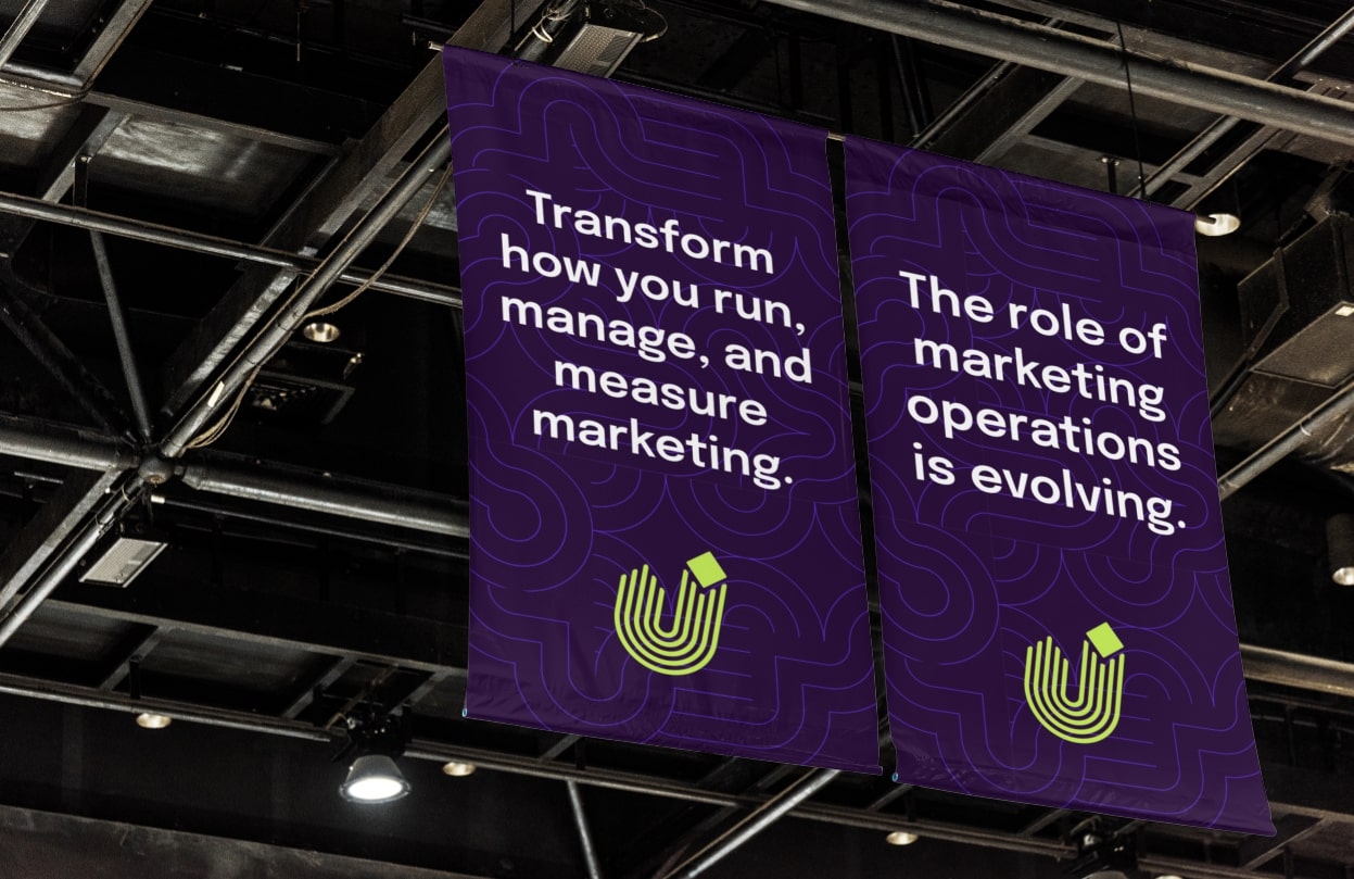

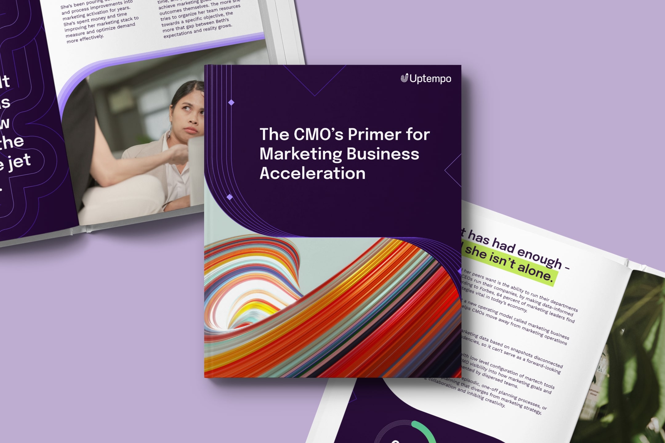
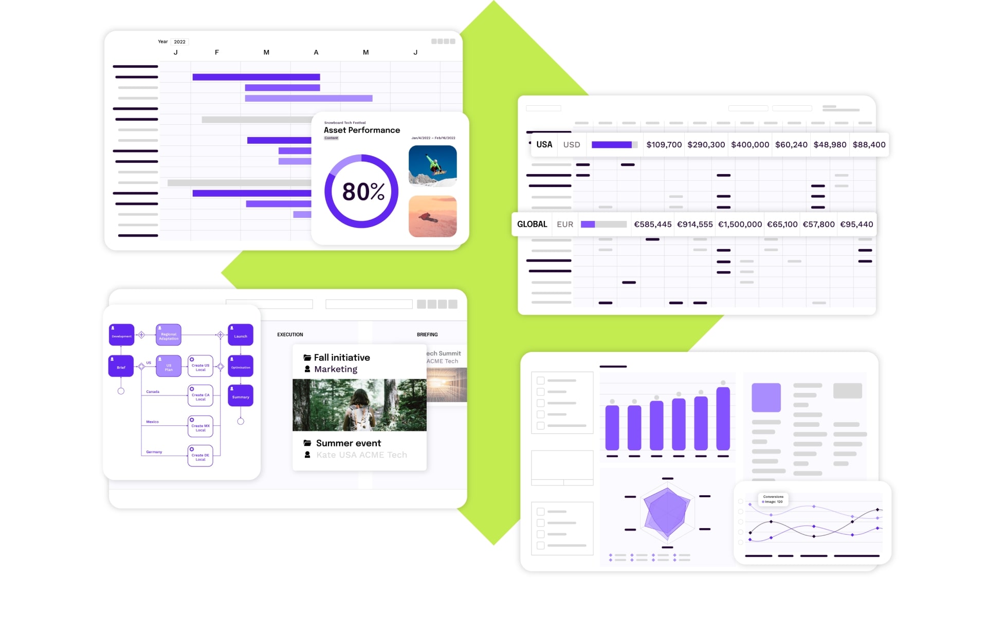
The vibrant colour palette was precisely calibrated so it could also be used across their software interfaces. The shades of purple make charts and graphs pop even more, without compromising overall legibility.
Speed of light.
Merging the souls and content of three different companies into a single ecosystem is no walk in the park, and that’s where the challenge shifted to the web.
Light was unanimously considered the fastest thing in the universe. I say was because the team that designed the Uptempo website (made up of myself and a good friend and fellow digital designer) was definitely quicker. We actually managed to map out the sitemap, then build the wireframes and page designs in record time. Much like the decorative patterns, we focused on creating reusable modules and components rather than designing individual pages.
Taking a modular approach during the wireframing phase allowed us to speed up the creation of the designs and the design system housing all the styles, components, and modules for the developers. This approach also massively smoothed things out for the dev team, who didn't find themselves having to build thousands of bespoke modules from scratch.


The client gets sweary.
Right, so after all this graft, was the client actually happy? I’ll let you decide from these comments:
"The logo, the font, the colour palette, the font choices for the content... I’m a huge fan of it all. It’s distinctive, bold, attractive, elegant, and incredibly versatile work. There is so much to like. The more I look at it, the more details I spot: for me, that’s the ultimate test. It’s a stellar piece of work that will brilliantly represent us in the market."
"I think it is fucking brilliant. Full stop."