MissionWired
Client
MissionWired
Type
Branding, Illustration, advertising, web design
Tools
Figma, Illustrator, Photoshop, Chat GPT, Gemini, Procreate
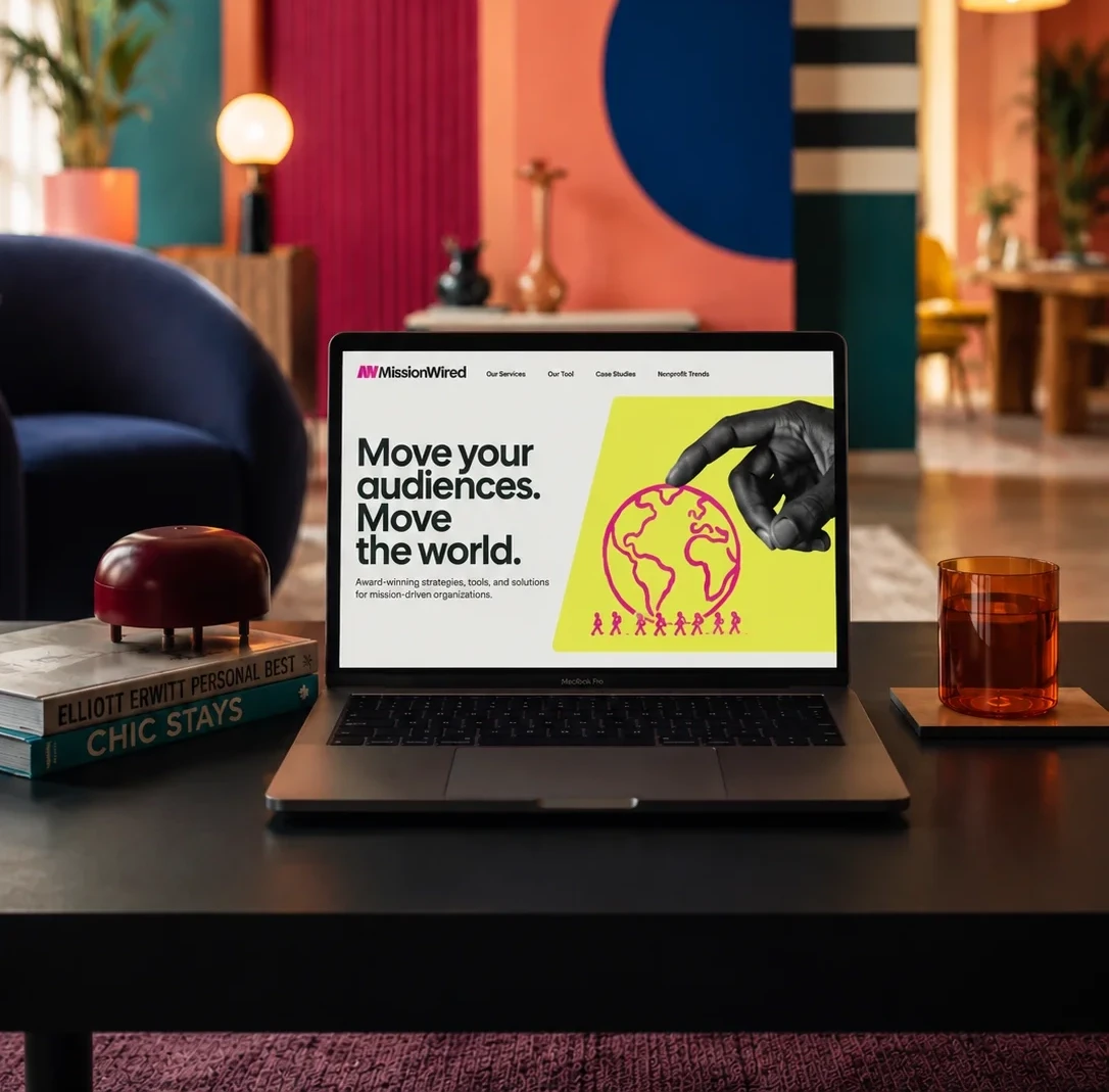
I had the good fortune to work with MissionWired—a client that respects and appreciates the value of design, is ambitious, and above all, fights for a righteous cause. They offer strategic support to non-profits and political movements, developing integrated online and offline fundraising campaigns. I happily dove into evolving their brand to align with their new positioning.
Humility is the base and foundation of all virtues.
Confucius said that, though he clearly never had to position a brand on the open market.
MissionWired, for instance, is an absolute powerhouse in the US fundraising world. Their results speak for themselves: thanks to an impressive mountain of data and rock-solid industry experience, they turn every fundraising campaign into a win. And I'm not exaggerating—they have ALWAYS successfully raised funds for the non-profits they support. However, their enviable track record was completely masked by a timid tone of voice and a colourful yet decidedly unambitious look. In short: humility might be a virtue, but in this case, it wasn't getting them anywhere!
Together with the strategy and copywriting team, we explored three creative territories to best represent MissionWired and its services:
Collective Engine: Focused on the energy of the collective as the true engine of change.
Kaleidoscope: Centred around tailored, personalised service, illustrated through the metaphor of a kaleidoscope.
Behind the cause: MissionWired as a silent yet rock-solid partner supporting causes with flawless service.



An idyllic collaboration.
And lo and behold, the first proposal—Collective Engine—won everyone over, evolving the existing identity in the spirit of continuity.
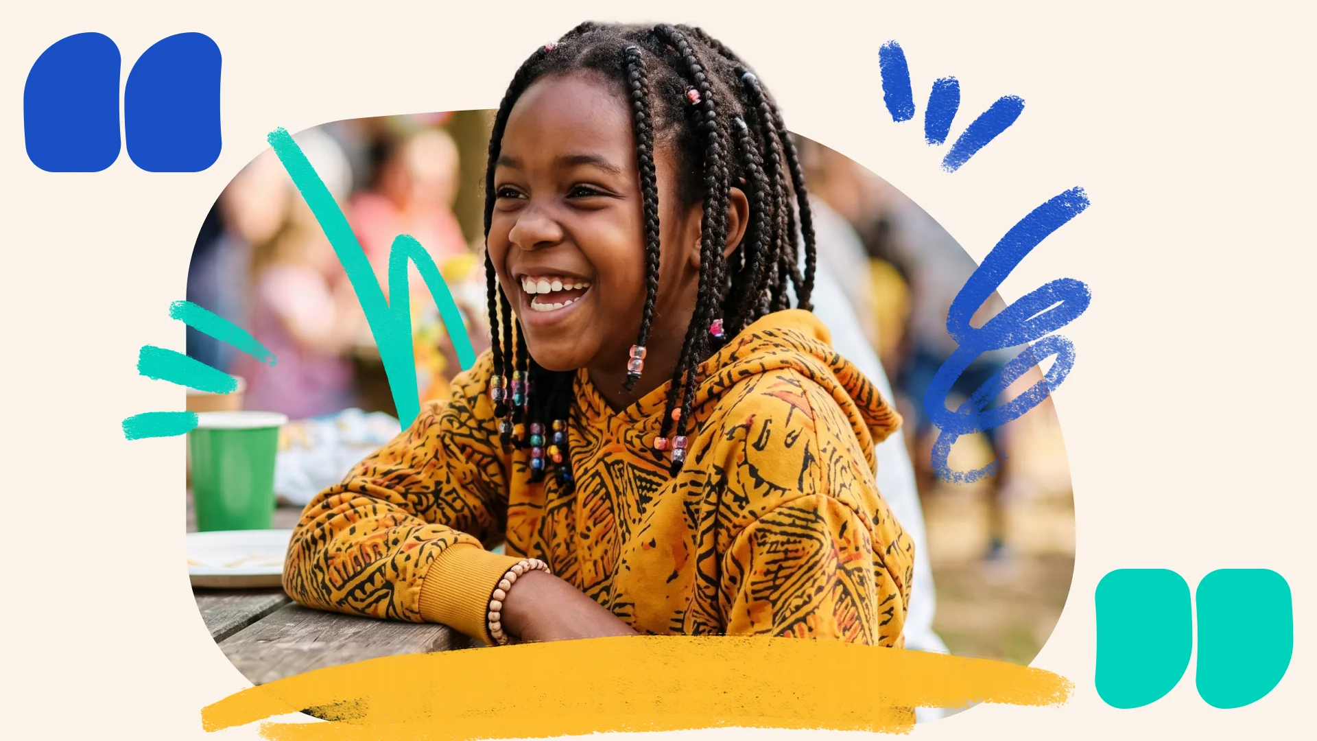
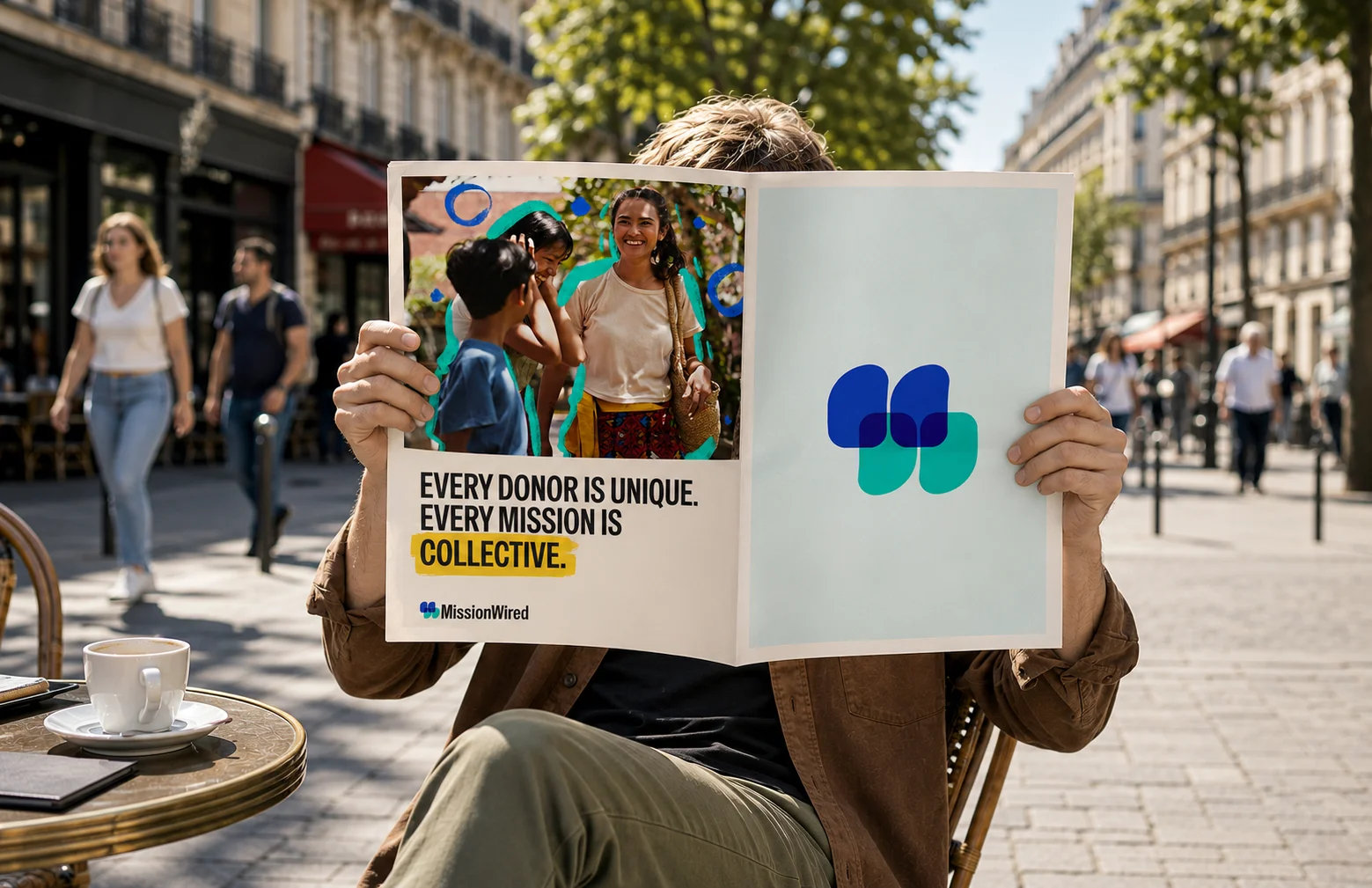
I reinterpreted the logo by transforming the old geometric shapes (affectionately dubbed "gravestones") into massive quotation marks, symbolising the voice of the collective, and refined the typography to make it more recognisable.
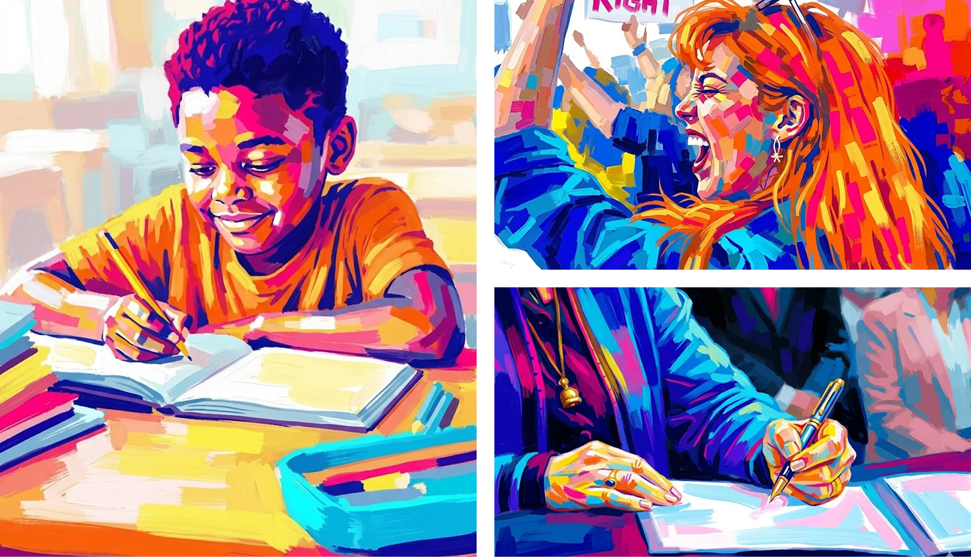
Later, we tweaked a few elements by injecting the energy of the third creative territory: we made the colours more vibrant and adopted a dynamic photographic treatment inspired by impressionist brushstrokes.
To scale this process, I trained Gemini with a prompt system capable of generating consistently cohesive images and illustrations—an innovative workflow that thrilled the client. The result was a disruptive, high-energy brand.
Everyone was happy, high-fives all round, project wrapped and ready for launch!
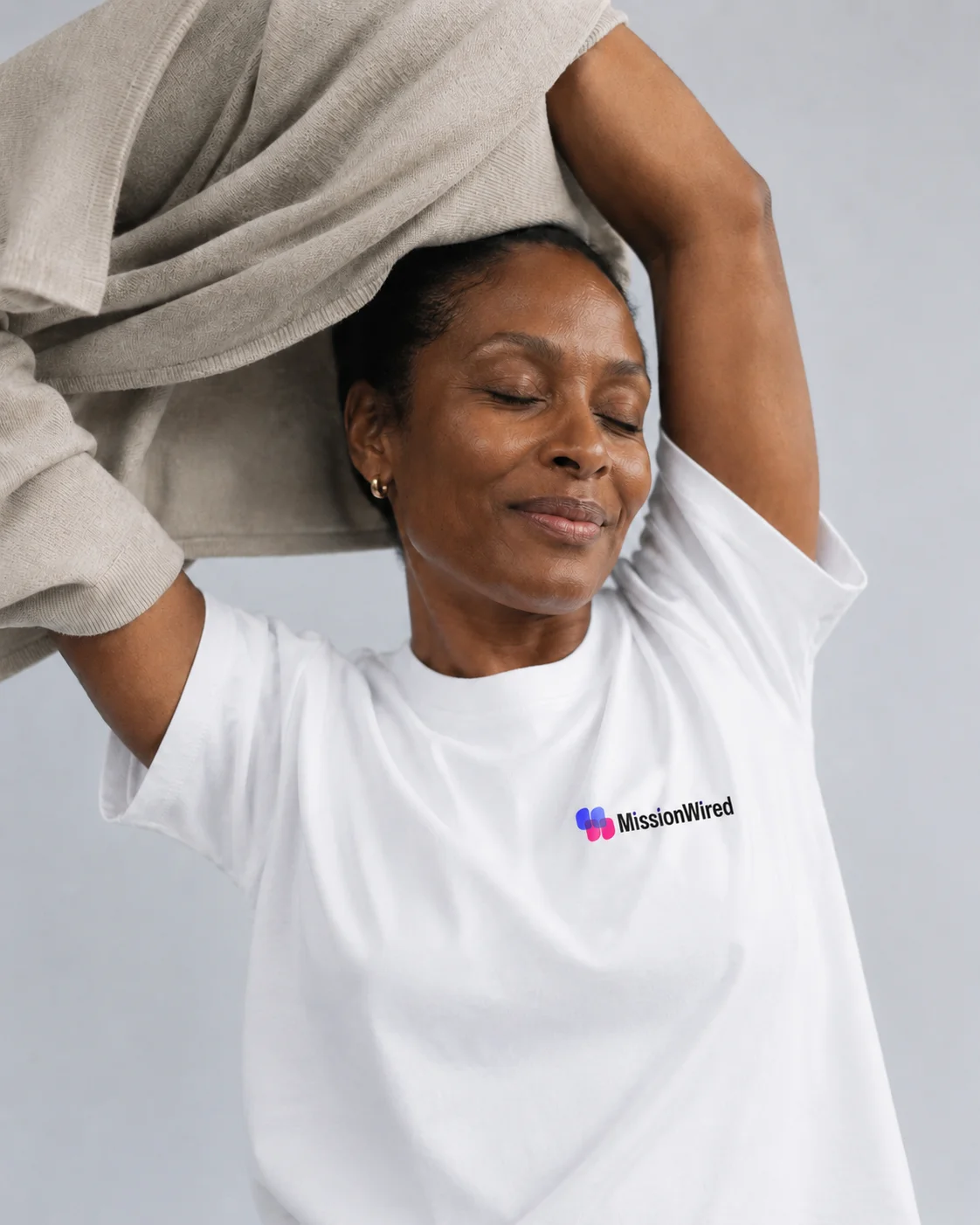
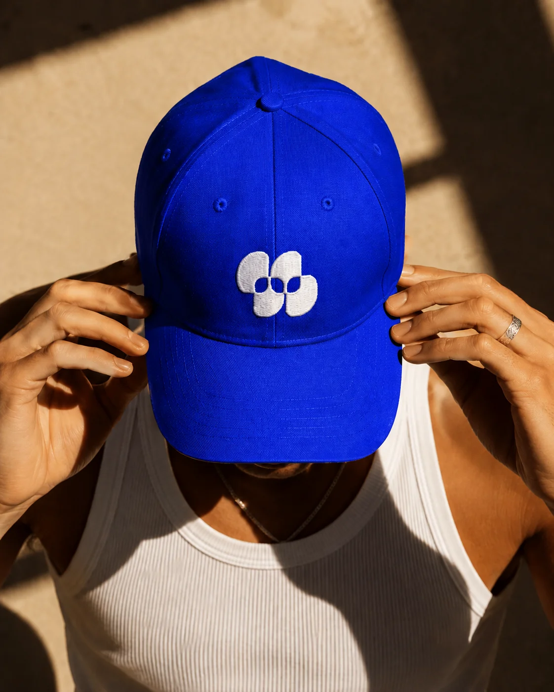
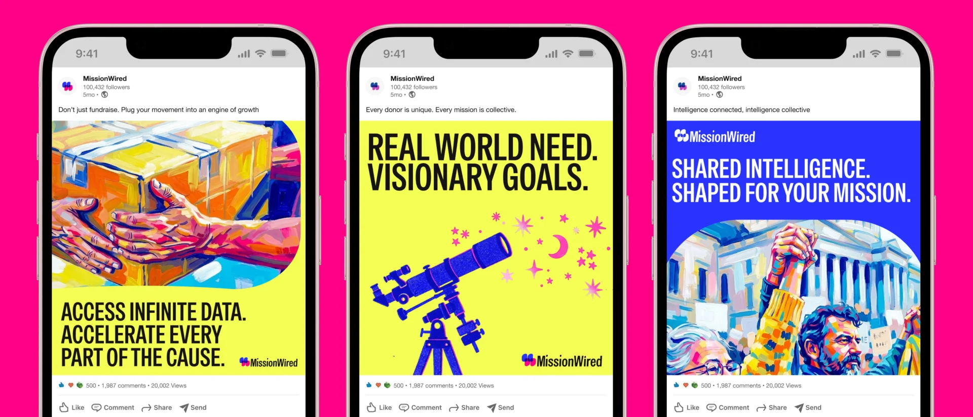

...Or so it seemed.
After telling us they adored the brand we'd created, they vanished for over a month. And as you well know, when a client ghosts you, it's never a good sign. When they finally resurfaced, they confessed that following an internal review, they'd decided to backpedal and leave most elements untouched. After a bit of digging, we figured out why:
The new palette hadn't gone down quite as well as hoped.
Relying exclusively on AI for photos and illustrations risked alienating their clients, particularly donors on the progressive side of the aisle.
Introducing a completely new logo required a massive logistical effort, especially having to recreate all visual assets and marketing collateral from scratch.
In short, of the entire brand proposal, barely the fonts and icons survived.
He who moves a mountain begins by carrying away small stones.
And here Confucius actually hit the nail on the head. I could have just swallowed the client's feedback, but I decided to take one last shot at offering a concrete solution I knew would satisfy everyone. Digging even deeper, I discovered their cold feet stemmed from the fear of completely uprooting a brand they were deeply attached to.
First off, I revisited the palette, reintroducing the primary colours and accent hues they already used.
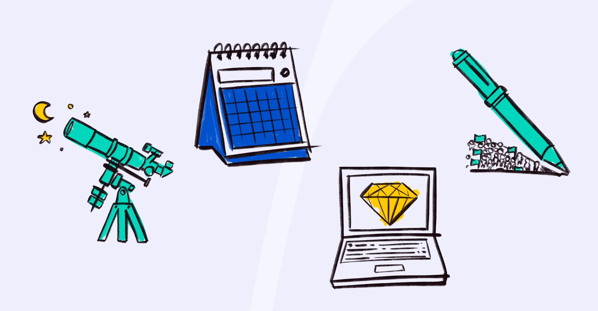
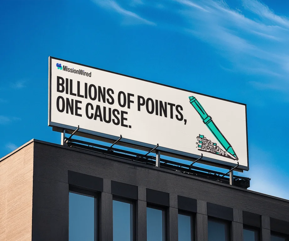
Next, I reworked the photo and illustration treatments. For photography, we ditched AI-generated images in favour of real people, giving the brand an authentic human face. I knew MissionWired’s internal design team wanted to be more hands-on with asset creation, but lacked the time. So, I built a chunky brush strokes effect that could be rapidly applied to photos using Procreate. I carried that same sketchy style over to the illustrations, abstract graphics, and—to some extent—the icons.
As for the logo, I held my ground and pushed for the change. I leaned heavily on feedback from their own design team, who were deeply unhappy that the old logo elements looked like tombstones.

And that's not all! The blue you see isn't even their original blue. I prepared two identical presentations: one with their historical blue, and one with a slightly punchier tone. I presented the first, and only after making sure they were completely thrilled with all the practical updates did I whip out the second presentation. I wanted to demonstrate live how such a tiny visual tweak could make a massive difference in energy.
Well, let's just say... you can see for yourselves which one they ultimately chose!

Results
There is nothing quite as satisfying as getting positive feedback that proves the very team that refused to touch the brand is starting to appreciate the new one. Here are a few comments we received:
"I’m still in disbelief at how you managed to overhaul the creative direction without a single compromise. I am genuinely blown away by the result."
"Thank you so much for the hard work and your patience in getting us to this point. We are all buzzing and incredibly excited: I can’t wait to see it come to life!"