Puragen
Client
Puragen
Type
Branding, Illustration, design system, web design
Tools
Figma, Illustrator, Photoshop, Chat GPT, Gemini
Website
I got roped into this project to finish off some work started by a colleague who had left the company. It seemed like I just needed to tidy up a few bits and bobs, but I found myself having to reconcile the visions of two stakeholder groups with diametrically opposed goals: on one side, the legacy leadership of Puragen (CEO, CMO, and Chief Engineer); on the other, Julian, representing the new board of Invica, the company that had just acquired them.
Costing an arm and a leg.
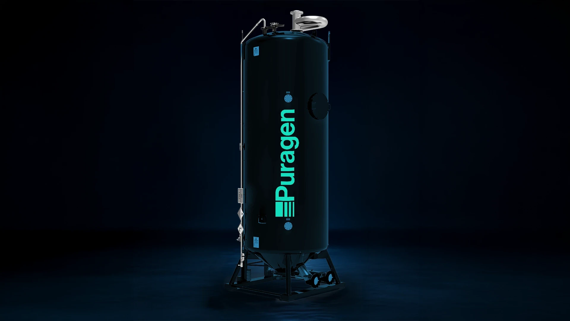
Puragen is a company that produces activated carbon systems to purify water, air, and gas. I don't know if you've ever seen industrial filters, but they are absolutely massive, and repainting them costs an absolute fortune. And this was the crux of the whole project. The Puragen team wanted to use cobalt blue as their primary colour, given that the physical filters were already that colour and finding the exact RAL code for industrial paints was a logistical nightmare. Invica's board, on the other hand, absolutely despised that blue.
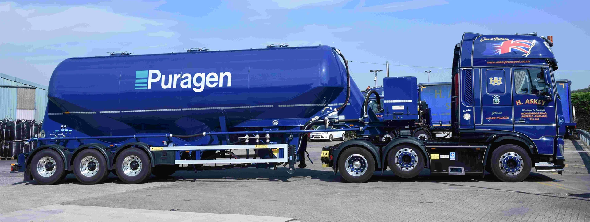
Filtering the colours too.
I realised we were well and truly stuck—one side hates the blue, the other wants it as their primary colour.
The more I thought about how to break the deadlock, the more I realised something was off: we were focusing on just one colour, when in reality we should have been thinking much more holistically about the palette's role within the brand.
It makes perfect sense to have blue for a company providing water purification systems, but we could milk a lot more potential out of the palette by using three colours to tell the story of the entire filtration process.
After chatting with the stakeholders, we managed to find two other colours that everyone could get on board with. We brought in Racing Green, whose dark tones symbolise the unfiltered element (whether that's water, air, or gas); in the middle sits the blue, representing the transitional phase of filtration; and finally, we have a bright aquamarine which, in stark contrast to the dark green, symbolises the newly purified and clean element.
This way, we kept everyone happy: from Julian's perspective, blue was no longer the primary colour, whilst for the Puragen team, keeping it as the central representation of the filtration process left them absolutely chuffed.
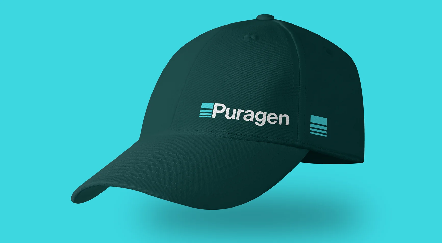
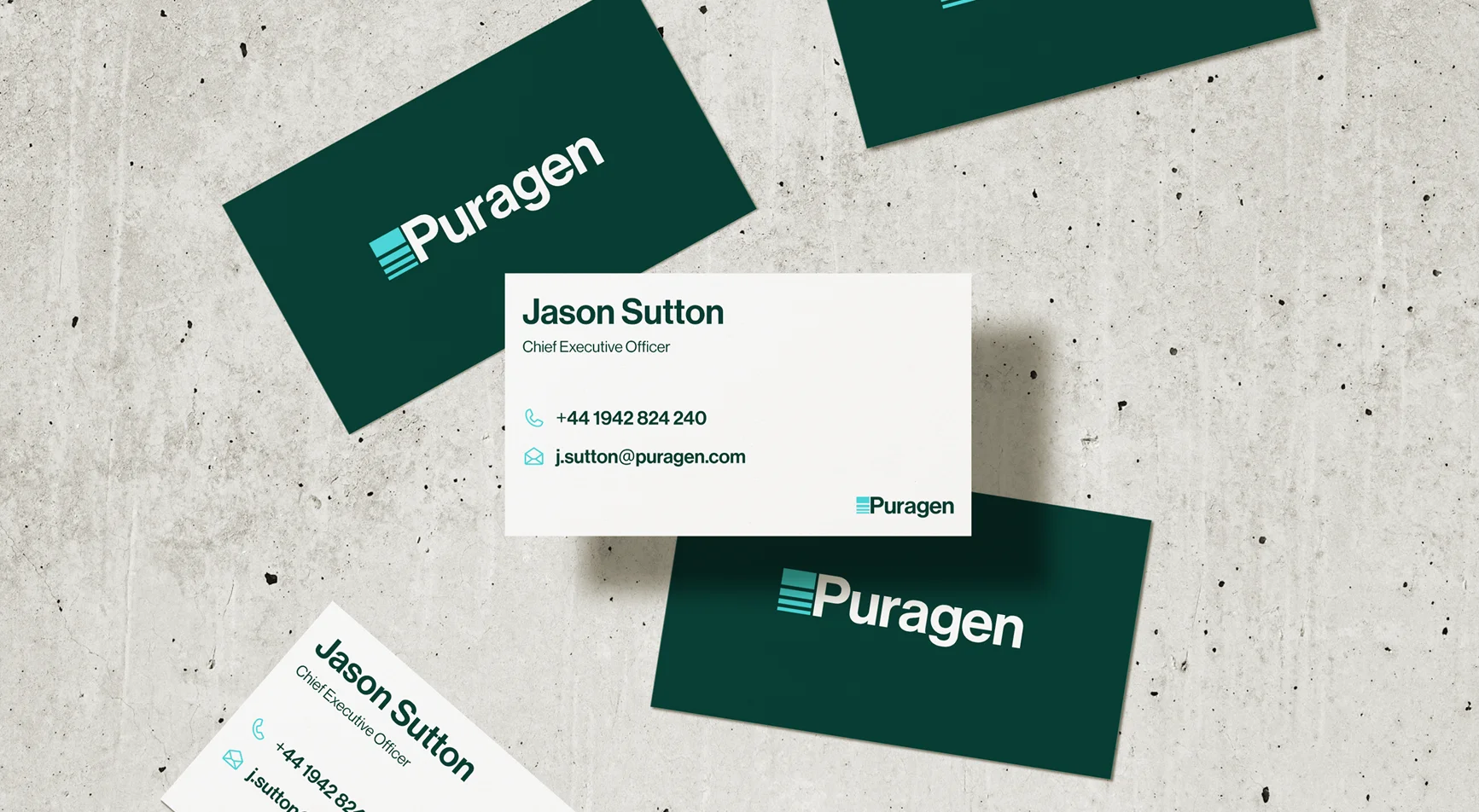
Design without filter.
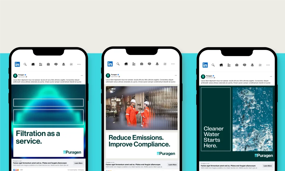
With the biggest hurdle cleared, the rest was pure creative joy. Finally having a solid foundation and the enthusiasm of all the stakeholders, I brought the entire visual system to life. I designed new icons, nailed down the photography style, and created a set of bespoke illustrations inspired by the concepts of purification, water flow, and filtration.
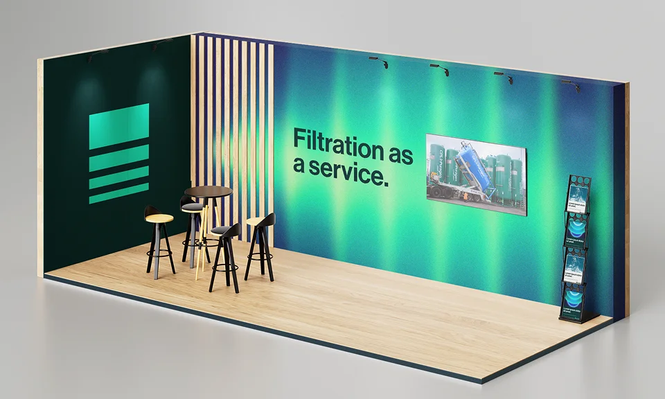
It's raining web pages.
The new brand went down an absolute storm, so much so that I was immediately tasked with creating the new website. A titanic challenge: we had to launch over 50 pages in next to no time, coordinating copywriters, developers, and designers who were less experienced with Figma.

Piggybacking on the experience with CID (see project), I optimised the design system to make it dead simple to use, even for those without a ton of Figma experience:
Responsive magic: I leveraged Figma's advanced variables. Designers only had to build the desktop layout and, with a single click, the components automatically reflowed to fit the mobile grids.
Integrated workflow: I standardised the working file. Every single artboard included a direct link to the copy document, the design version number, and its exact hierarchy within the sitemap.
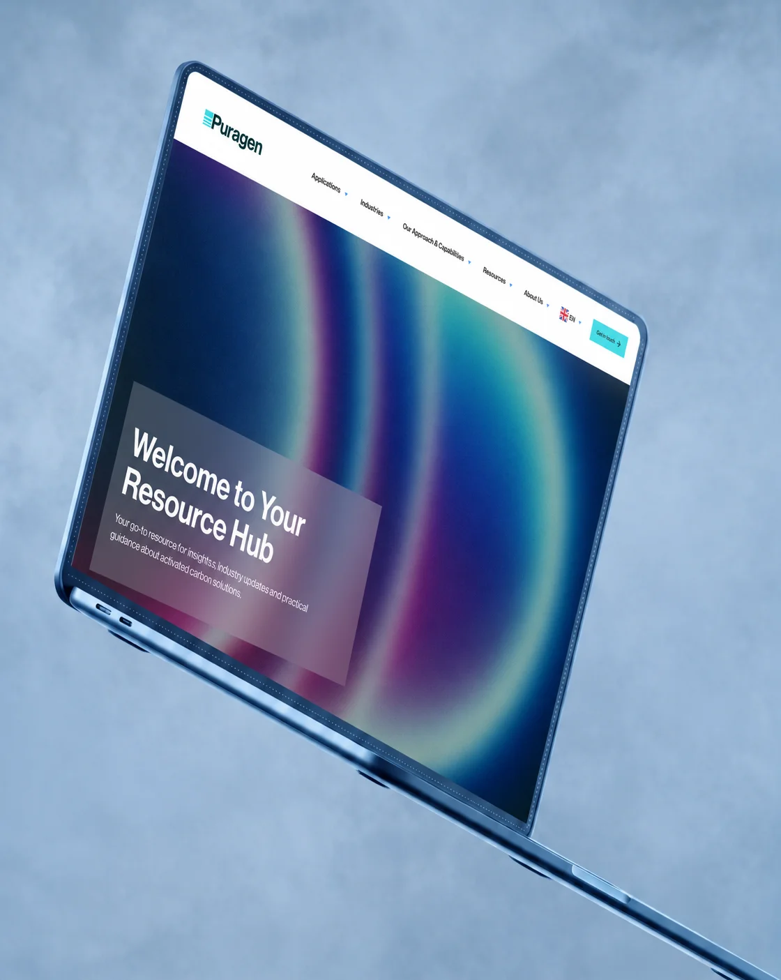
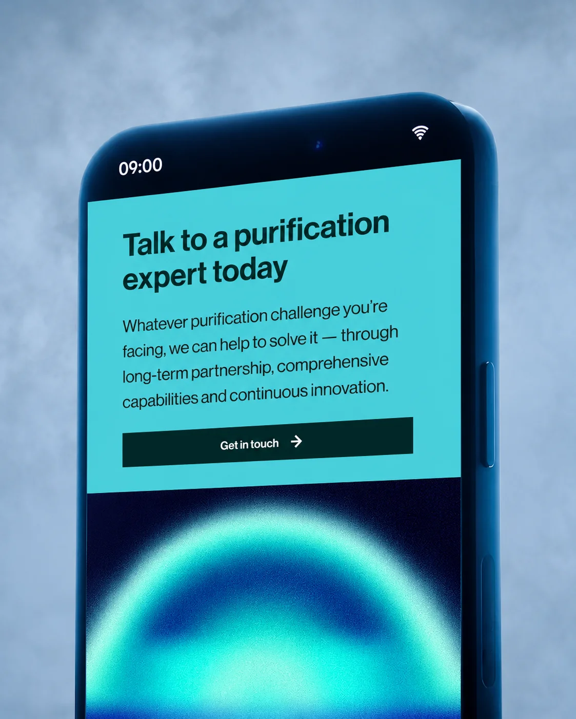
Results
The impact of this methodical approach was hugely positive: we managed to slash design production time by at least a third. We were churning out approved layouts so fast that the copywriters were literally struggling to keep up! The page builds had been agreed upon with the developers in advance, allowing them to export and implement the sections automatically.
What started off as a diplomatic clash over a colour palette turned into an across-the-board triumph, perfectly summed up by the words of my colleague, the account lead:
"What started out as a microsite scheduled for an April launch evolved into a full-blown website, translated into three languages. Masterful work, massive congratulations, and a huge thank you to the entire Puragen team!!!"
Not stopping there, we also ran the Puragen framework through PageSpeed Insights, scoring a solid 95/100 on desktop—not a bad result at all, confirming that the design choices and technical architecture are perfectly balanced to maximise performance.
And a personal result I'm quite proud of: the filters are now Racing Green. Look how gorgeous they are!