Pretzl

Client
Pretzl
Type
Illustration, web design
Tools
Figma, Photoshop, Illustrator, Gemini, Chat GPT
Website
A lot of noteworthy things happened in 2025: Donald became president of America again, a pope died, and we got a new one, and a small town in Cornwall had grandly inaugurated a plastic supermarket trolley tunnel. However, one thing completely turned my career upside down: Velocity, the company I’d been working with for the past few years, was merged with four other companies from the Next 15 group to create a brand-new marketing agency called Pretzl.
After recovering from this news, I got roped into what seemed like a straightforward web design project, but it turned out to be much, much more.
The power of diplomacy.
The first phase of this project was handled by the various senior creatives from the companies, allowing them to get to know one another and start figuring out everyone's strengths. Over the course of a few months and several meetings, the core elements making up the brand were defined. We therefore had the name, the logo, the colours, and the fonts, plus a few general ideas regarding the graphic direction. At that point, everything was ready to move on to building the website.

A big hug for the devs
Even before getting down to the website designs, I aligned with the developers to understand what process they’d follow, what hurdles might pop up, and how ambitious we could afford to be with the designs. This step was crucial both for organising my own work effectively and for reassuring the dev team that we’d be following a rigorous process: with so many designers involved, developers can sometimes get left behind, forced to work on vague or overambitious designs.
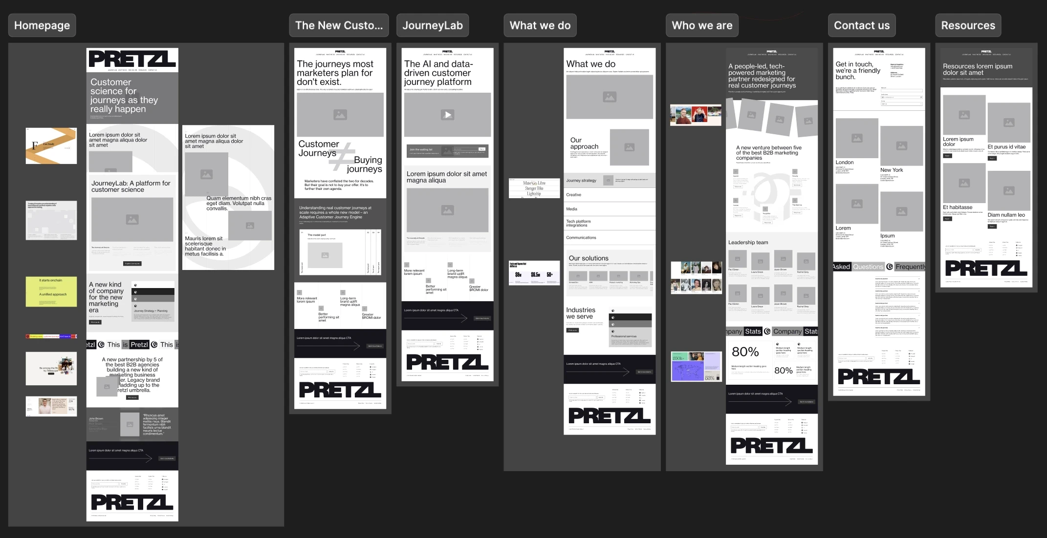
After guaranteeing a peaceful night's sleep for the devs, I kicked off with the wireframes, focusing heavily on animations and interactions (there were three Creative Directors and one Executive Creative Director to win over). To make everything more tangible and useful, I used Figma Make to build working prototypes, so the team could get a proper, hands-on feel for the ideas. Here you can see poor Figma Make trying to make sense of my Italian prompts.
Side note
Over the years, I’ve learned to appreciate wireframes, because they allow me to keep the layout creation completely separate from the visual design. If you don't nail down the page structure in advance, you run the risk of having to revise the designs a hundred times, especially when there are a lot of cooks in the kitchen. Agreeing on layouts before moving on to the design isn't just easier; it also helps keep a lid on the bizarre requests that often crop up during the more creative phase.
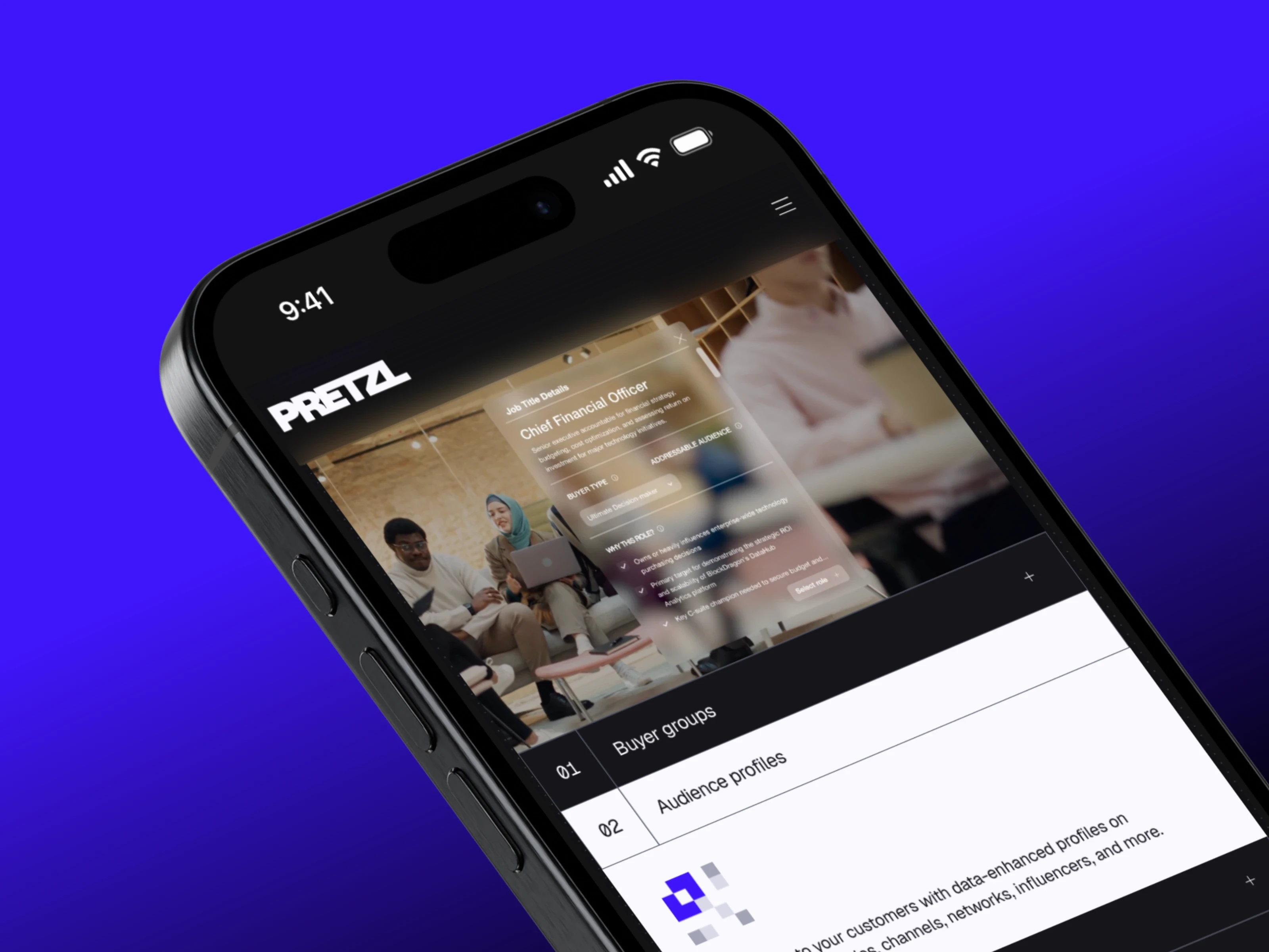
With the structure agreed upon, I then got to work on the actual design of the site, collaborating with copywriters, designers, and animators to achieve the result you see here.

A vintage touch
My organisational skills and ability to mediate between departments—which helped us piece the site together—were met with genuine enthusiasm (I'm not saying it was quite like Beatles fans tearing their hair out and screaming at the top of their lungs at gigs... but almost). Consequently, the team roped me in to coordinate the missing pieces of the design system too.
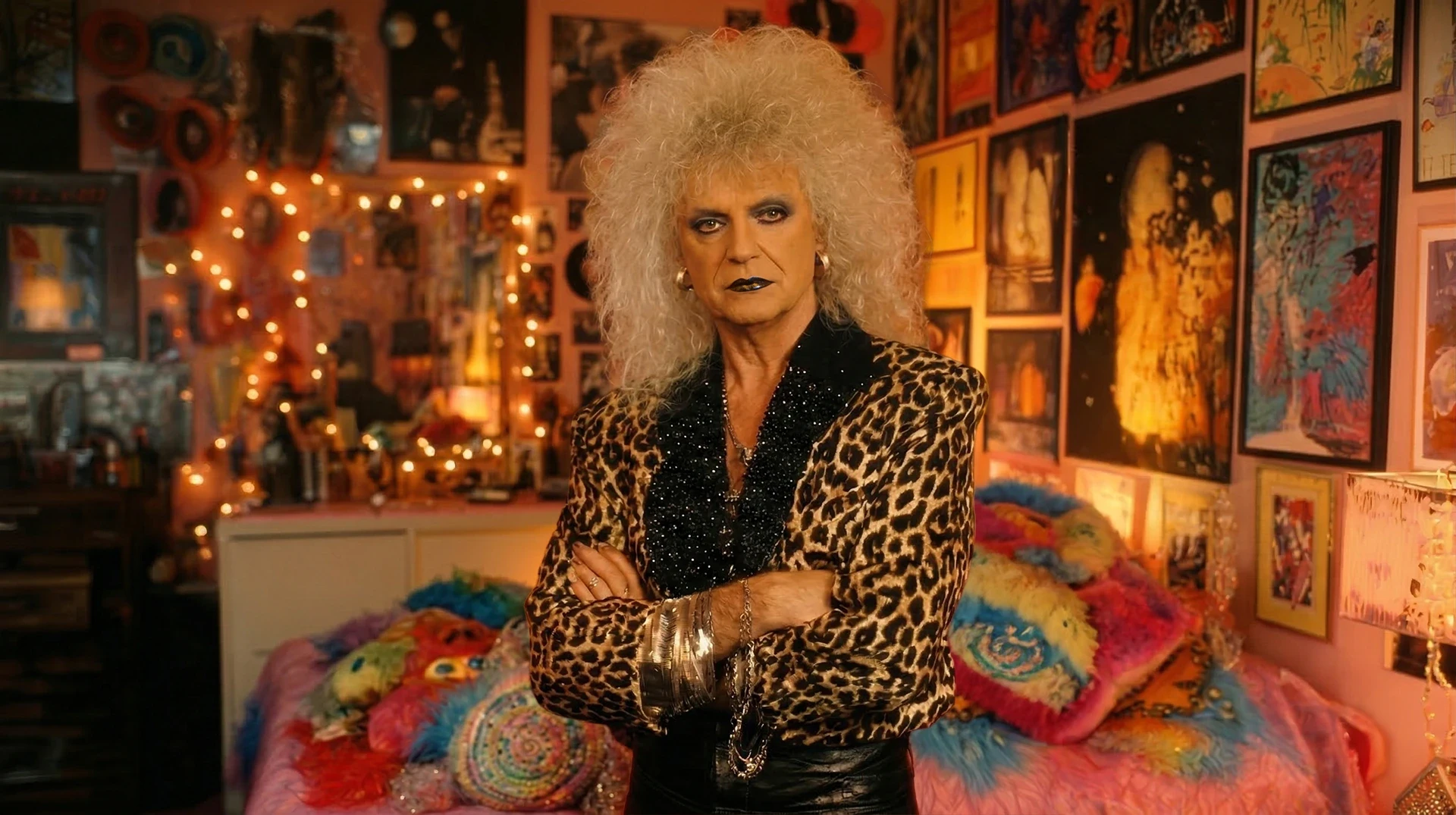
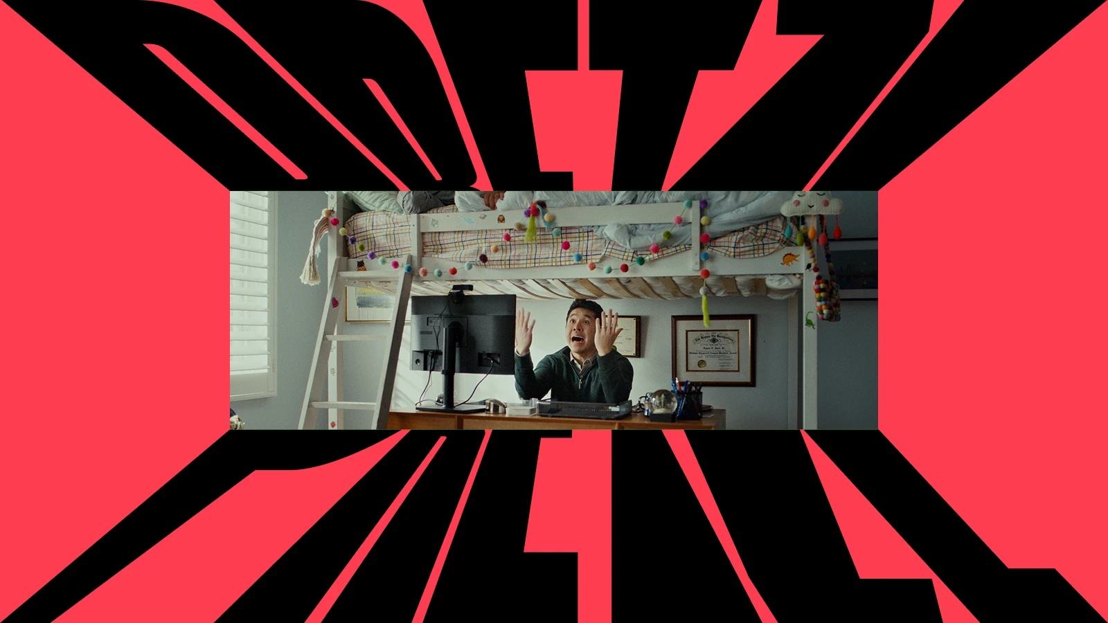
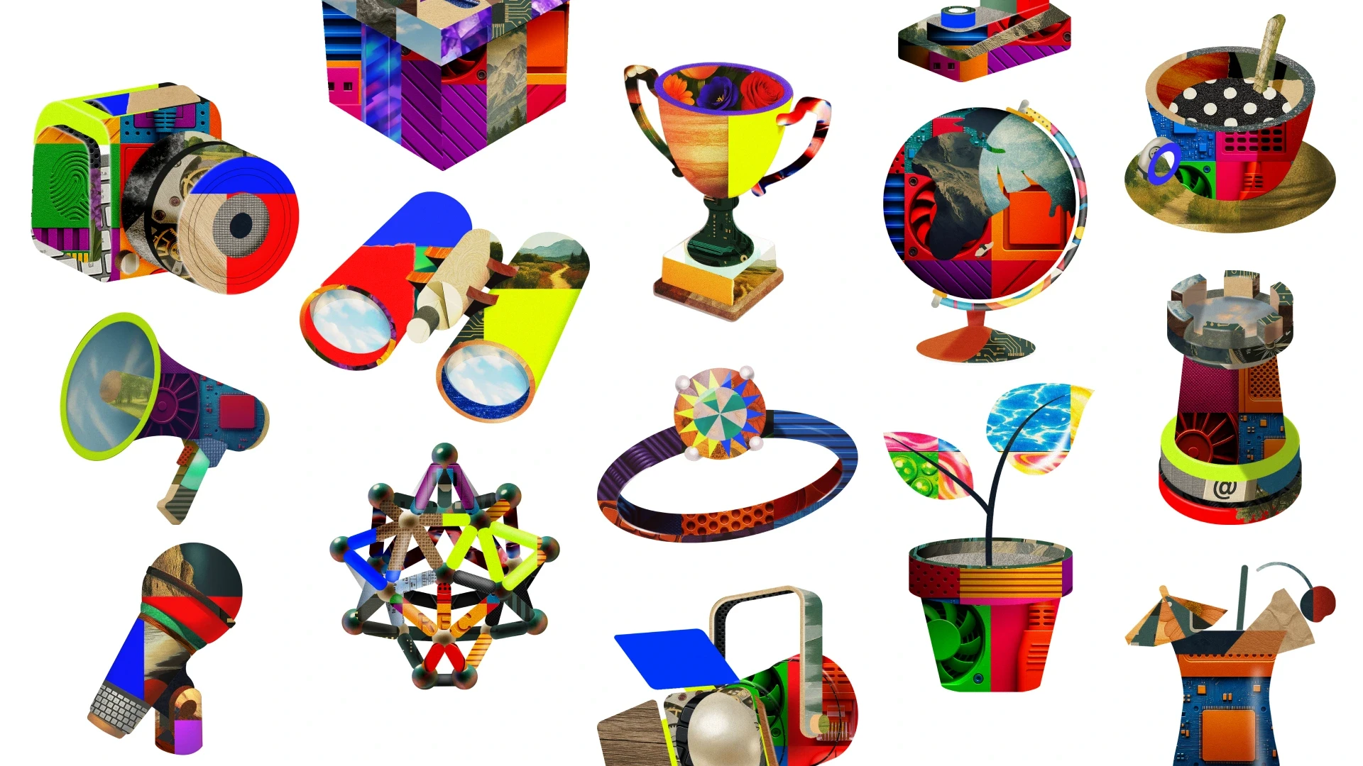
To communicate a brand that calls itself 'unusual', standard flat illustrations simply weren't going to cut it. Along with the creative directors, we decided to go all-in on the collage technique: a disruptive, ironic, and deliberately maximalist visual language, designed with a very specific goal: to grab the user's attention mid-scroll and shake up the sheer boredom of traditional corporate B2B comms.
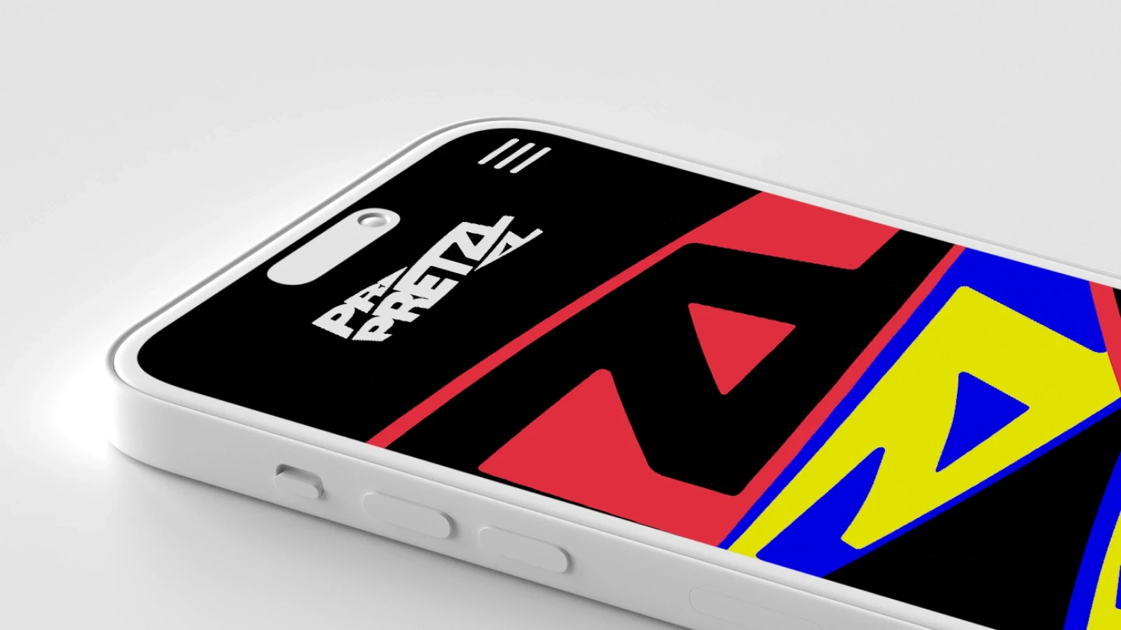
The visual system is split into two styles: a primary treatment for showcasing capabilities through full-blown illustrated scenes, and a secondary one dedicated to services. In the latter, the chaos of the collage is 'organised' and contained within shapes that mimic everyday tech objects, guaranteeing maximum clarity and legibility.
The all-important 'yes'.
Before the celebratory Predator-style handshakes, we needed to get the final 'yes' from the Executive Director flying in from the States. To win him over, I laid a strategic "trap" during his visit to London:
Selling the strategy: By some miracle, I managed to find a slot in his diary and, during the meeting, I explained the strategic rationale behind the collages. I also reassured him that the creation process was a well-oiled machine, allowing us to churn out new images in absolutely no time.
The Wow factor: Immediately after the pitch, I walked him over to the developers' desks. We’d secretly coordinated to have a fully working, interactive demo of the homepage ready and waiting for him. Seeing it live, with all the smooth animations already baked in, was the final masterstroke.
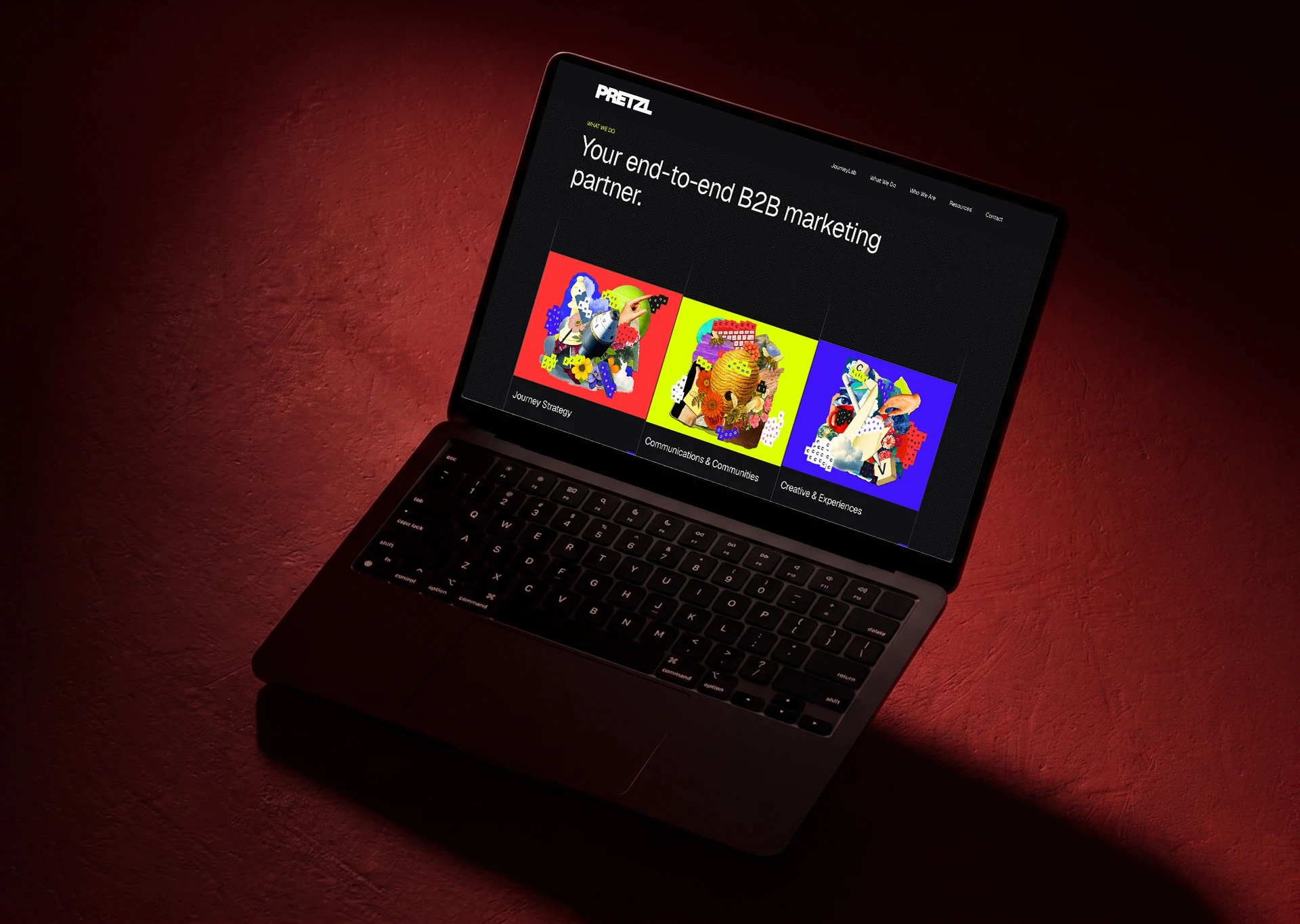
The plan worked an absolute treat: the Executive Director, won over by the organisation and the sheer quality of the work, gave the ultimate green light across the board. In fact, it went even better than I'd hoped... those colourful collages are now printed on the pillars of Pretzl's offices all over the world!
Results
The collective graft paid off, bringing with it praise from the CEO:
"Transitioning from multiple distinct entities into a single brand was a complex challenge. The new design wasn't just an aesthetic exercise; it was the glue that gave visual form to our transition: a cohesive, disruptive language that now unites our different souls, from the website interactions right through to the walls of our offices around the world."
And our trusty PageSpeed Insights gave us some more brilliant news: the site scored 98/100, peaking at a flawless 100/100 for both SEO and Best Practices. The mobile version didn't do too badly either, racking up 75% for Performance, 100/100 for SEO and Best Practices, and 91/100 for Accessibility.