Plinc

Plinc reached out to us to translate their visual identity into a stronger, more recognisable brand. The challenge was to move past an image tied to fragmented, manual consulting and carve out a clear positioning for their new integrated ecosystem: a platform where automation and AI transform complex data into beautifully simple, scalable sales strategies.
A bit on the shy side
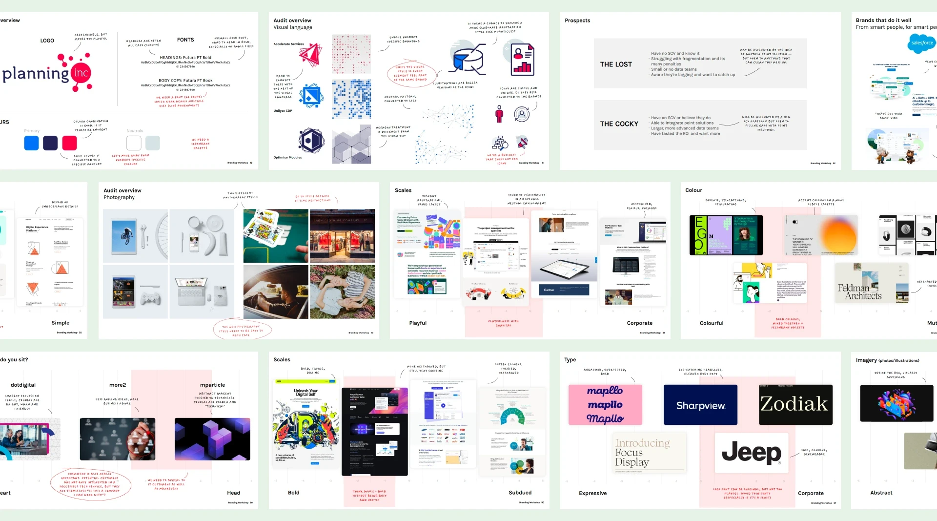
Plinc came to us treading very carefully, asking for a mere brand refresh out of fear of damaging their brand equity. But I knew the brand could afford to be much bolder, so I used the design workshop to challenge their assumptions. I pointed out just how anonymous their current identity looked next to their competitors, and—by teasing them with a strategic dose of FOMO and some much punchier visions—I pushed them to aim higher.
The result? We got the green light to explore much more eye-catching creative routes.
One brand, two directions.
Armed with the client's newfound ambitions, I got straight to work, coming up with two distinct options for the new brand. The first leaned into a soft, human aesthetic, using fluid, colourful shapes to make every customer feel like a bit of a VIP, rather than just another number in a database. The second was built on a technical, modular grid, designed to convey the idea of precise, rock-solid technology that slots together perfectly to meet any company's needs.
Hidden in plain sight.
Right from the off, Plinc recognised the first route as the modern, grown-up version of their original brand.
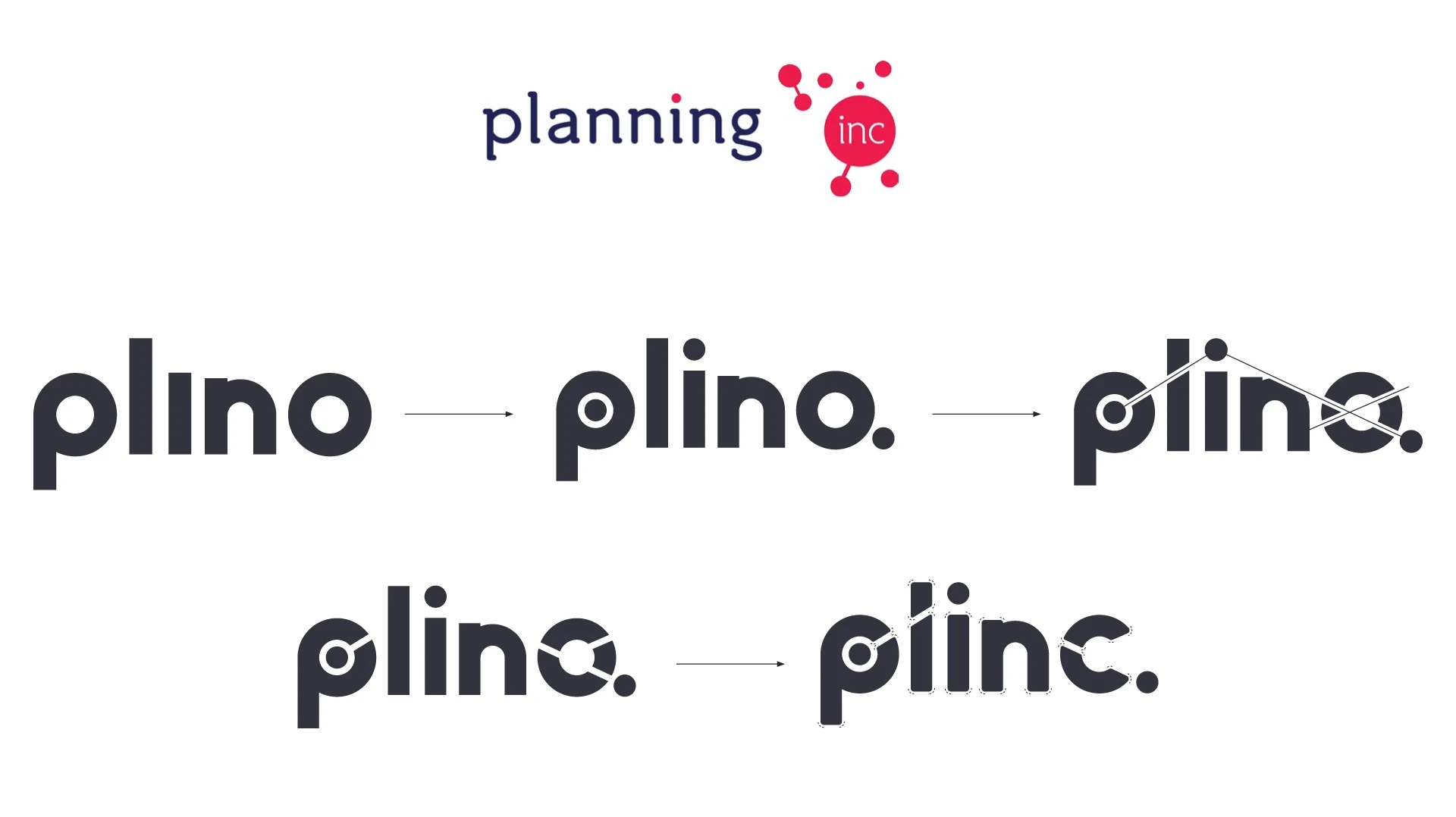
The new wordmark nods to the characteristics of the original logo, but reworks them in a much more refined and elegant way. The line connecting the dots is there, but at the same time, it’s completely invisible.
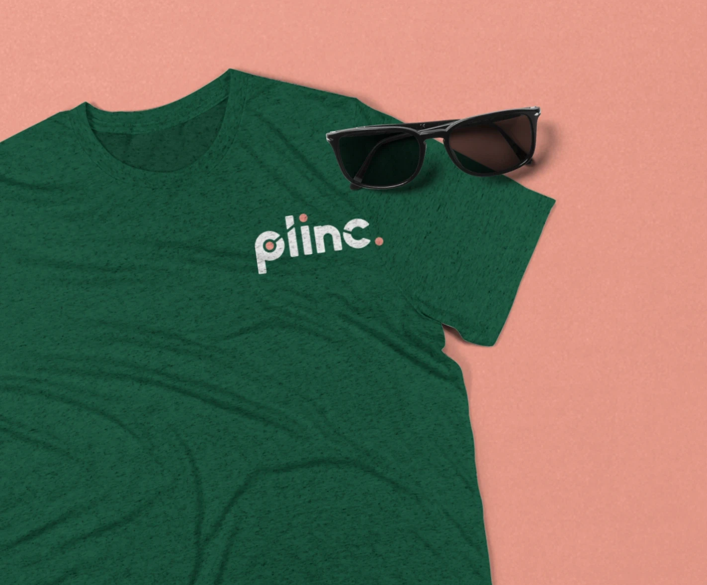

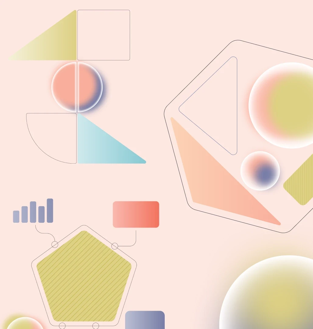
I loved the idea of visualising the concept of the 'Single Customer View' without having to rely on obvious pictures of people. Mostly because, let’s be honest, that would have been a bit of a cliché. So, I had the idea of creating organism-like compositions: each one completely unique, yet built from the exact same core elements. This approach then gave us the freedom to play around with these 'organisms' and craft fun animations packed with personality.
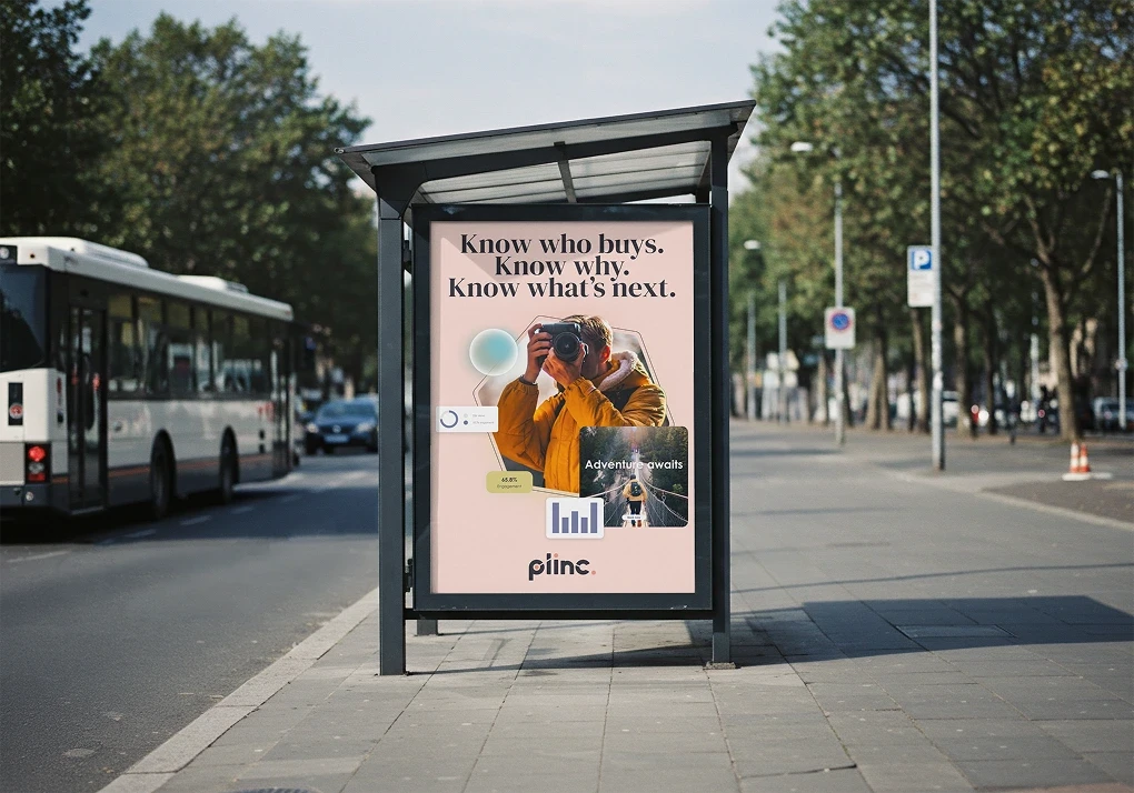
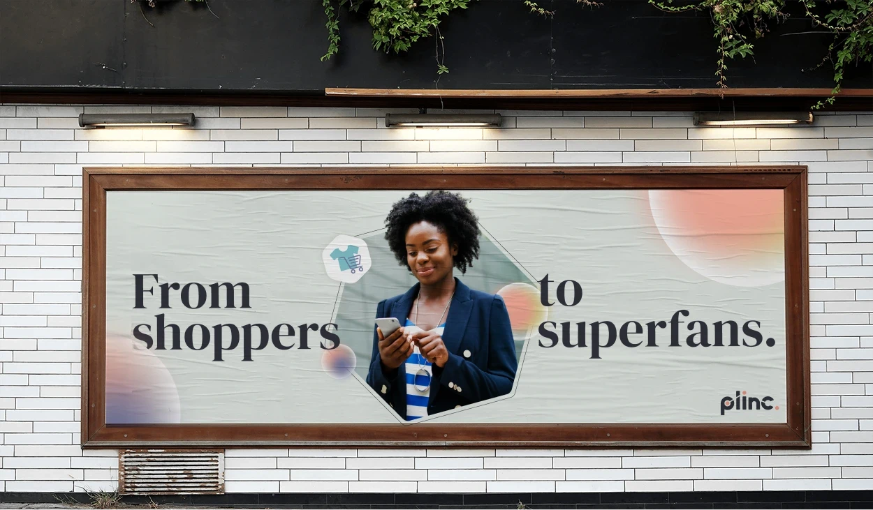
As you can probably guess, these geometric shapes also double up brilliantly as photo containers. Used properly, they’re perfect for framing a scene and its subjects, making even standard stock imagery look a fair bit more dynamic and interesting.

And finally, the website
Naturally, I also took charge of the web design for the Plinc site, which was the result of an incredibly tight-knit collaboration with the other teams at Velocity (which has since merged into Pretzl, of course). The wireframes were mapped out alongside our Head of SEO to ensure everything was fully optimised for both UX and conversions. The motion team helped me translate the illustrations into slick animations, and working closely with the dev team meant the Figma design system was structured as flawlessly as possible.


Results
The client was absolutely chuffed with the result (and frankly, it’d be a bit weird if I showed you a project where the client actually hated what we did). The feedback they shared is proof that it’s always worth steering the client towards the best possible solution:
"The result is incredible and I couldn’t be happier. A massive thank you to the whole team at Velocity Partners for your creativity and patience: we started with the idea of a simple brand evolution, but your approach and the sheer quality of the work convinced everyone to go all-in on a true revolution. When strategy and creativity come together, this is the result: absolutely out of this world."
The PageSpeed Insights results were also highly encouraging—our tests actually clocked a 97/100 for performance, with SEO and Best Practices sitting pretty at 100!