FPV

Client
FPV
Type
Branding, Web design
Tools
Photoshop, Figma, Illustrator
FPV stands for Founder Power Venture. Behind such a punchy name sits a venture capital firm that genuinely believes in long-term investment relationships: they choose to back only the ventures they truly believe in, walking side by side with founders to fuel growth without the frantic, short-sighted rush of old-school playbooks.
A client like this needed a visual identity with a bit of grit, paired with a website that genuinely reflected their values. And I was more than happy to take that on.
What's in the box?
Every proper branding project kicks off with a client workshop, which is where I begin hammering out the design brief. The workshop with FPV helped me pin down:
The brand’s overarching purpose and core objectives
The defining keywords that represented them
Their actual design tastes
The workshop unearthed the key principles that guided our design proposals: reinvention, cutting-edge vision, expertise, and trust.

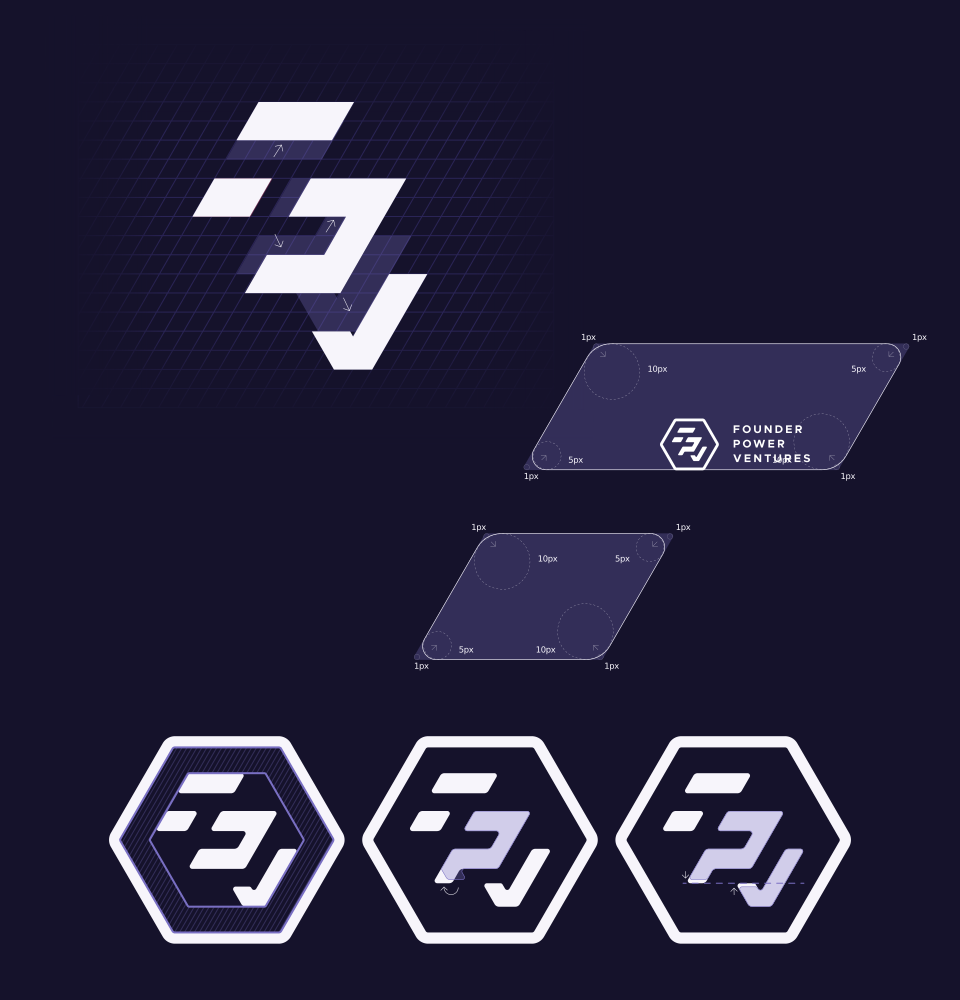
The client was after a logo with a proper story behind it: something capable of grabbing people's attention while rewarding anyone curious enough to unpack its geometry. Here's what I came up with:
The outer perimeter, which at first glance looks like a flat 2D hexagon, can also be read as a transparent 3D cube revealing internal layers. These shapes serve as a simplified visual representation of the acronym FPV.


Connections.
We expanded the visual language by introducing an angled rectangular motif inspired by the internal layers of the logo mark.
These interconnected shapes—which at first blush evoke the circuitry of a microchip—serve as a visual nod to the very pathways powering today's technology, just as FPV powers and propels ambitious new ventures.


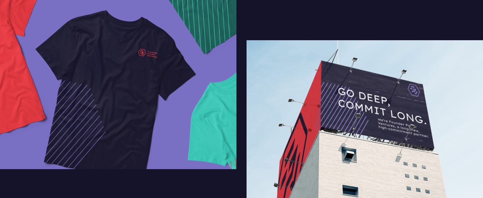
Diagonals everywhere.
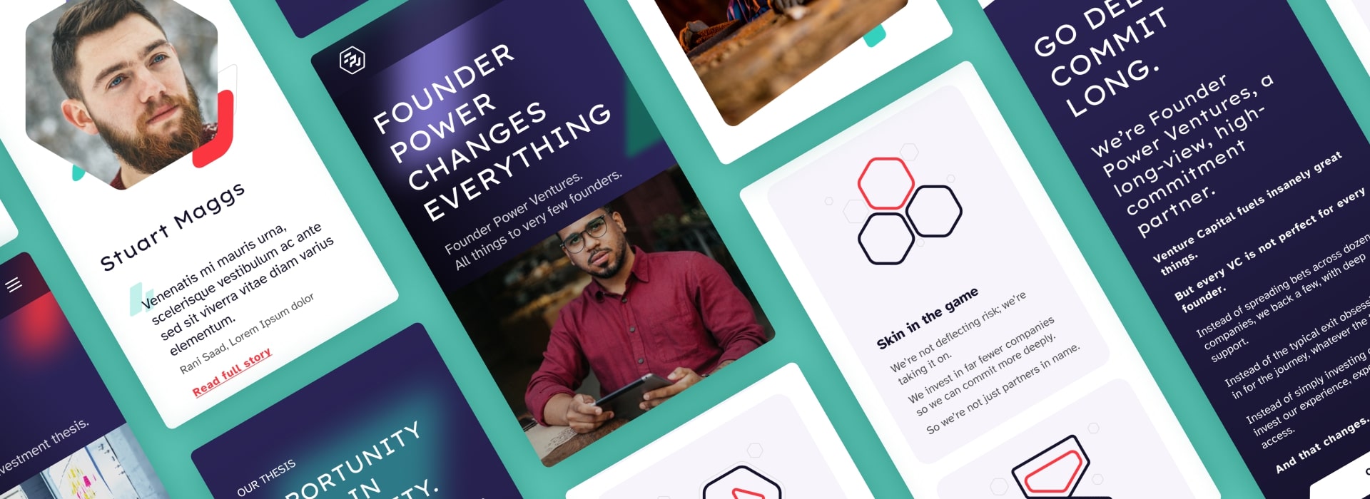
I put the new design system through its paces in various ways, but the ultimate test was building the site itself.
Every element—from the image masks right down to the icons—speaks the exact same language, ensuring a seamless visual experience. The diagonal angles inspired the CTAs, which literally slice across the page and demand your attention. Resisting the urge to click that button has never been so bloody hard.

Results
Naturally, I’m biased and will sing the project's praises, but what did the client actually think? You'll find their verdict below.
“Your ability to think orthogonally, well beyond the most obvious path of the brief, is exceptionally powerful. It enables the client to stand out with an identity that completely revitalises how people look at this space.
Plus, you’re an absolute joy to work with. The entire experience was overwhelmingly positive, super dynamic, and creatively ambitious.”


