CID original
Client
CID
Type
Branding, web design, illustration
Tools
Photoshop, Figma, Illustrator
CID is a German software company with offices across Europe. Over recent years, they’ve been busy building their Asset & Wealth Management product (called Affinity), designed to give investors a crystal-clear view of the stock market. As a result, they needed a brand system that could tie their core offering together with their new product.
Alex²
CID holds a special place in my heart. Working with the stakeholders was an absolute pleasure mostly because they were completely on the same wavelength. In fact, they were so much on the same wavelength that they actually shared the exact same name: Alex. Right from the first workshop, the direction the new brand needed to take was crystal clear. Both Alexes preferred clean, direct designs free from unnecessary clutter. They also wanted a bespoke illustration style that would stand out from typical, run-of-the-mill tech brands.
So far, so good. But the real question was: how do you make the two products—Bespoke Software Solutions and Asset & Wealth Management—visually distinct, while still making them co-exist within a single visual system?
After exploring various options, I decided the best way to tell the two products apart was to use two distinct colour pairs. One features red—representing the human touch and bespoke software—paired with a warm French Violet. The second combines a blue representing cold calculation and data management with Persian Indigo, a cooler-toned purple. Turquoise rounds off the palette as a neutral.


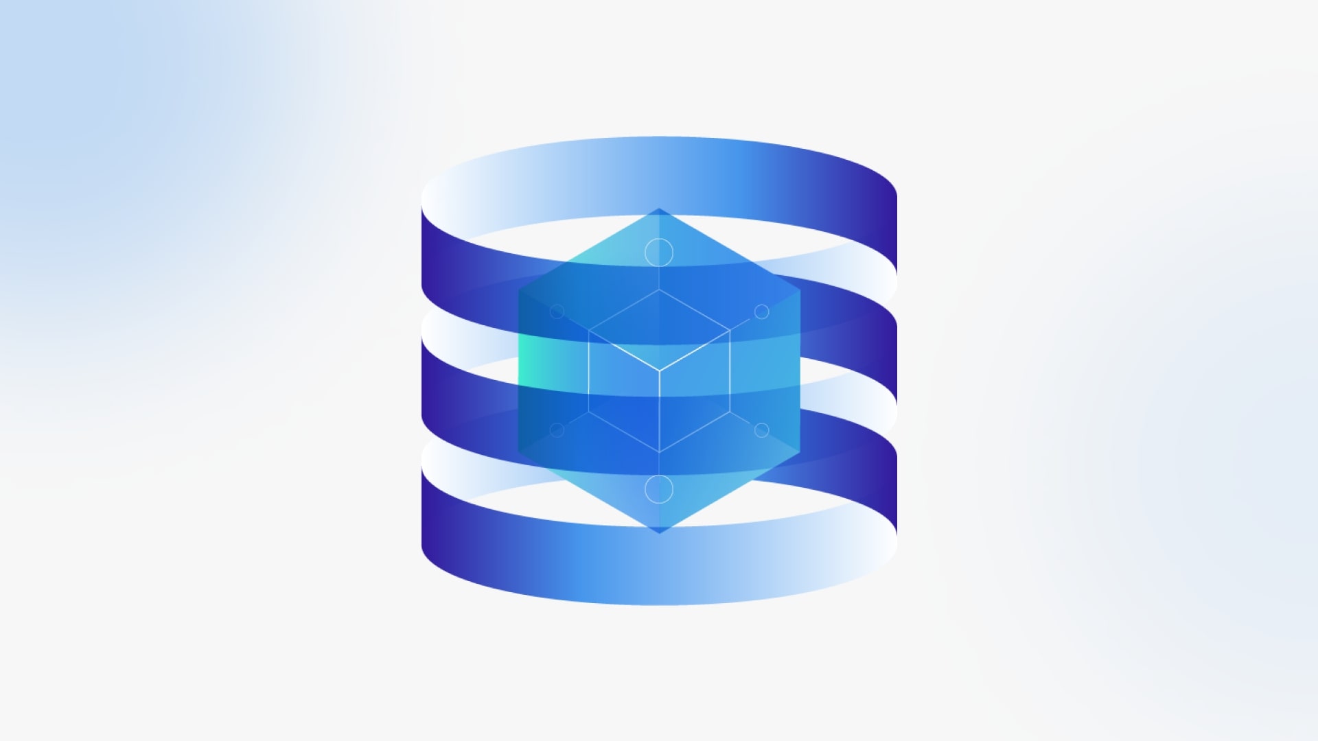
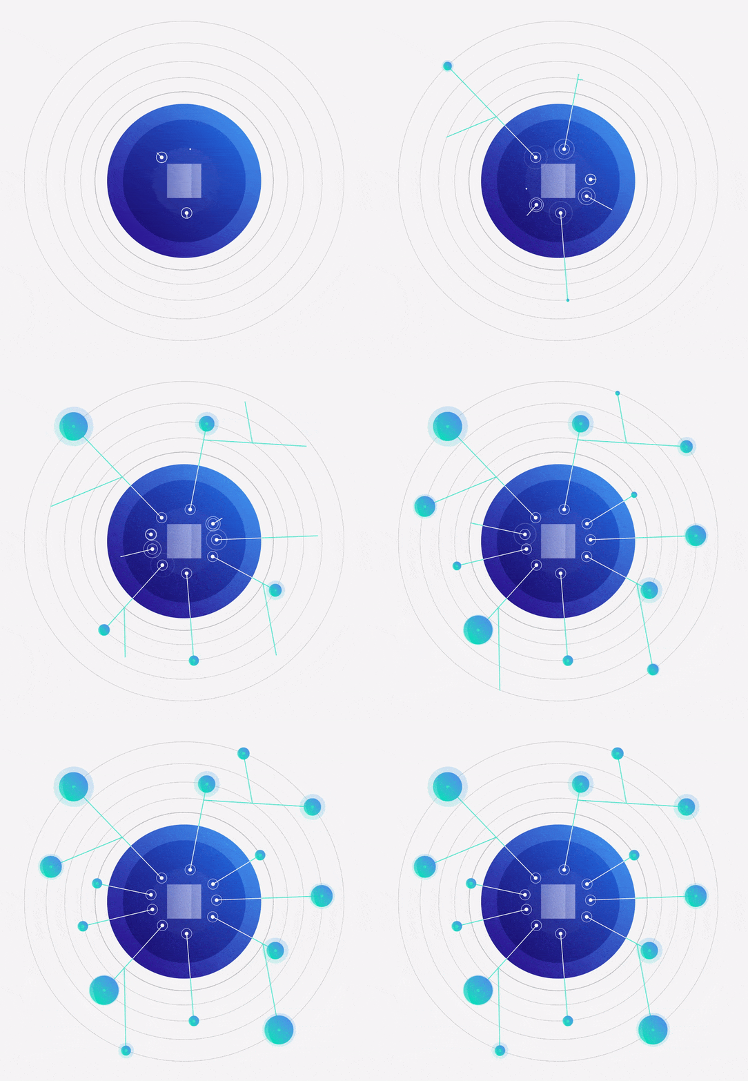
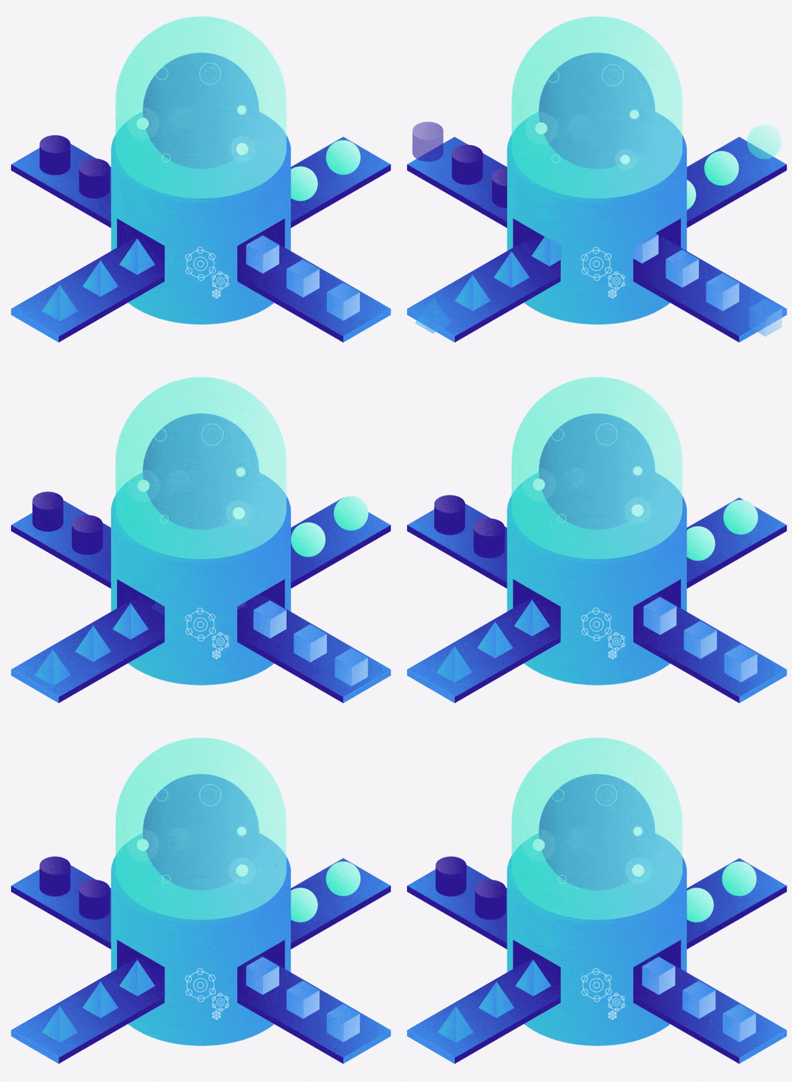
This palette duality inspired the illustration library. The image on the left, crafted in blues and indigos, represents automated data management. The image on the right, warm and human, represents the personal touch behind crafting bespoke software.

As mentioned, CID is a German client with offices all across Europe. It was vital to find fonts that came packed with all the necessary glyphs to write in German, Ukrainian, and Spanish. The final choice fell on Prata and Outfit, two Google Fonts with very, very extensive glyph libraries.


The illustration style heavily influenced the icon style. I also included a secondary library based on Google Material Symbols, which can be downloaded and used without having to rope in a designer.

Remember those illustrations I showed you earlier? Now they're animated! Who would've thought?
The client was so chuffed with the new brand that they asked us to animate the illustrations. I roped in the motion designers, who absolute nailed these little gems. This step gave me the chance to tweak a few illustrations so they worked brilliantly both as static images and as animations... especially the hands!
Are they Lottie animations? You can bet your life on it.



Speaking of collaboration, let me show you the fruit of 8 sprints delivered alongside an ace team of account managers, project managers, motion designers, developers, and... well, me. All that graft on colours, illustrations, and fonts culminated in the CID website.


I hope these visuals give off a sense of a calm, confident brand. What does the client think?
The design, content, and functionality of the website are now on a completely different level. This positions CID as a serious, heavy-hitting player in our target markets.
Last (but certainly not least), here are some very promising early results:
Within 2 months of launch, the site pulled in 20,000 visits.
The ABM campaign launched in the wake of the rebrand saw a cost-per-lead reduction of over 50%.
Performance skyrocketed:
Google Search performance jumped from 9% to 92% on mobile and from 73% to 99% on desktop;
Accessibility hit up to 96% on desktop and 95% on mobile;
Best practices hit a neat 100%!


