Uptempo branding
INFO
Client — Uptempo
Category — Marketing, Data management
Project type — Branding, web design
Uptempo is a power brand (is that even a word?) made of three heavyweight brands in Marketing Ops: BrandMaker, Allocadia and Hive9. This new company needed a fresh brand that kickstarted its new venture. As you can imagine, my task was to create the new branding, from the logo to the website.
The brief was straightforward enough:
“We’re aiming to define a powerful style that conveys Uptempo principles with a touch of playfulness. Bright colours are welcome, as well as a unique visual style.”
Uptempo stakeholders
Did I do it?
We’ll get to that in a moment.
If you’ve read other case studies on my site, you probably have noticed how much I like to start a brand project by coming up with a clear rationale that connects all the visual elements. Logos, illustrations, icons and decorations must speak the same language.
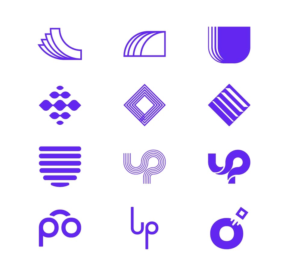
This project, I must admit, gave me a hard time right at this stage. Here you can see some early explorations of the logo. How to visualise keywords like connected, continuous, fast and smart in a unique way?
The design inspiration actually came from the name Uptempo, which is inspired by music…or the design of the score to be precise. The latter is a clear, reliable guide for musicians. Thanks to this simple tool, they can play in sync with the rest of the band.
This is also Uptempo’s mission – to offer reliable tools that guide marketers towards their goals, allowing them to work in sync with the rest of the company.
The new logo turns the dynamic shape of the U into a score that guides the diamond (note/marketer). Phew, that’s done.

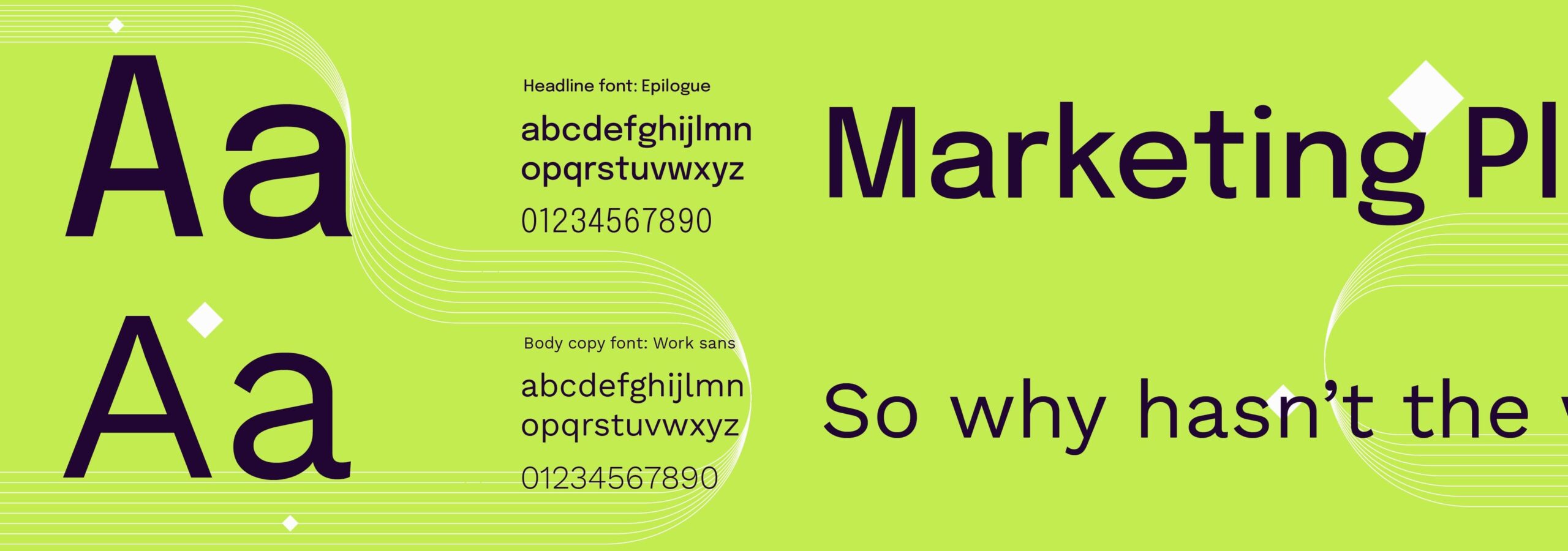
Epilogue and Work Sans fonts were chosen for their modern strokes, and for the flexibility they offer as variable fonts.
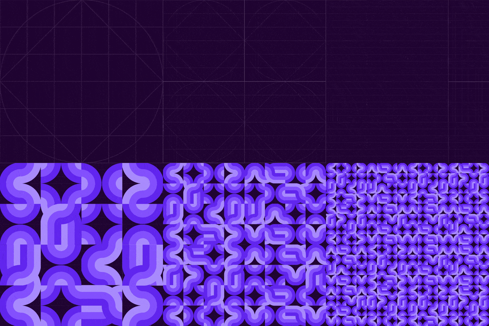
Now that things started to make sense, I wanted to test the rationale by creating a coherent visual system. The client was adamant – no illustrations nor icons were allowed. Thing is, they needed some sort of visuals other than photos, something that could be used by designers and non-designers. To be honest, I love these kinds of challenges, because they test not only my design skills but also my ability to future-proof my designs.
I came up with a modular pattern system, based on a simple grid. The latter offered the right flexibility to create multiple tile variations. Plus it’s really cool to animate!
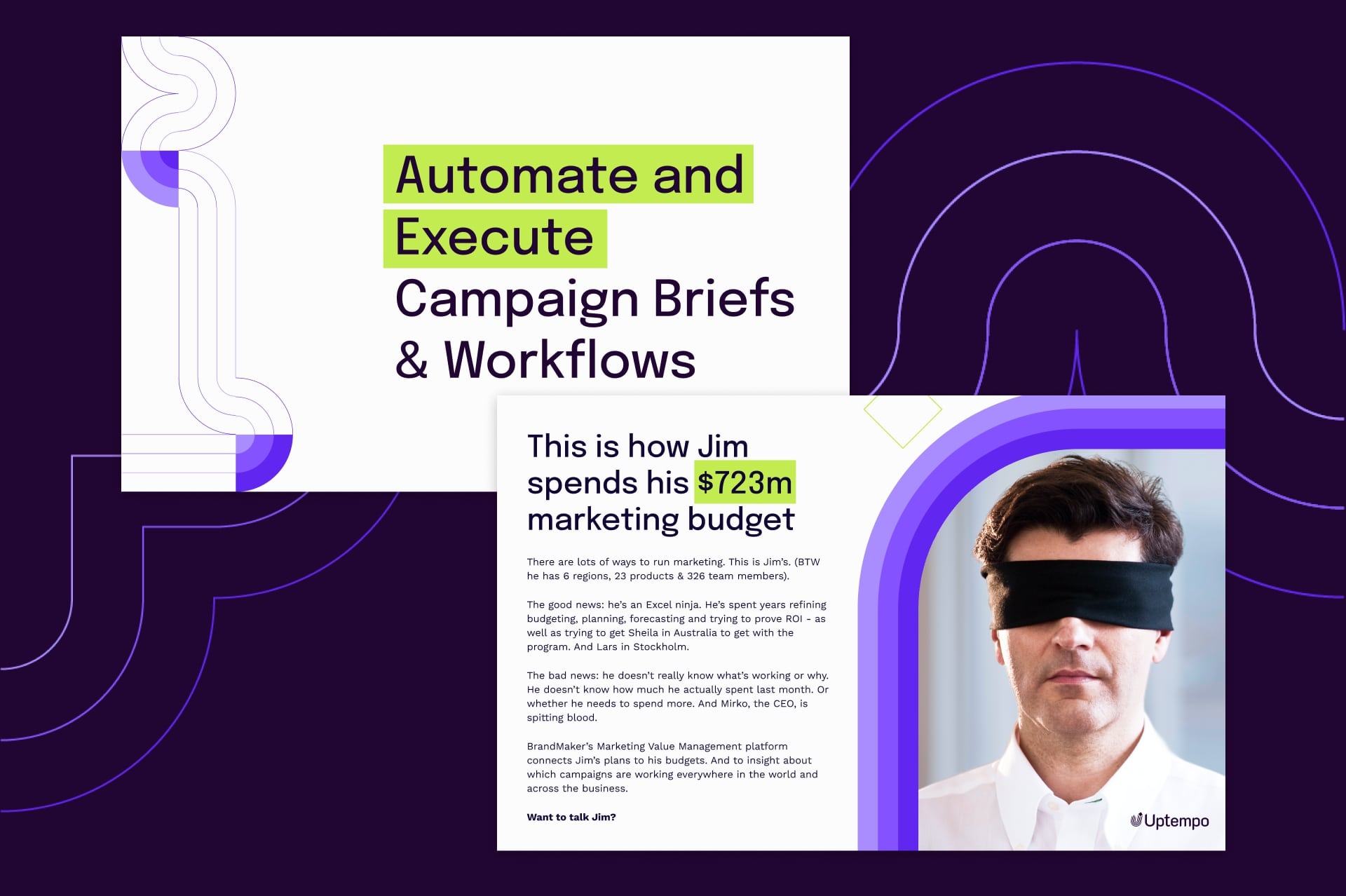
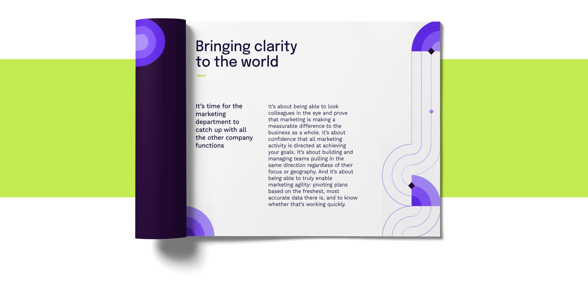
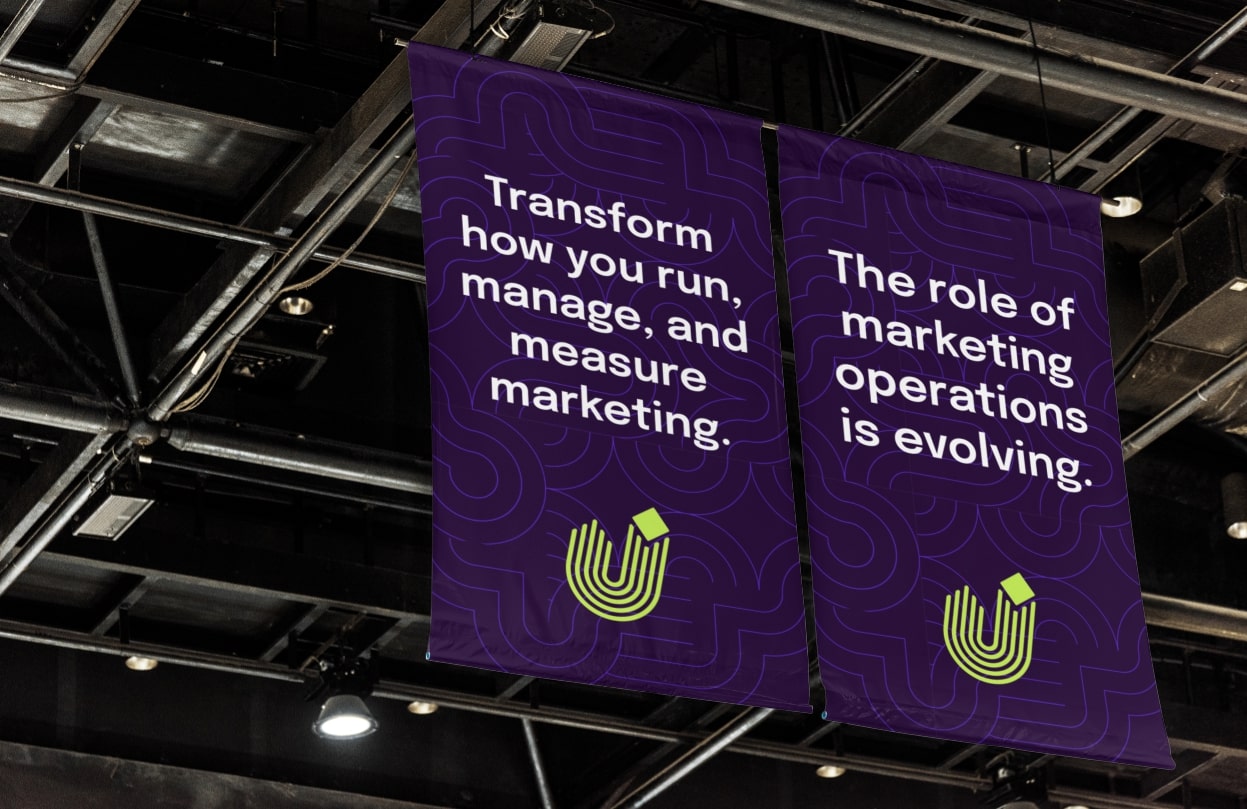
This simple design system adds a touch of uniqueness, without being too intrusive.
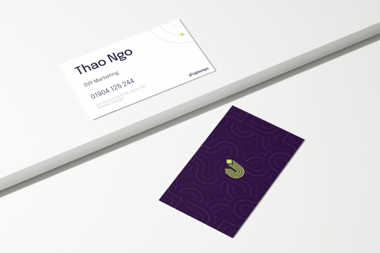
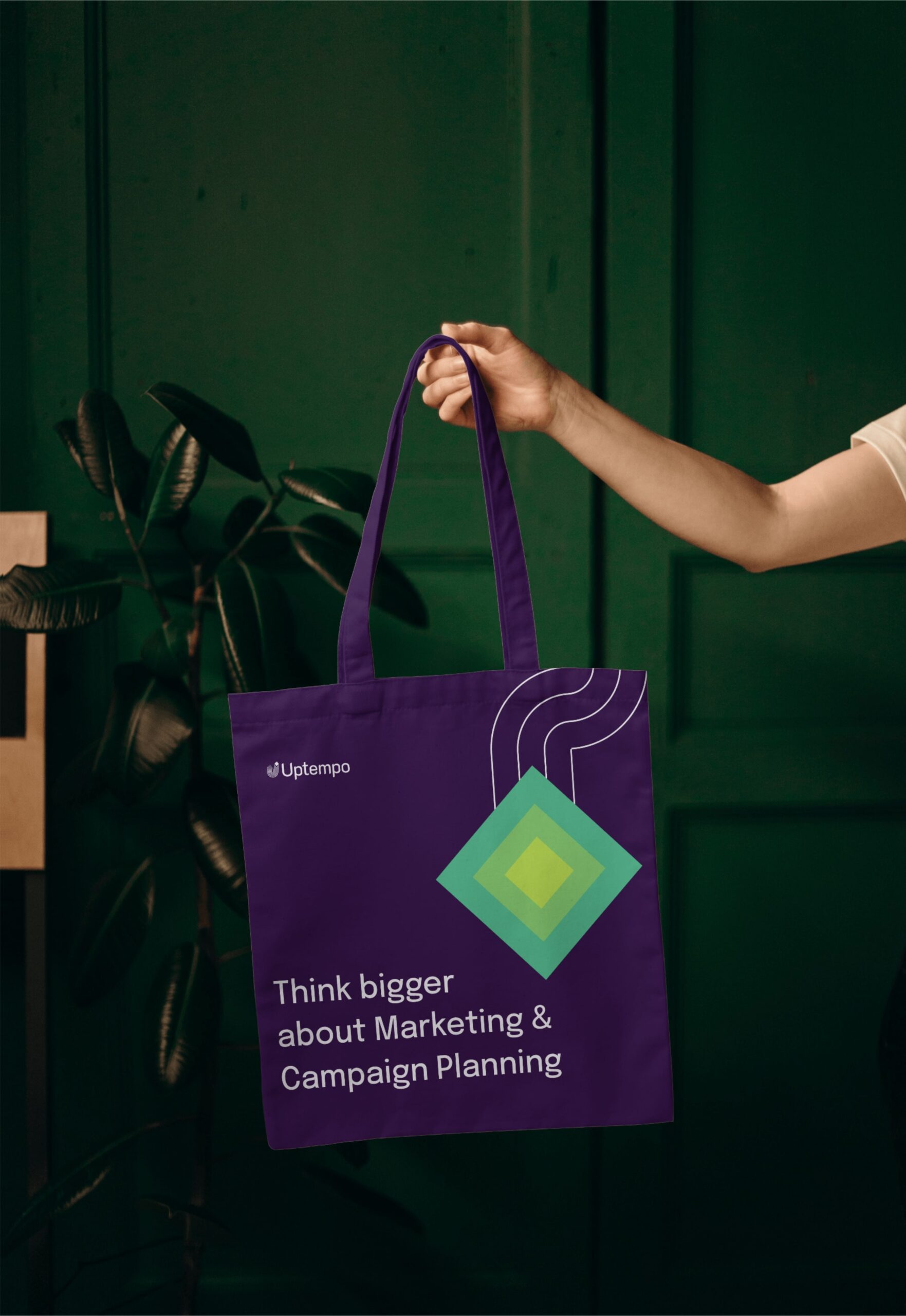
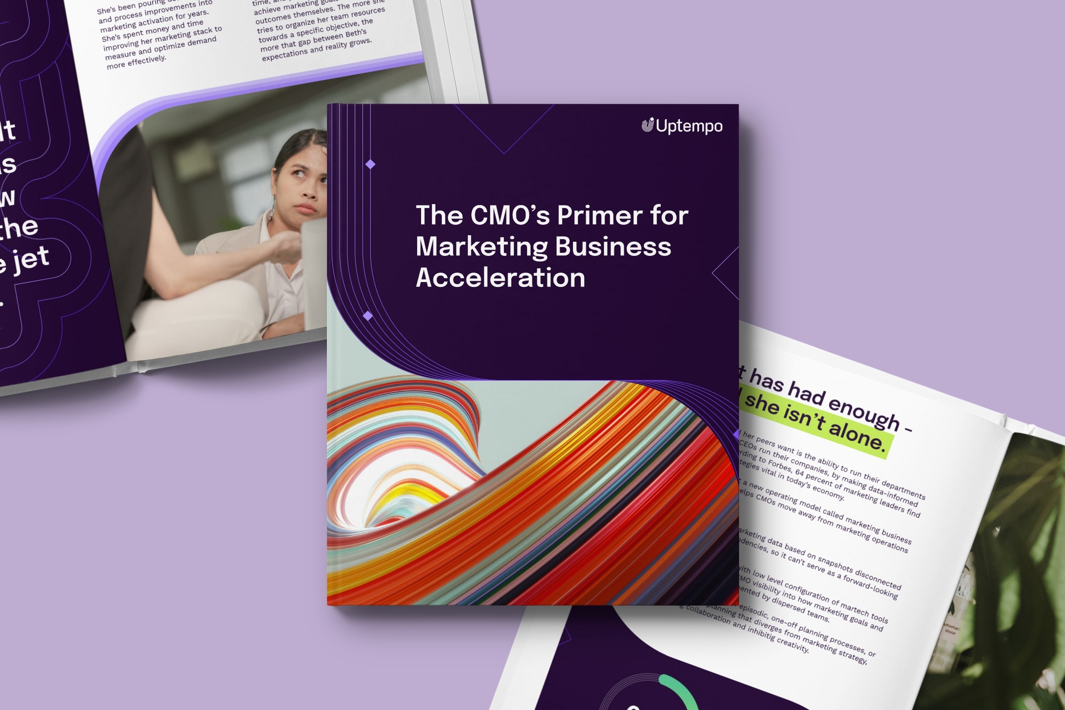
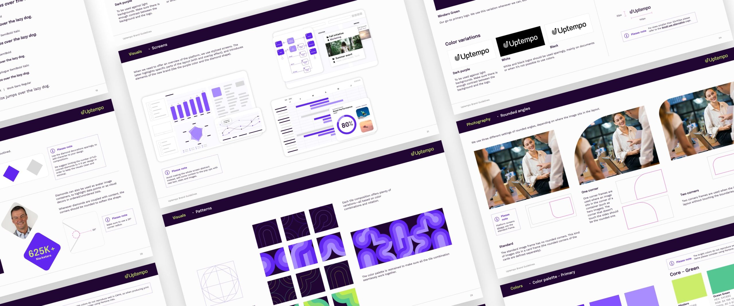
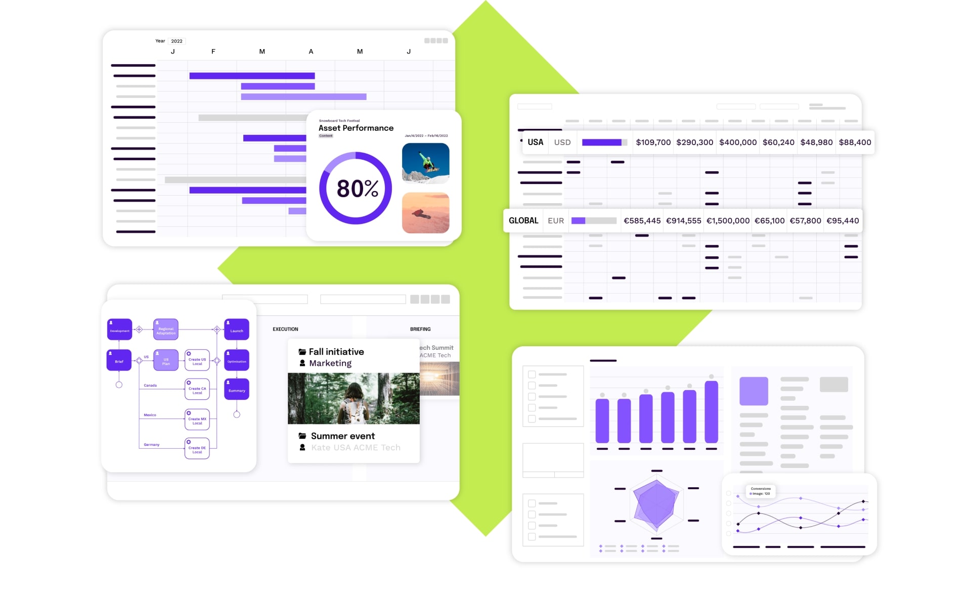
The vibrant colour palette has been fine-tuned so that it could also be used on platform screens. Shades of purple make charts and graphs stand out even more, without compromising the overall readability.
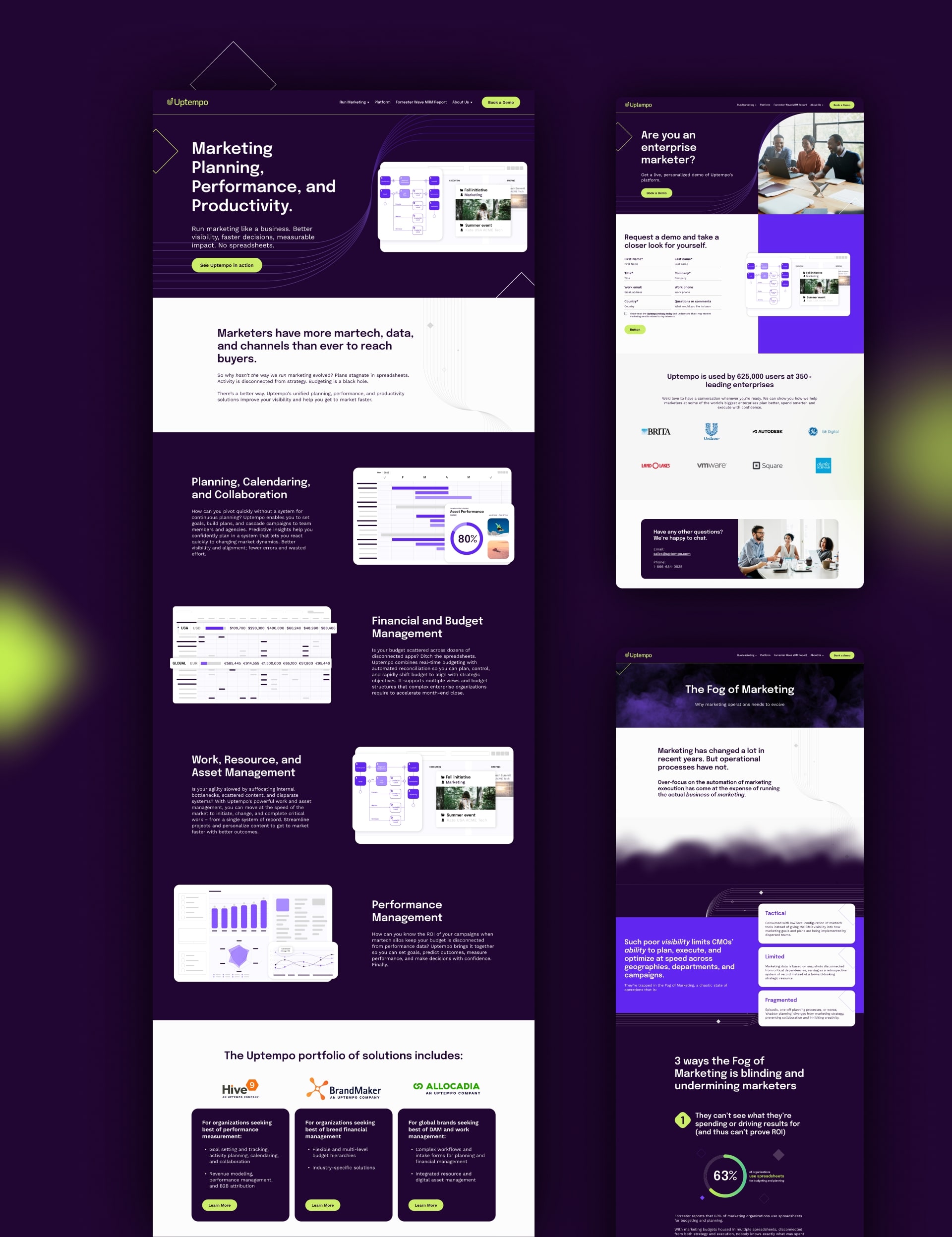
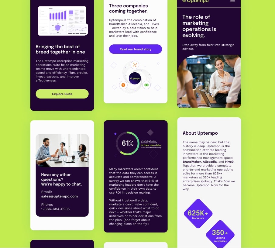
Light was unanimously considered the fastest thing in the universe. I say was because the team that designed Uptempo’s website (made up of myself and a dear digital design pal) was definitely faster. In fact, we managed to put a sitemap on paper, and create the wireframes and the page designs in record time. Like the pattern decors, we focused on creating reusable modules and comps, rather than standalone page designs.
Modularising the contents in the wireframe phase allowed us to speed up the creation of the designs and the baseplate (containing all the styles, components and modules for the developers). This approach also facilitated the work for developers, who didn’t have to create thousands of bespoke modules.
What does the customer think of all these modules?
