
Go Branding
Client — Go
Category — OTT Streaming
Project type — Branding, Web Design
Go is a fictional OTT streaming service entirely dedicated to the world of women sports.
The renowned branding agency Nomad Studio created the made-up brand and the brief for the Created Academy’s Visual Design Foundation course that I took.
The brief was to update the Go branding and app design and make it more appealing to the young female audience.


Nomad Studio provided the logo, the colours and the app interface that needed to be updated. As you can see, the logo was too generic and not really sporty. On the other hand, the contrasty colours worked well together, but they did not stand
out in the app interface. The latter featured too many colours that fight for the users’ attention.
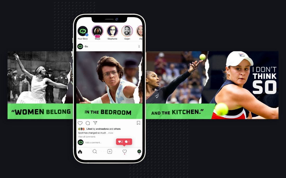
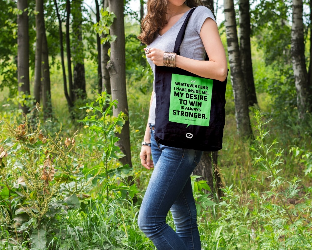
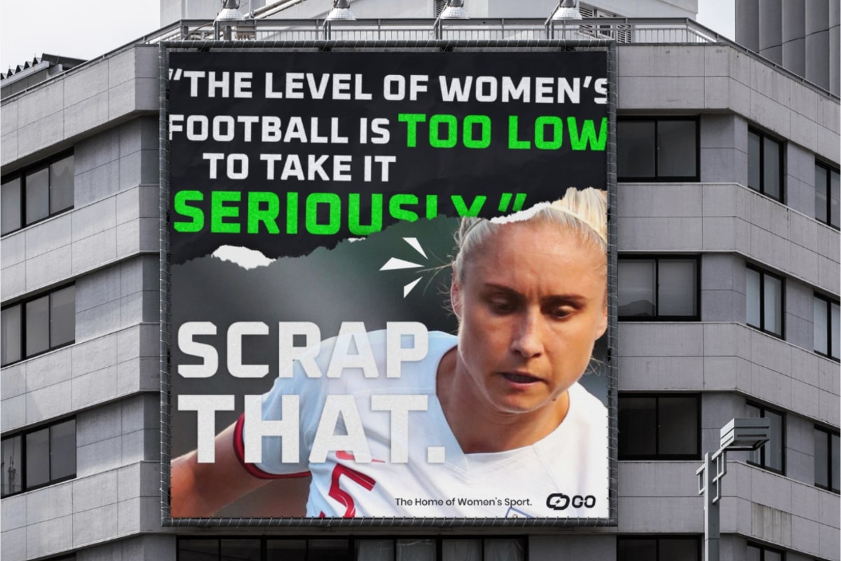
I wanted to challenge the preconceptions that women can’t play sports as well as men. The visual style symbolised the teared-up rulebook of sports, revealing the great female athletes that left a mark.
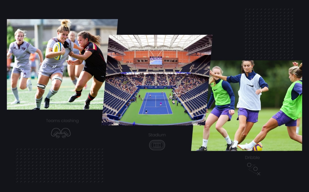
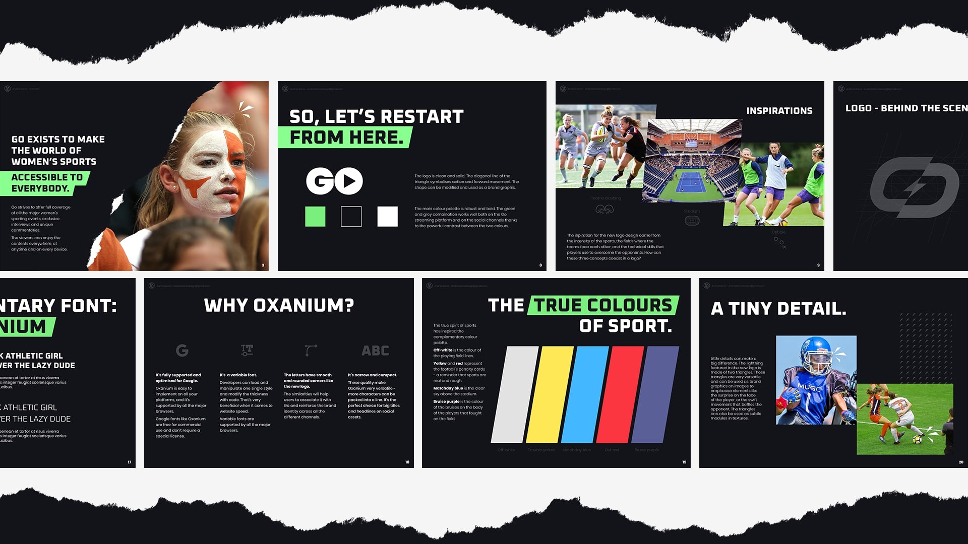
The inspiration for the logo came from the intensity of sports, the fields where the teams face each other, and the technical skills used to overcome the opponents.
![]()
The outer shape of the logo mark represents the stadium that hosts the matches. The lightning in the centre is the energy unleashed when the two teams face each other. The diagonal lines and the two colours symbolise the zig-zag motion of a footballer’s dribble.

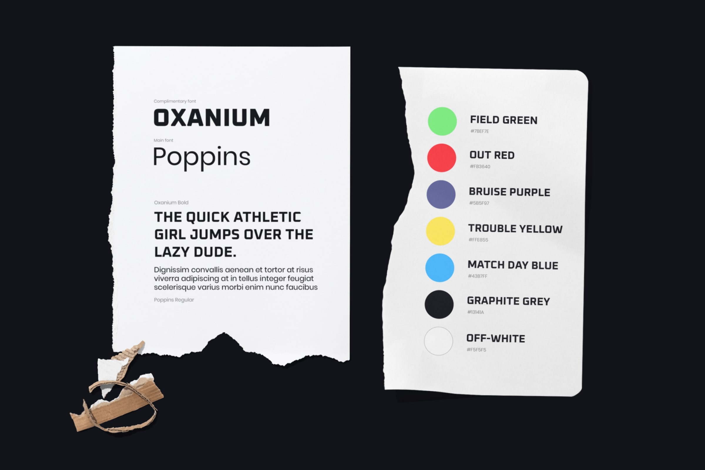
I chose Oxanium as a complementary font. The smooth and rounded corners remind the curved shapes of the new logo. It’s the perfect font for titles; it’s narrow and compact, so more characters can be packed into a line. Last but not least, Oxanium is a variable Google font – fully supported by all the major browsers and fast to load on the app.
The colours of the sport have inspired the complementary palette:
– Off-white is the colour of the playing field lines
– Yellow and Red represent the football penalty cards
– Blue is the clear sky above the stadium
– Purple is the colour of the bruises on the player’s body
All the rationale behind the new branding was detailed in the brand bible. The document also showed how the new branding elements applied to big and small collaterals.
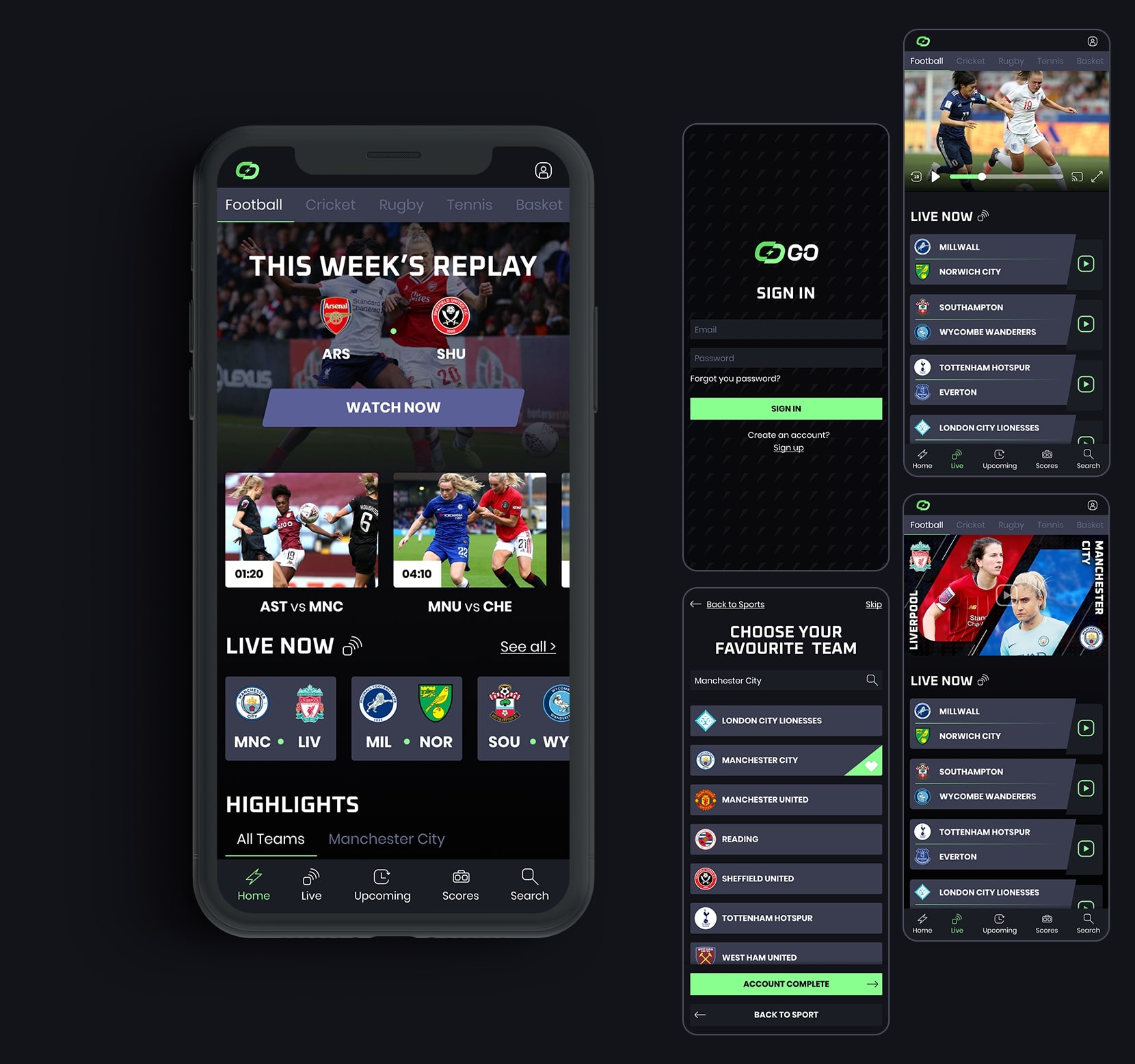
The app interface was the culmination of all I’ve learned during the course. The look of it reflected the rules I laid out in the brand bible to ensure a consistent user experience.
The structure of the app was planned from scratch, starting from user interviews. I used the info gathered from the interviews to create a brand new sitemap, the user personas, and the user flows. The sample below focuses on the user flow that takes the user from the signup screen to a live match streaming.
The teachers at Created Academy were so impressed by the app design, and decided to include it as a sample on the Visual Design Foundation Course page.