
FPV Branding
INFO
Client — FPV Category — Finance Project type — Branding, Web Design
FPV is the acronym for Founder Power Venture. As this solemn name suggests, they are a venture capital company focused on establishing long-lasting investment relationships. To make sure this happens, they only fund projects they’re genuinely passionate about and help companies grow gradually, no matter the time scale.
A company like this needed a brand identity with some oomph, and a website fit for its values. And I gladly took care of that.
Every proper brand project starts with a workshop with the client, where I begin to outline the design brief. During the workshop with FPV, helped me to identify:
– What was the purpose of the brand and overall goals
– By which keywords they felt represented
– Their tastes in design
The workshop brought to light the keywords that informed the design proposals: Reinvention, Cutting Edge, Expertise, Future and Partner.
![]()
![]()
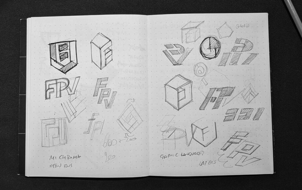
It was immediately clear that the client wanted a unique and meaningful logo.
“Andrea, who doesn’t want that?” I hear you saying.
Well, in this case, the client wanted a logo with a cool story – something that could grab someone’s attention with a wow effect, and reward those who are curious enough to examine the composition. I come up with this:
The outer layer – which at first glance is a 2d hexagon – suddenly becomes a see-through 3D cube, revealing its internal layers. These shapes are a simplified representation of the letters in the FPV acronym.
![]()
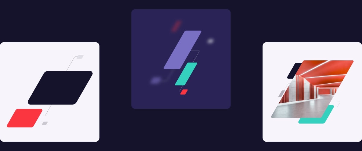
Now, don’t get me wrong. The hexagon is a beautiful shape, but a brand cannot live on hexagons alone. The visual language has been expanded by adding the oblique rectangular shape, inspired by the internal layers of the logo.
These interconnected shapes represent the bonds created between FPV and the projects they finance, but also the connections on the chipboard.
These small connections are essential to power all the technology we use every day, like FPV is essential to power ambitious ventures.

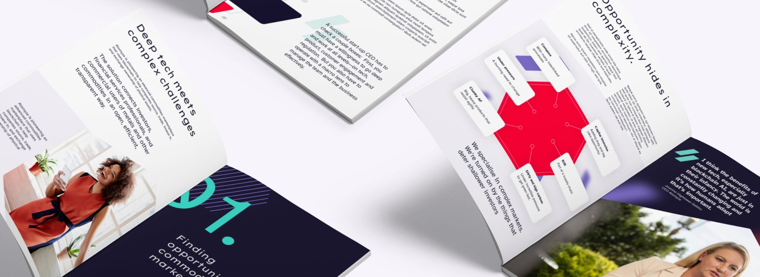
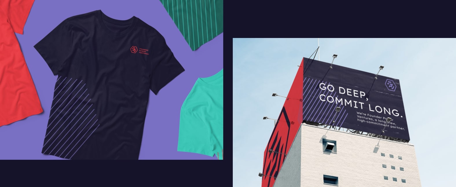
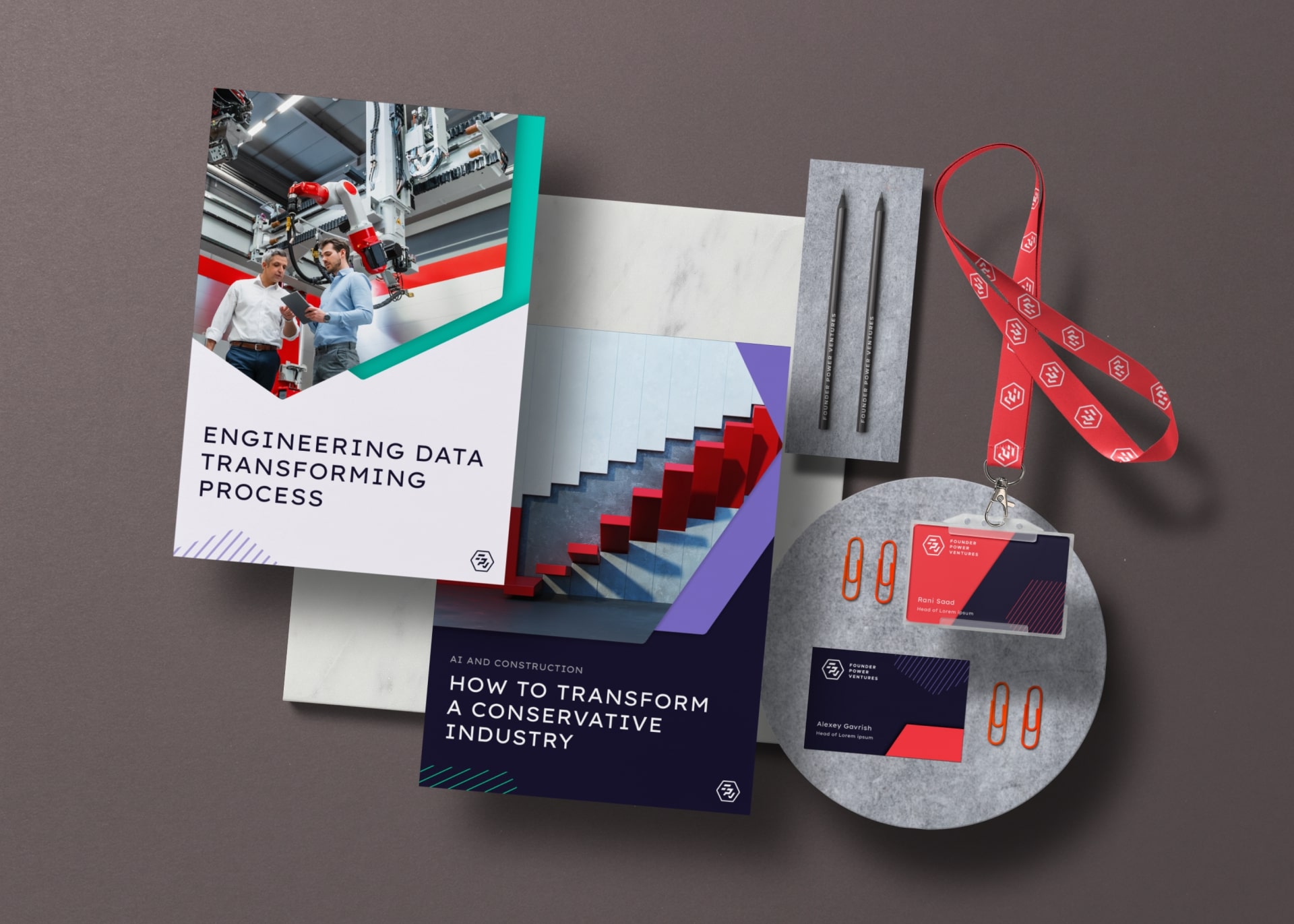
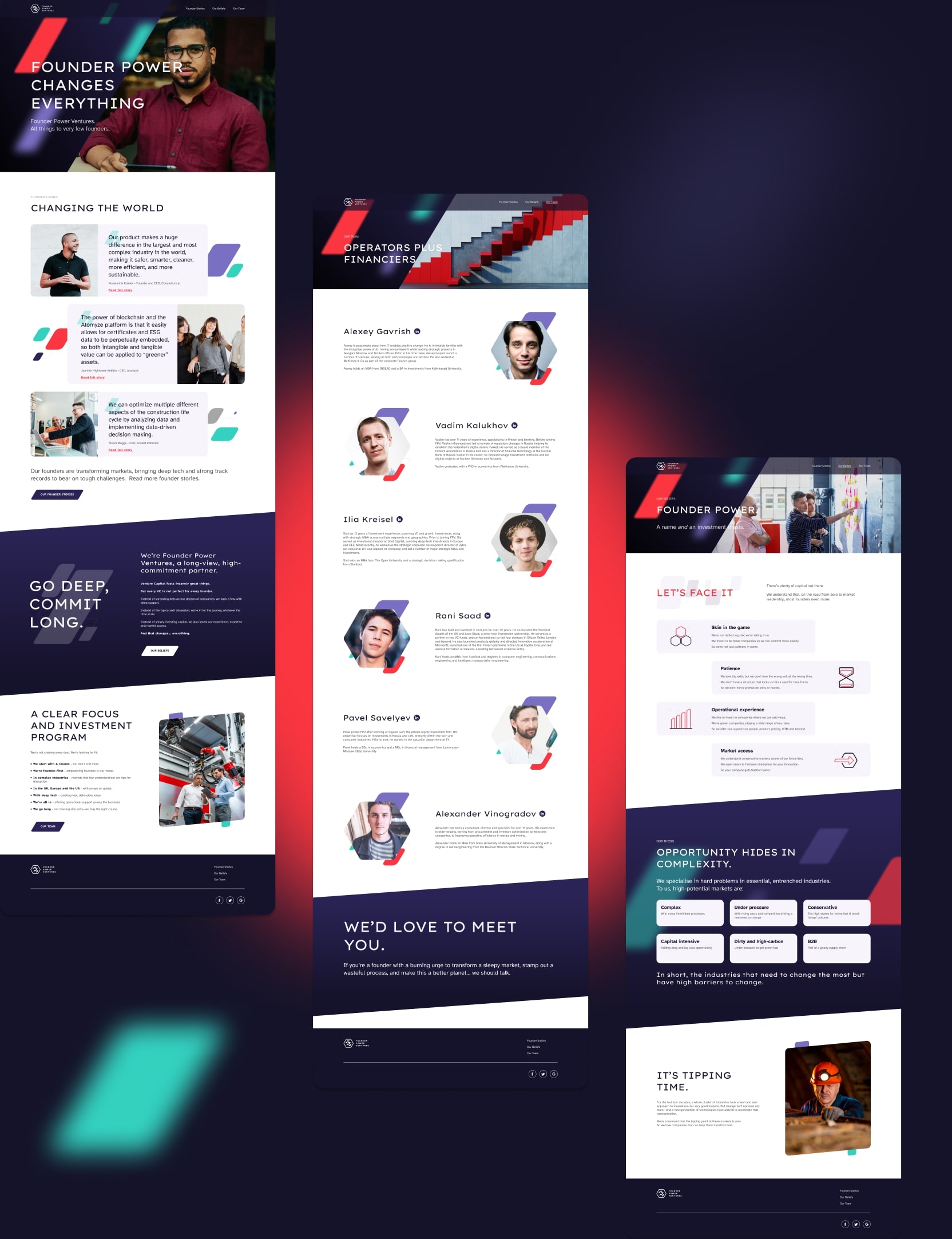
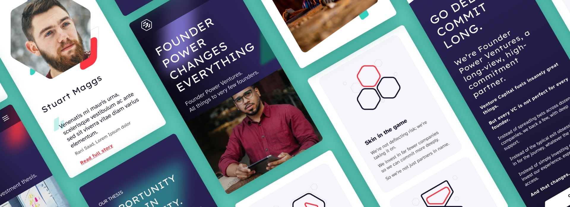
We put the new brand system to the test in various ways, but the ultimate challenge was to create FPV’s MVP website (pun not intended).
In the latter, all the elements (from the image masks to the icons) speak the same language, ensuring a seamless visual experience. Diagonal shapes inspired the CTAs that literally cut through the page and grab the user’s attention. Resisting the temptation to click that button has never been so difficult.
Of course, I speak well of the project, but what does the customer think about it? Below you can find the answer!