CID Branding
INFO
Client — CID
Category — Software production,
Finance
Project type — Branding, Web design, Illustration
CID is a German software production company with offices all around Europe. In recent years they have been busy creating their own Asset & Wealth management product (called Affinity) capable of providing a clear market view to investors. They felt that the brand had to be adapted to showcase their new breadth of services.
Now, CID has a special place in my heart. It was a pleasure to work with the stakeholders because they were very much in sync. In fact, they were so in sync that they share the same name: Alex. From the very first discovery workshop, the direction that the new brand had to take was very clear. The two Alexs favoured clean designs, free from unneeded distractions. They also wanted a bespoke illustration style that stood out from other stereotypical tech brands (especially their competitors).
In a world of Kraftwerk brands, CID wanted to be Bach.
Despite the promising start, the main challenge was still there:
How to make the two products (Bespoke Software Solutions and Asset & Wealth Management) visually different, but at the same time make them coexist in a single visual system?
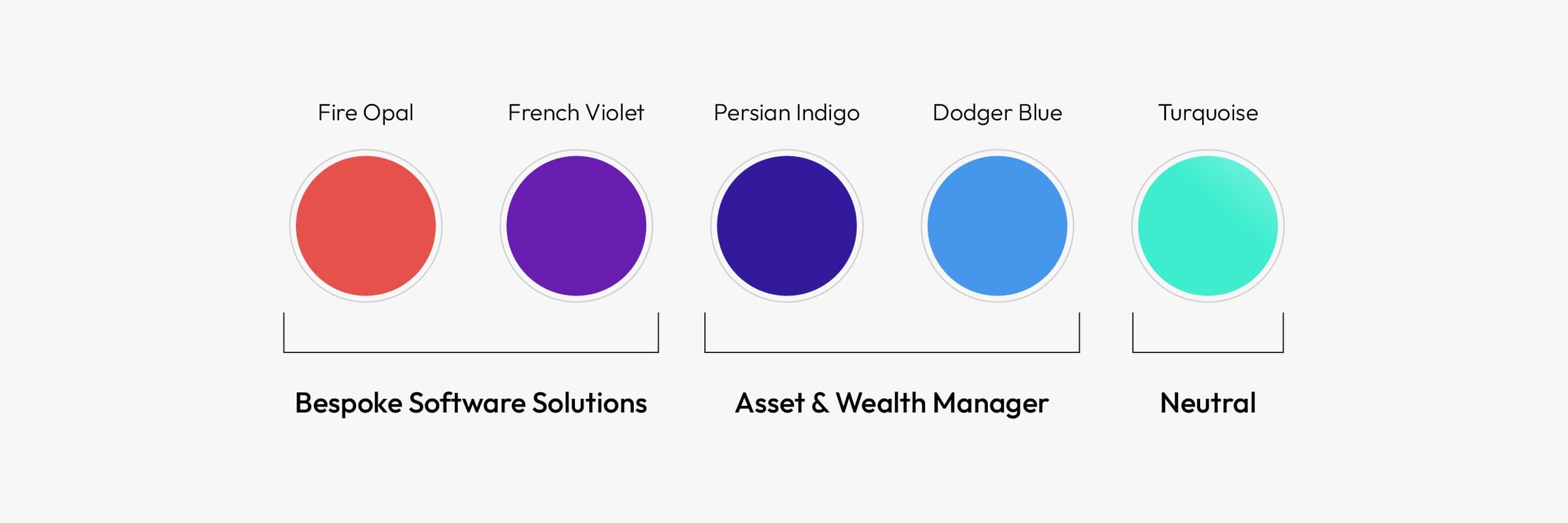
Instead of focusing on the visual assets, I decided to distinguish the two products using different colours. On the opposite sides of the palette sit red (representing the human touch/custom software) and blue (symbolising cold calculation/data management). Two purples act as a complementary bridge – violet on the red side, and indigo on the blue side. Turquoise completes the palette as a neutral colour. The latter has been picked to add a touch of lightness, freshness and warmth.

Given how important colours have become in this brand refresh, it seemed wise to leverage them even more by creating a series of complementary gradients. They’re the quintessential stone that kills two birds: they can be used as decorations and as a device to categorise content (red/violet gradient – Bespoke Software Solutions, blue/indigo Asset & Wealth Management).
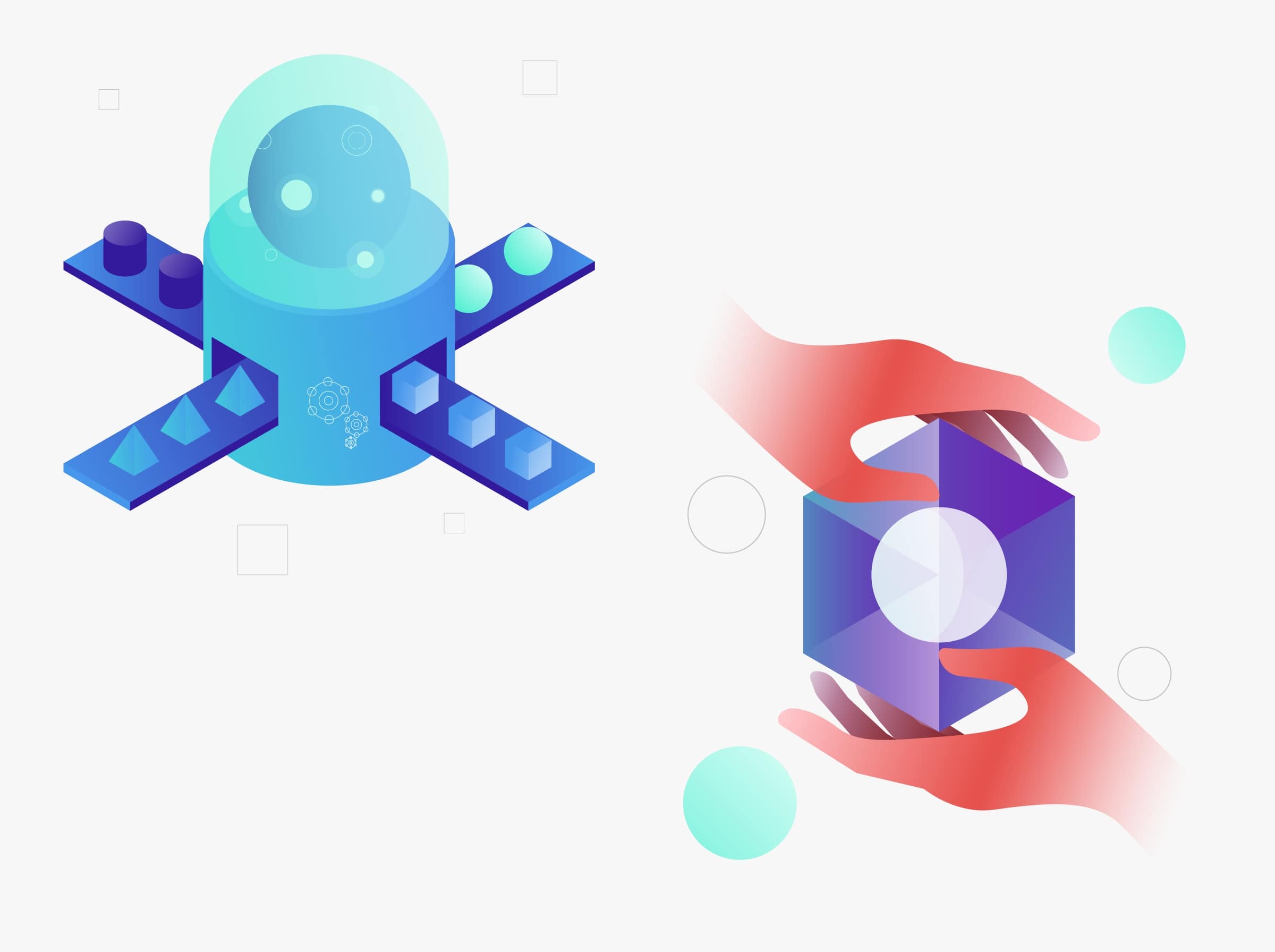
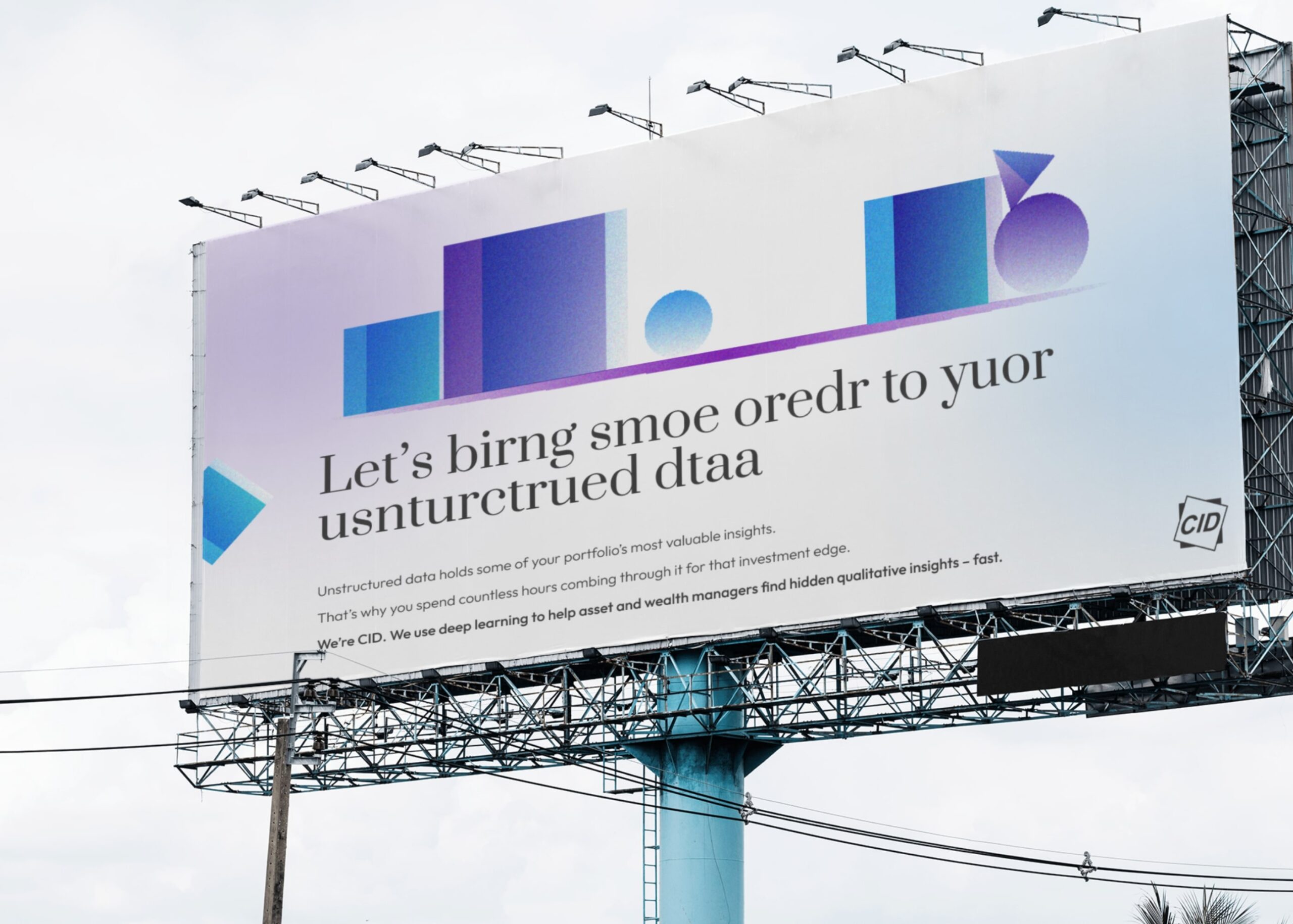
The colourful breakthrough also inspired the illustration library. The image on the left, created using blue and indigo tones, represents automated data management. The image on the right, warm and human, represents the personal touch behind the creation of bespoke software. There are more samples further down the page. But first, we have to talk about…
But first, we have to talk about…
…Fonts.
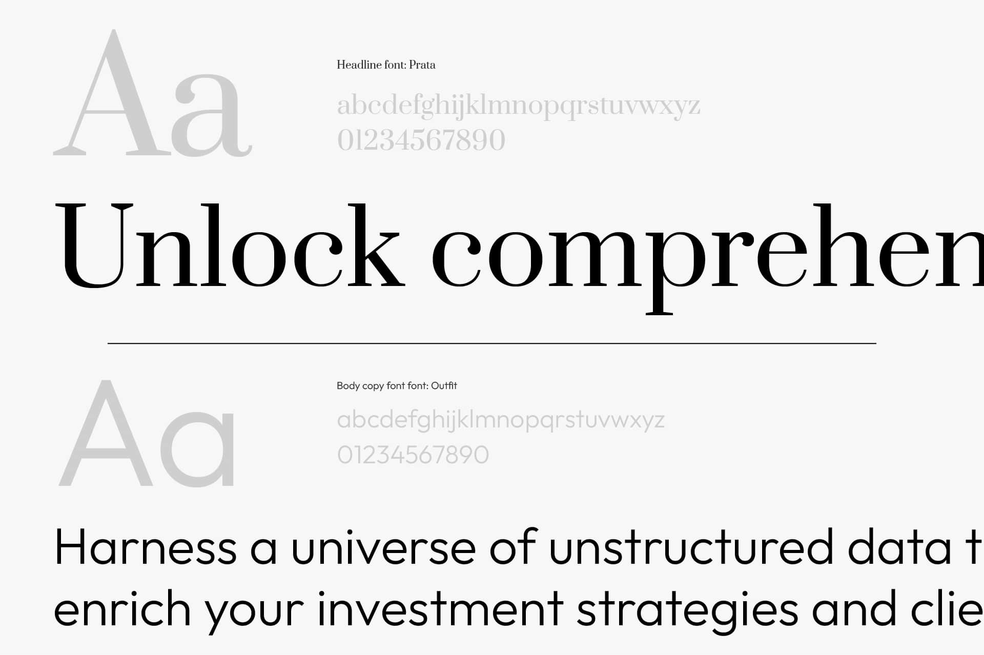
Specifically, why did I choose Prata and Outfits? As we said, CID is a German client with offices all around Europe. It was essential to find fonts that had all the glyphs needed to write in German, Ukrainian and Spanish. Furthermore, Prata is a font with a unique and elegant style and adds a touch of finesse to a brand that wants to be perceived as sophisticated and refined.
The illustrations’ style inspired the custom icon libraries. One is more elaborate (for large formats) and the other is more straightforward (for small formats). To make CID’s life even easier, the small icons are inspired by Google Material Symbols, which can be downloaded and used without getting a designer involved.
![]()
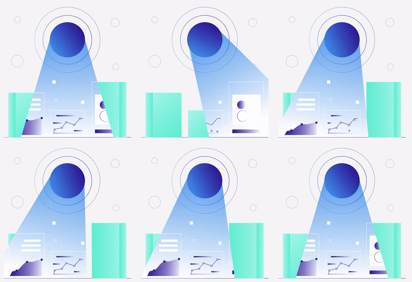
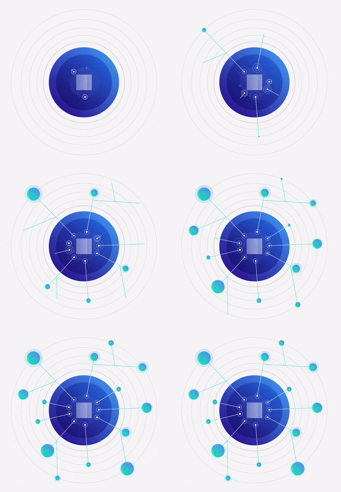
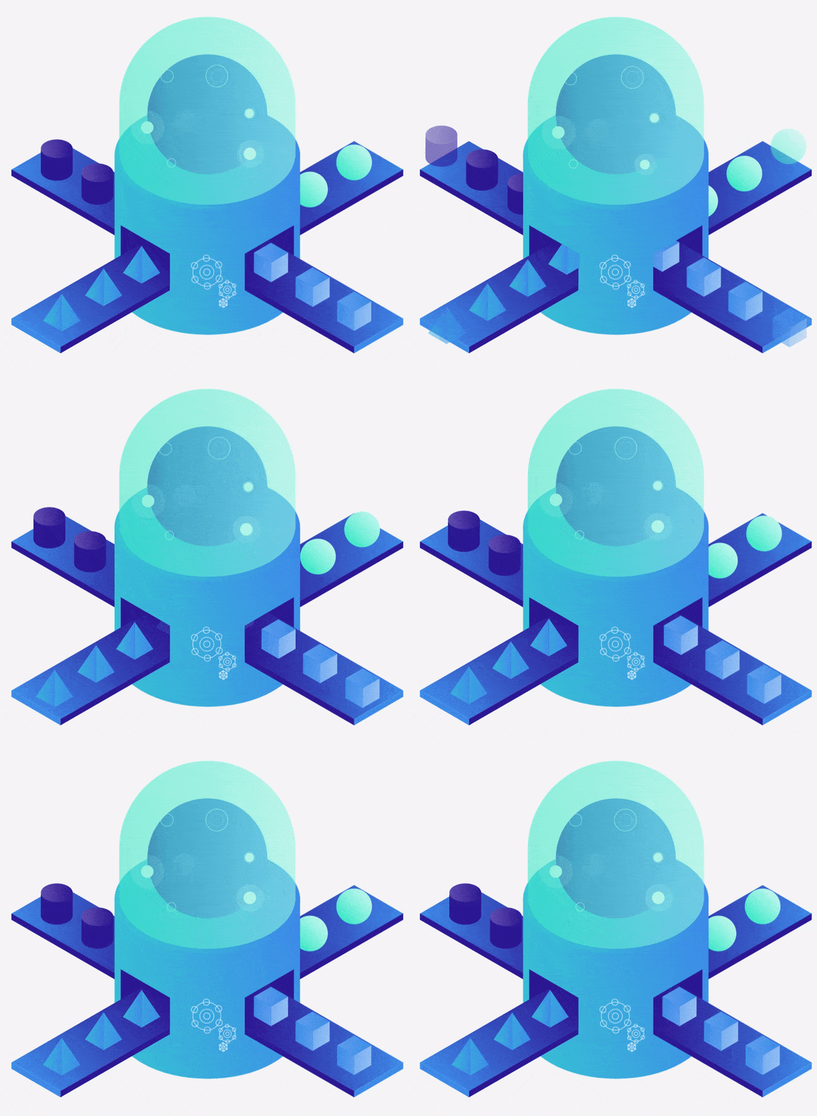
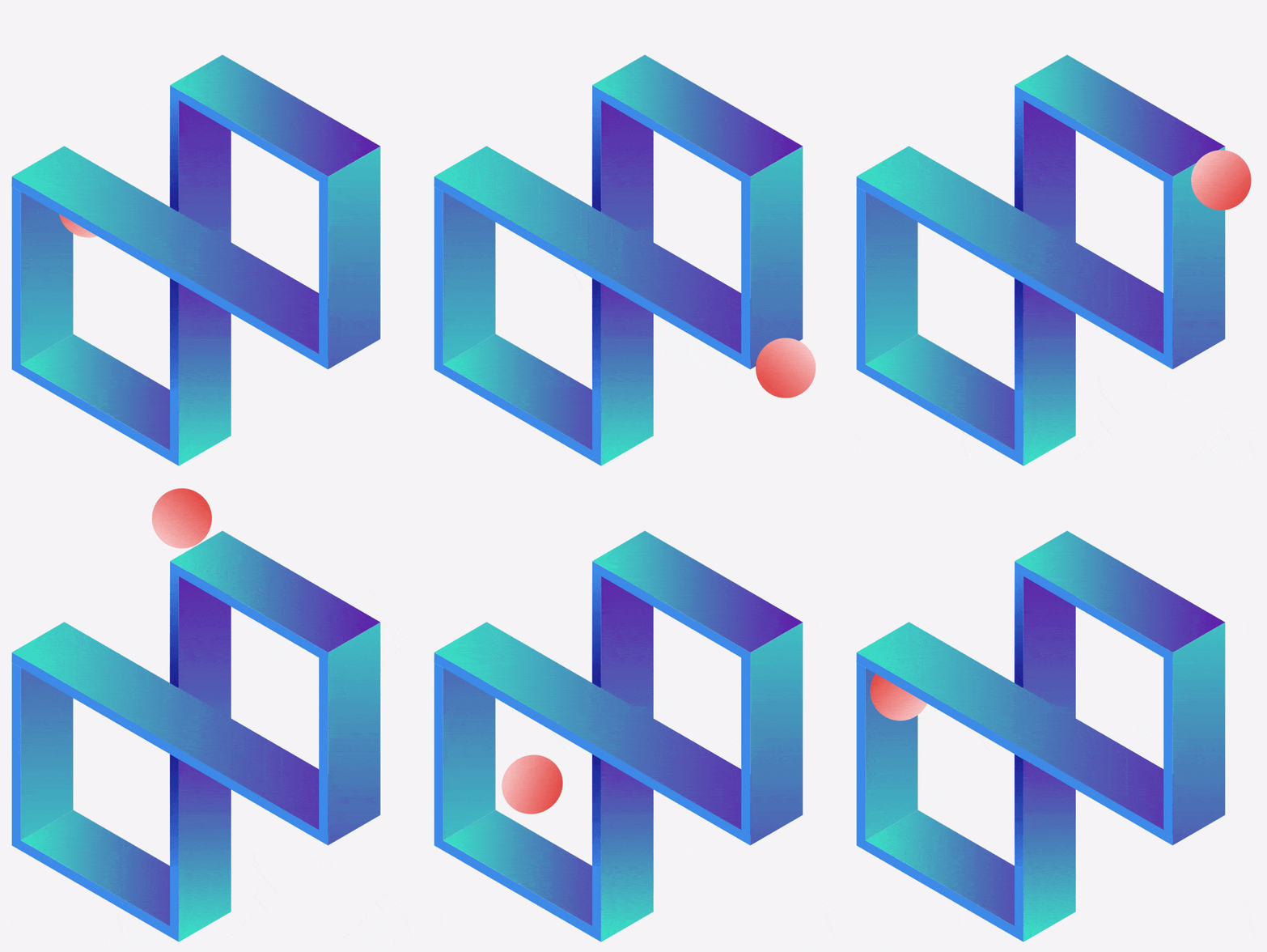

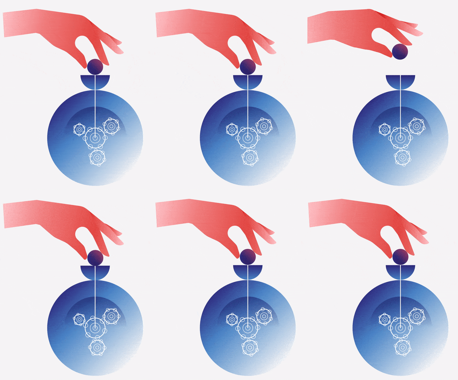
Remember the illustrations I showed you earlier? They’re now animated! Who’d have thought?
The client response was so positive that we decided to get the motion designers involved and animate these bad boys. I wore the art director hat and overlooked the animation production. This step gave me the opportunity to tweak some of the illustrations so they looked good as still images as well as animations…especially the hands!
Are they Lottie Animations? You bet.
Speaking of collaboration, let me show you the fruit of 8 sprints (scrum sprint, to be precise) carried out with the excellent team of Account managers, Project managers, Motion designers, Developers and…well, me. All that work on colours, illustrations and fonts culminated in the CID website.
Below you can see some of the pages.
The gradients in the heroes tell the user straight away if the page is about Bespoke Software Solutions or Asset & Wealth Management. Illustrations, photos and texts coexist harmoniously in generous white spaces free from distractions. I will go out on a limb and say that this website is as relaxing as a meditation session.
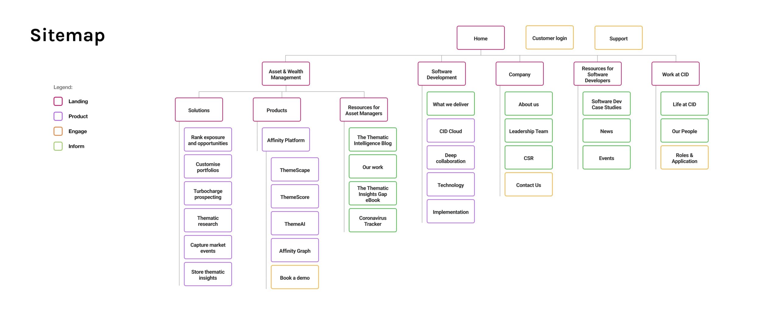
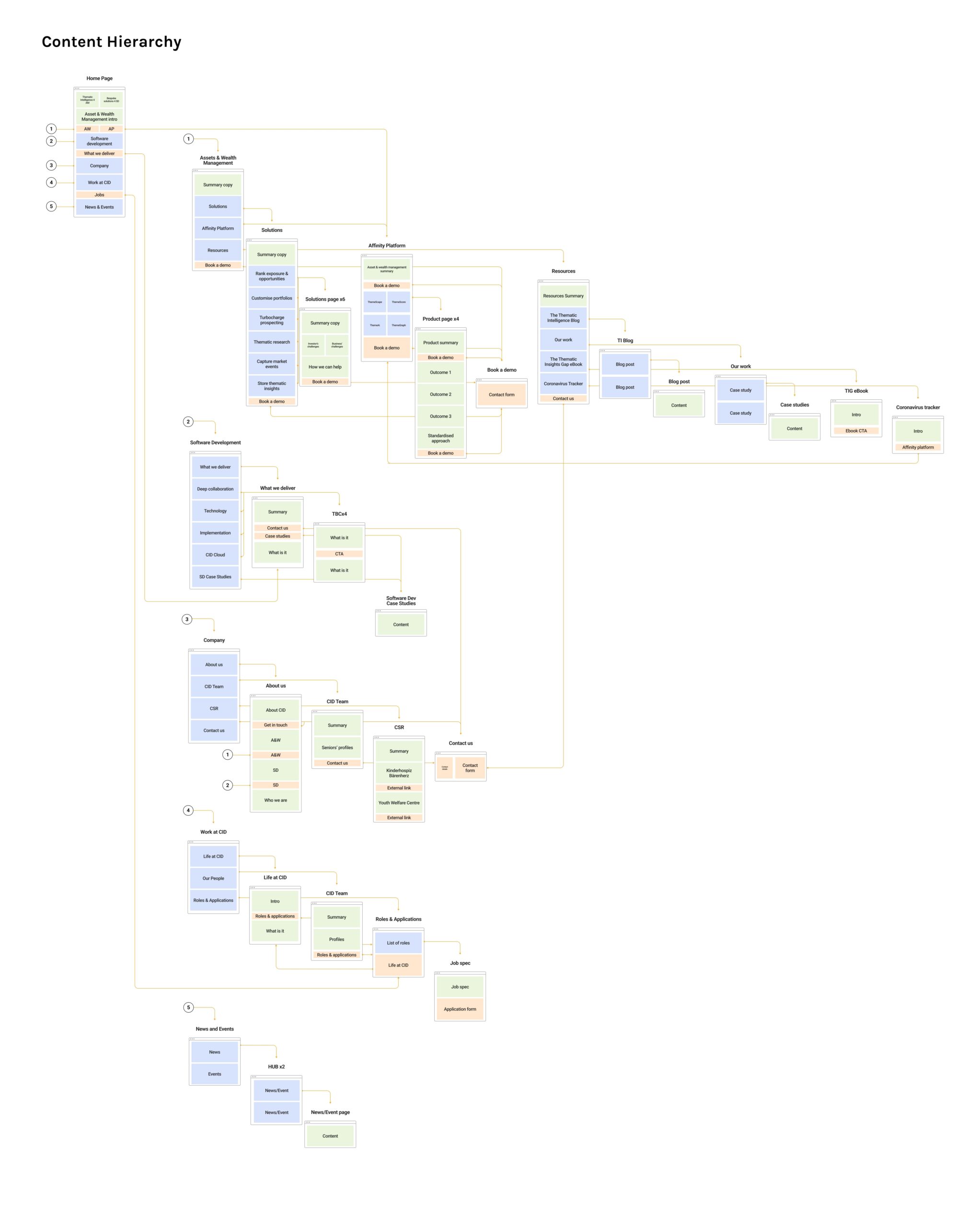
Here’s a sneak peek of the prep work I’ve done with our copywriters and developers. Sitemaps and Content hierarchy docs are essential tools that can help us detect any potential issues before we’re too deep into the process.
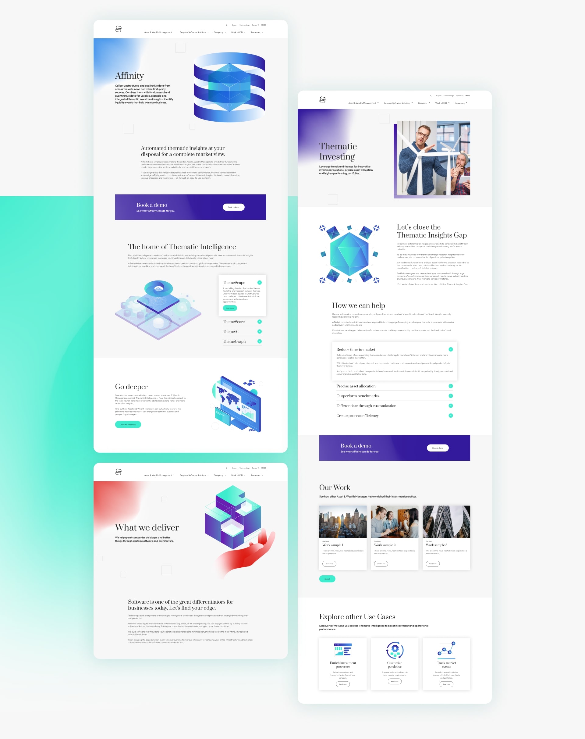
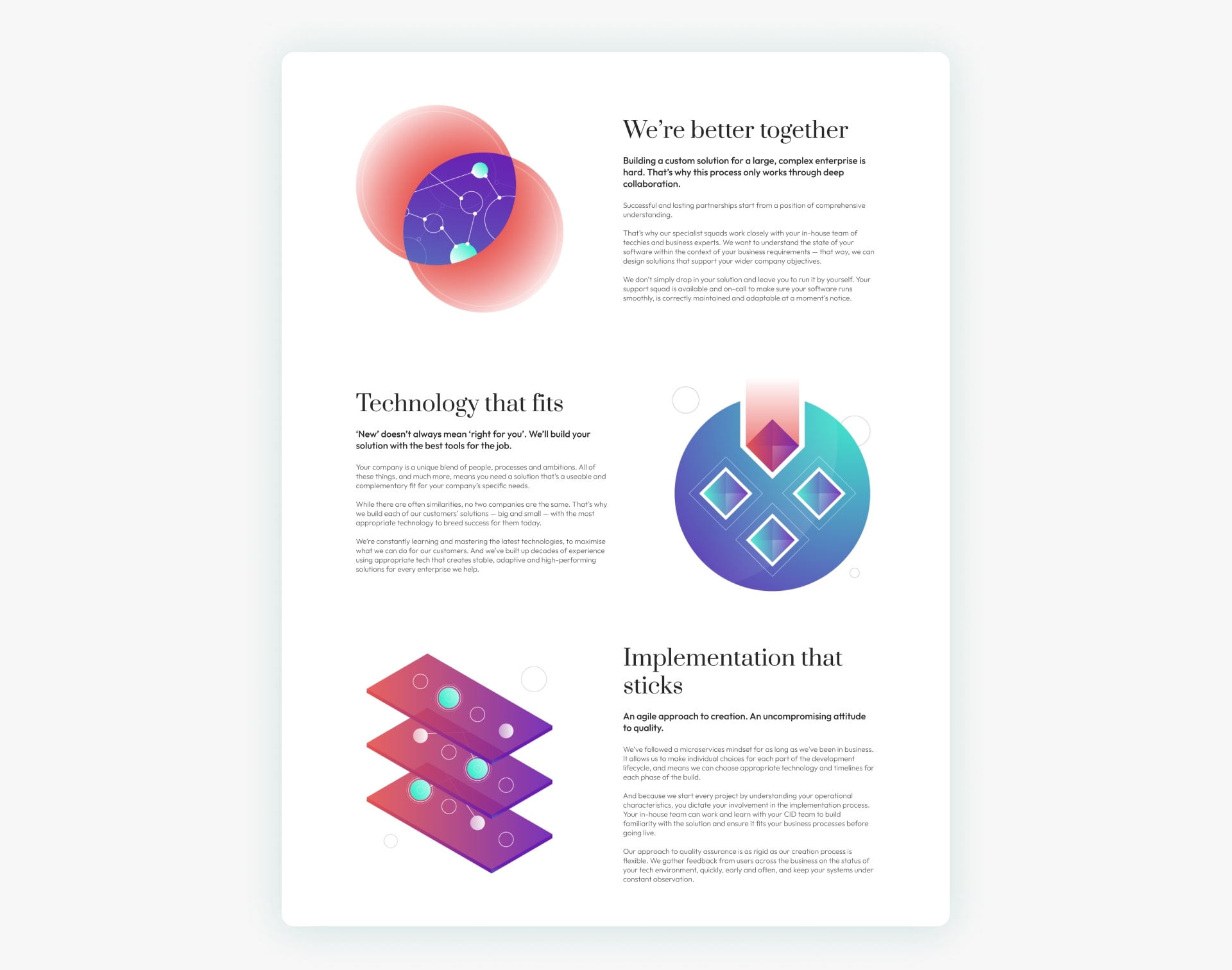
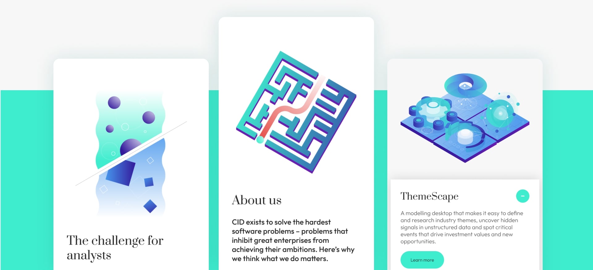
I hope the feeling of a brand that is calmly confident transpires from these visuals. What does the customer think?
“The design, the content, the functionality of the website are all on a completely new level now. This position CID as a serious, powerful player in our target markets.”
Last but certainly not least, here are some very promising initial results:
- Within 2 months of launching, the website got 20,000 visits.
- The ABM campaign that was launched on the back of the rebrand saw a reduction in cost per lead by more than 50%.
- Performances skyrocketed:
- Google Search performance went from 9% to 92% on mobile and from 73% to 99% on desktop;
- Accessibility up to 96% desktop, 95% mobile;
- Best practice is a heartwarming 100%

