
Insurance 4 Car Hire
Client — Insurance 4 Car Hire
Category — Car Insurance
Project type — Web Design
Insurance 4 Car Hire is a company that offers car excess insurance and peace of mind to their clients. They noticed the users were having issues navigating the website and finding the right product, and they wanted to fix that.
In the first part of the project I collaborated with the analytics team and the UX designer. The aim was to identify the specific website’s performance issues and come up with clear solutions.
We noticed that other insurance companies (like LV and Admiral) were light years away in terms of information architecture. And that made a huge difference for their target audience: adventurous people in their 20-40s, keen to travel and explore other countries.
Our UX designer identified that the latter were tech savvy and had no desire to get lost in the maze of an overcomplicated website.
And how can we blame them? As soon as they landed on the homepage, users were welcomed with a wall of copy (and some very specific insurance lingo). The variety of colours and the tight layout made the experience even more difficult.
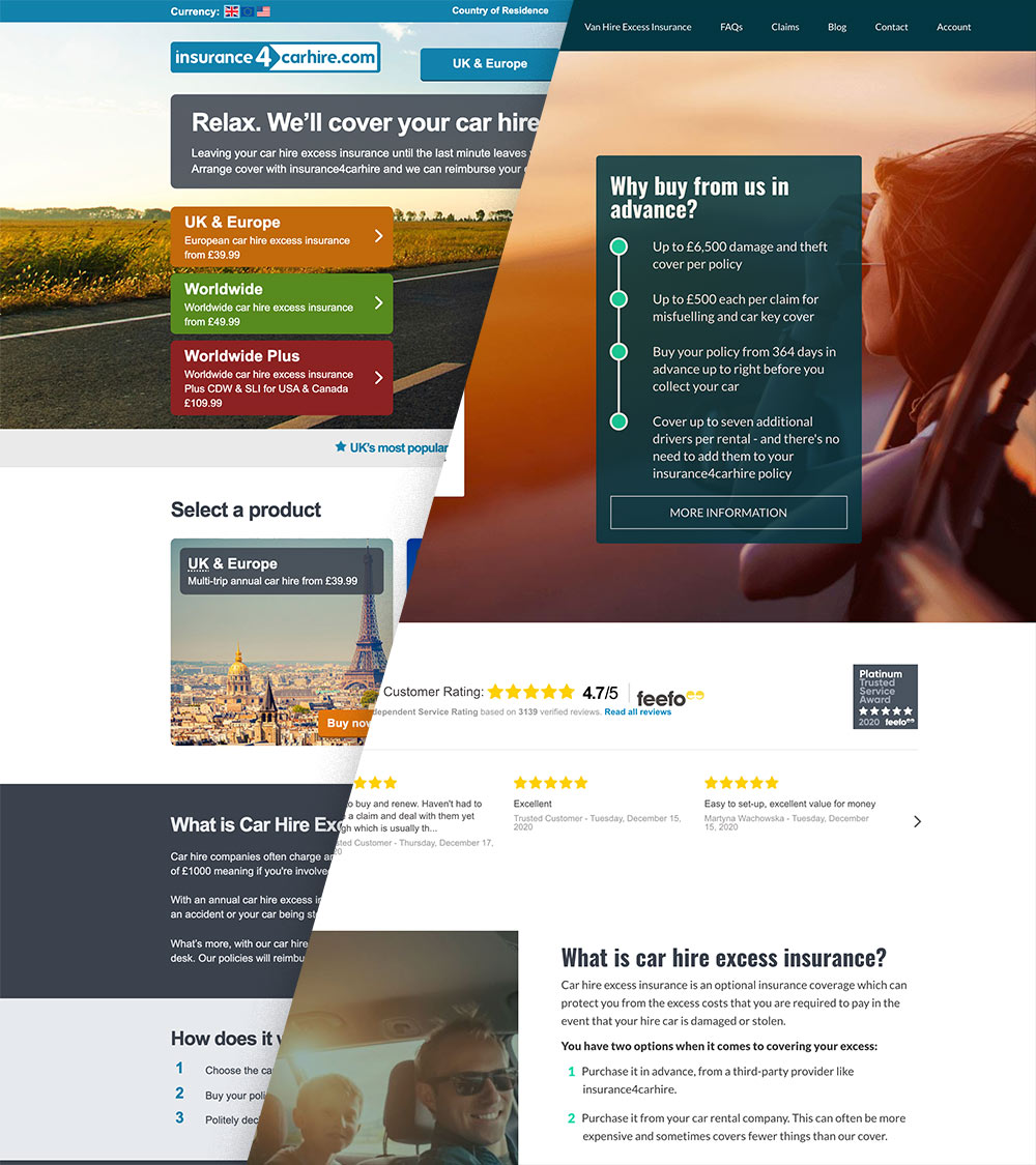
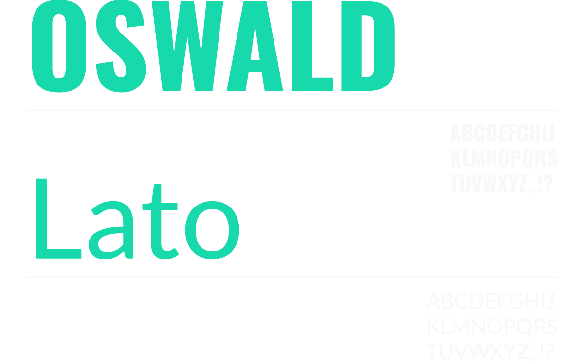
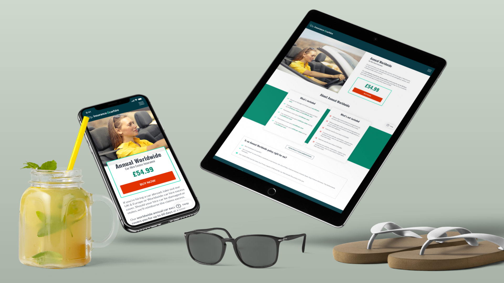
Based on our findings, I produced a new style guide with a vibrant colour palette and two user-friendly fonts.
The fonts Oswald and Lato – both Google Fonts – were chosen for their good readability and their fast loading time.
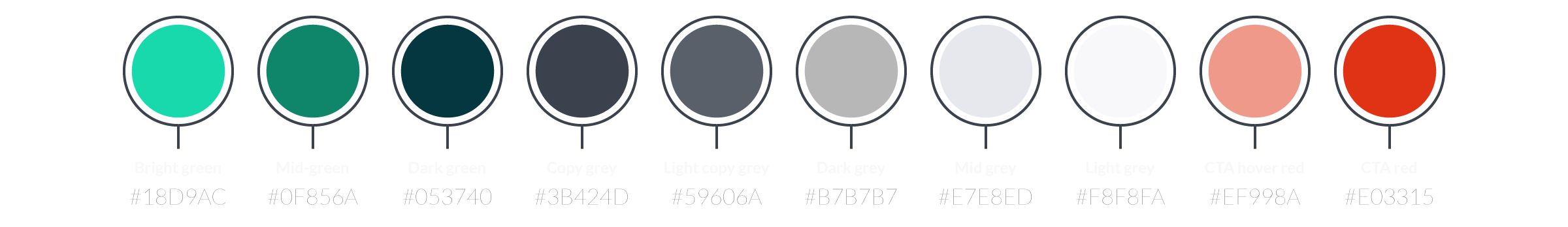
The new colour palette was created in order to:
– Offer more contrast
– Stand out from other companies
– Be easy to maintain and use
The shades of green, inspired by nature and the spirit of exploration, offer a great contrast to the bright colours of the buttons.
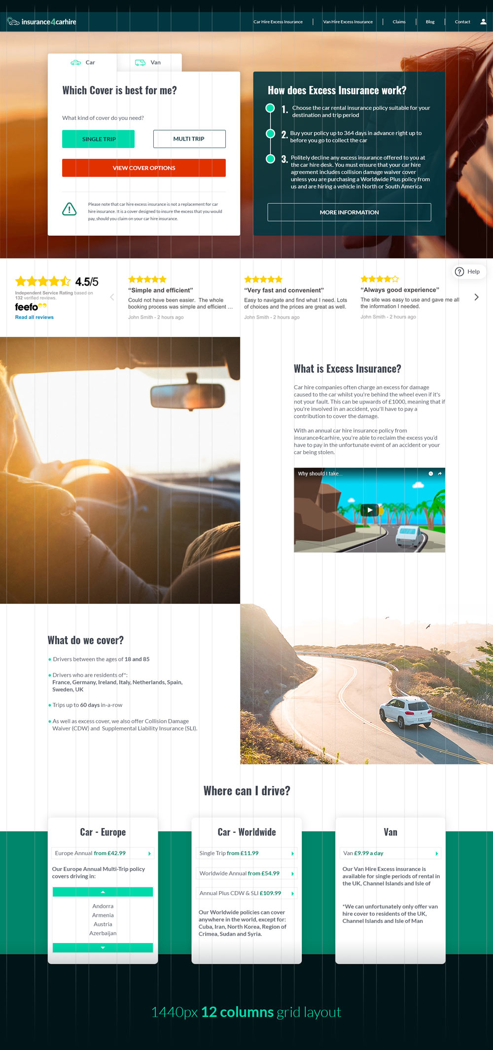
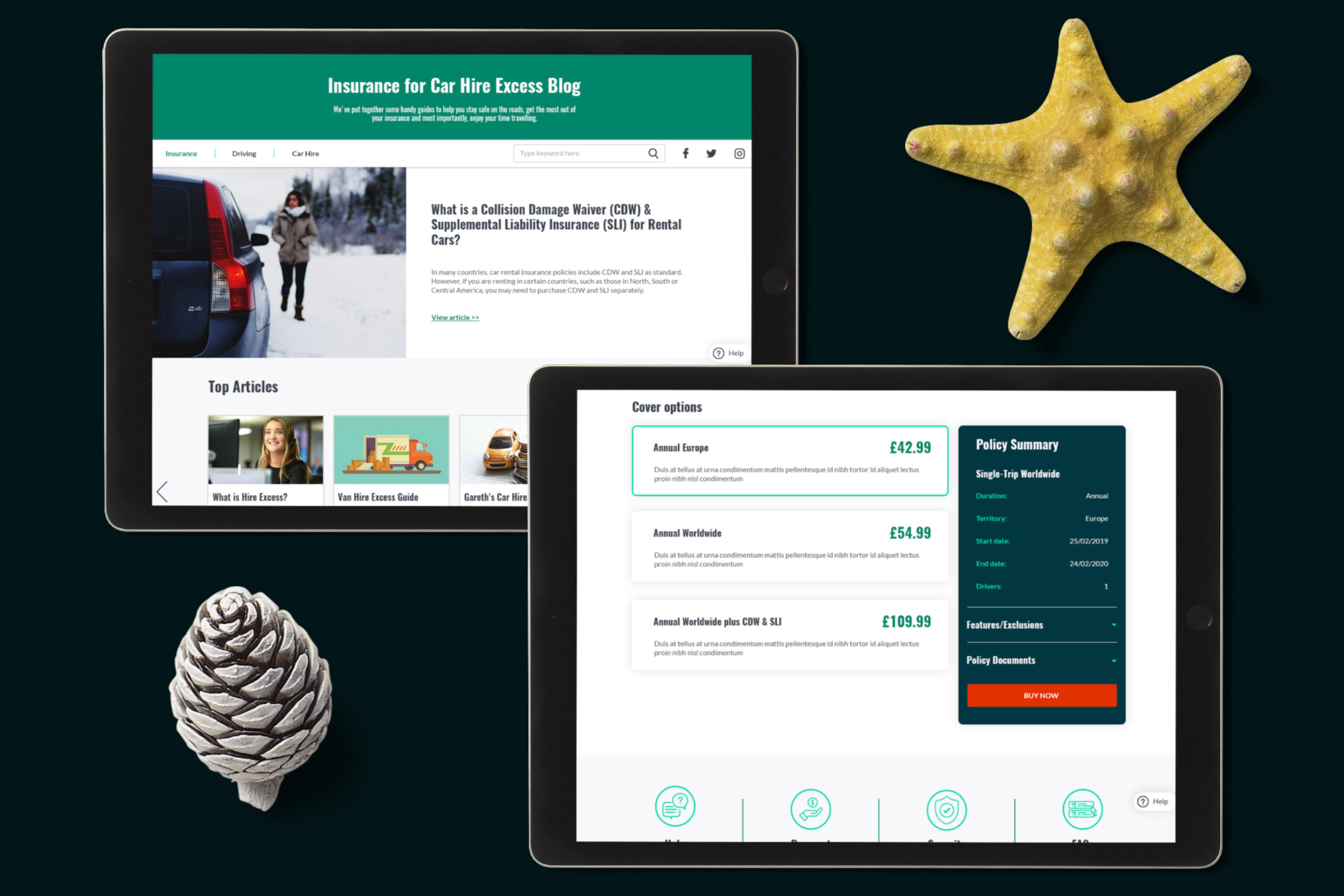
The new sleek website design was the result of the collaboration between myself, the UX designer, copywriter and the dev team. Together we worked on:
– Sitemap
– Information architecture
– User flow
– Wireframes
Throughout the process the client played a key role by ensuring that the contents were clear and represented the services in the best possible way.
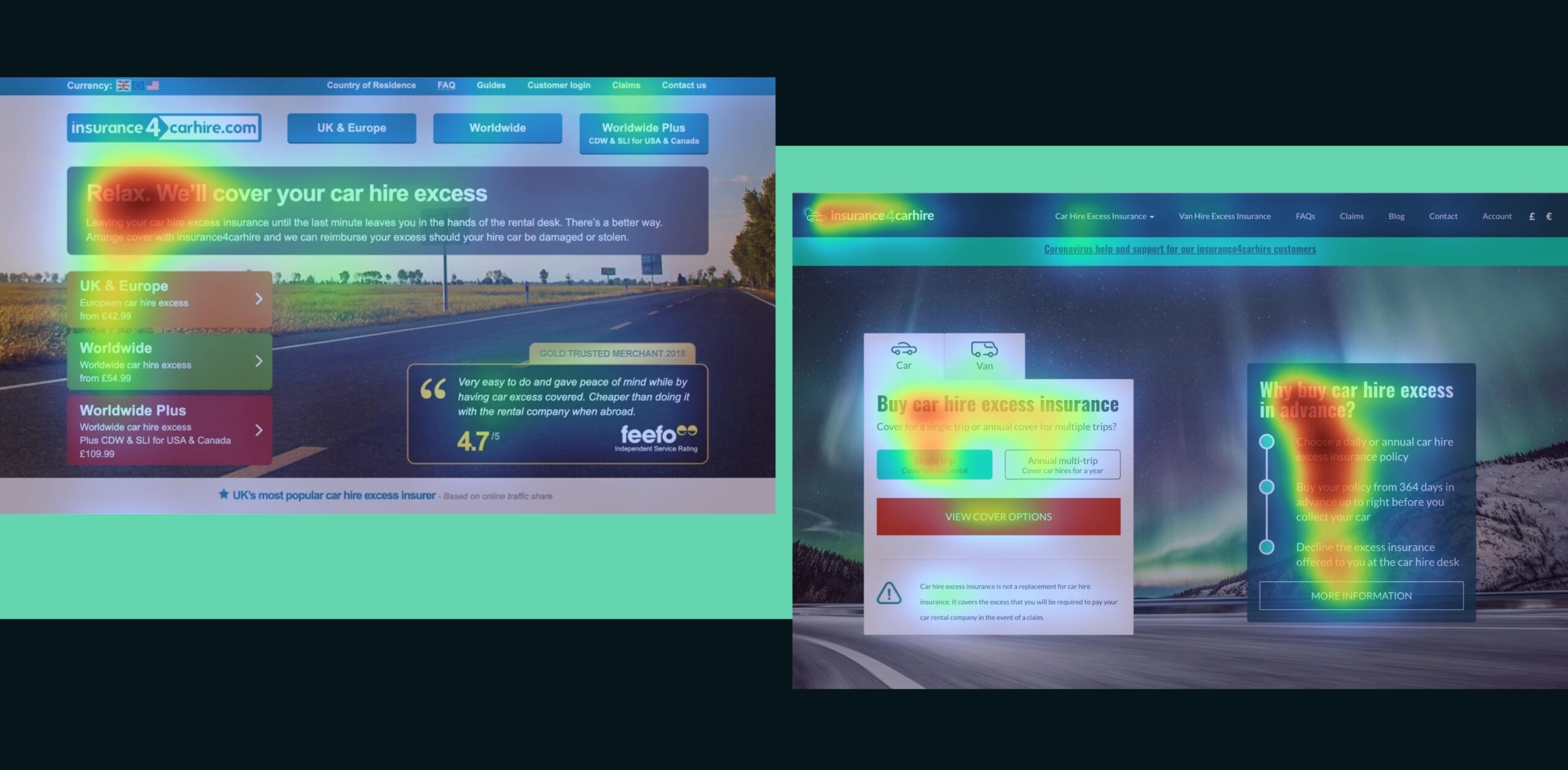
These heat maps show you the difference in focus from the original hero and the one we created. Impressive, isn’t it?
The client was extremely happy with the final result. The new website looked fresh and bright thanks to the updated fonts and the new palette. The new solid website structure delivered a consistent experience through the website.