Builtvisible Brand Refresh
Client — Builtvisible
Category — SEO, Content, Analytics
Project type — Web Design, Branding, Art Direction
Builtvisible is an award-winning digital marketing agency specialised in SEO, content and analytics. I joined the company in 2015, right in the middle of a massive rebrand. Five years later, I was in charge of updating the brand I helped to create.
Builtvisible evolved in the last 5 years and the services it offers grew as well. A brand refresh was indeed necessary. Not a simple lick of paint, but a targeted renovation of the brand’s look.
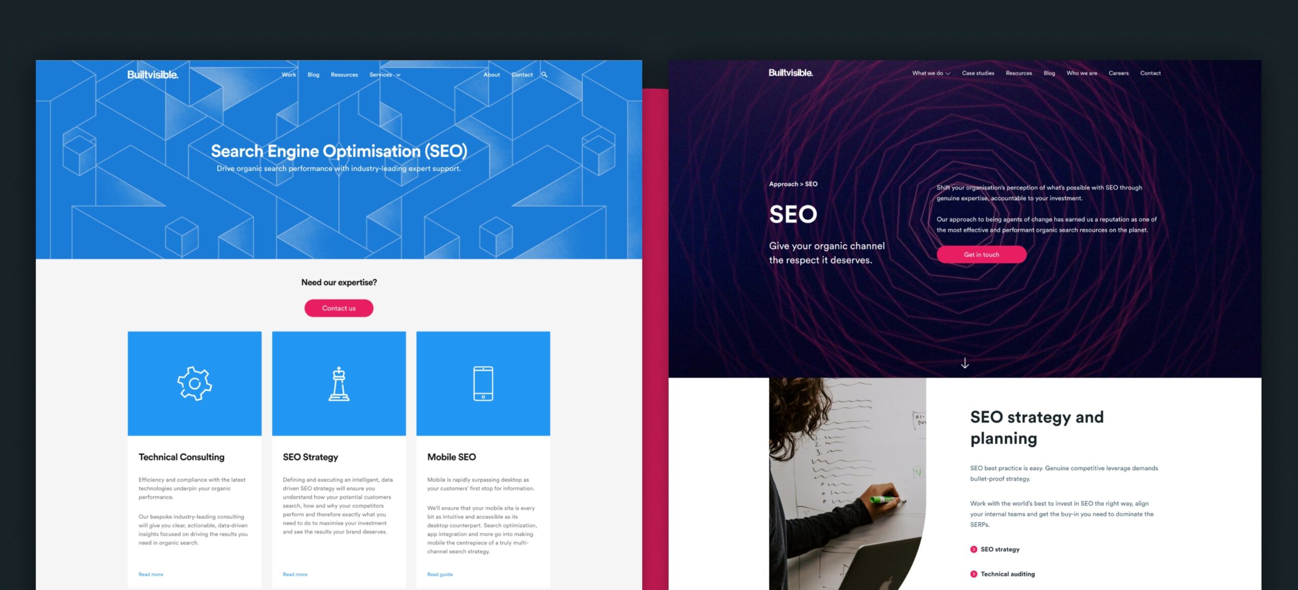
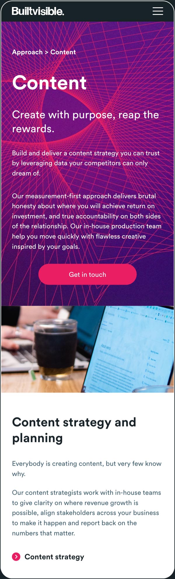
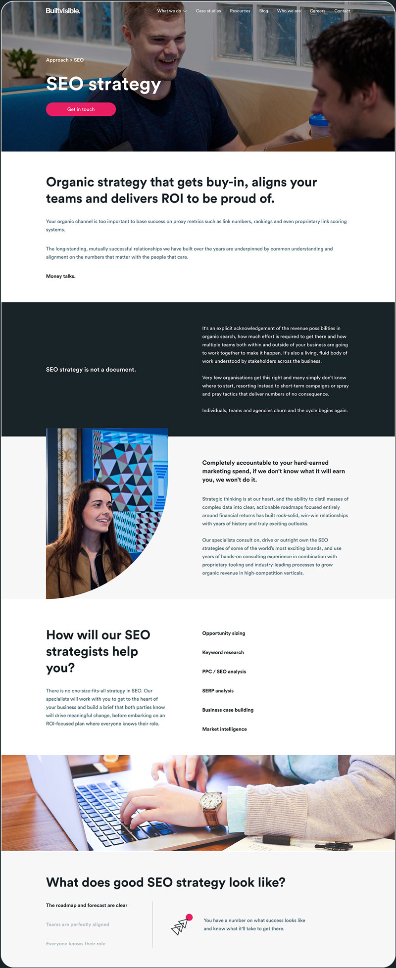
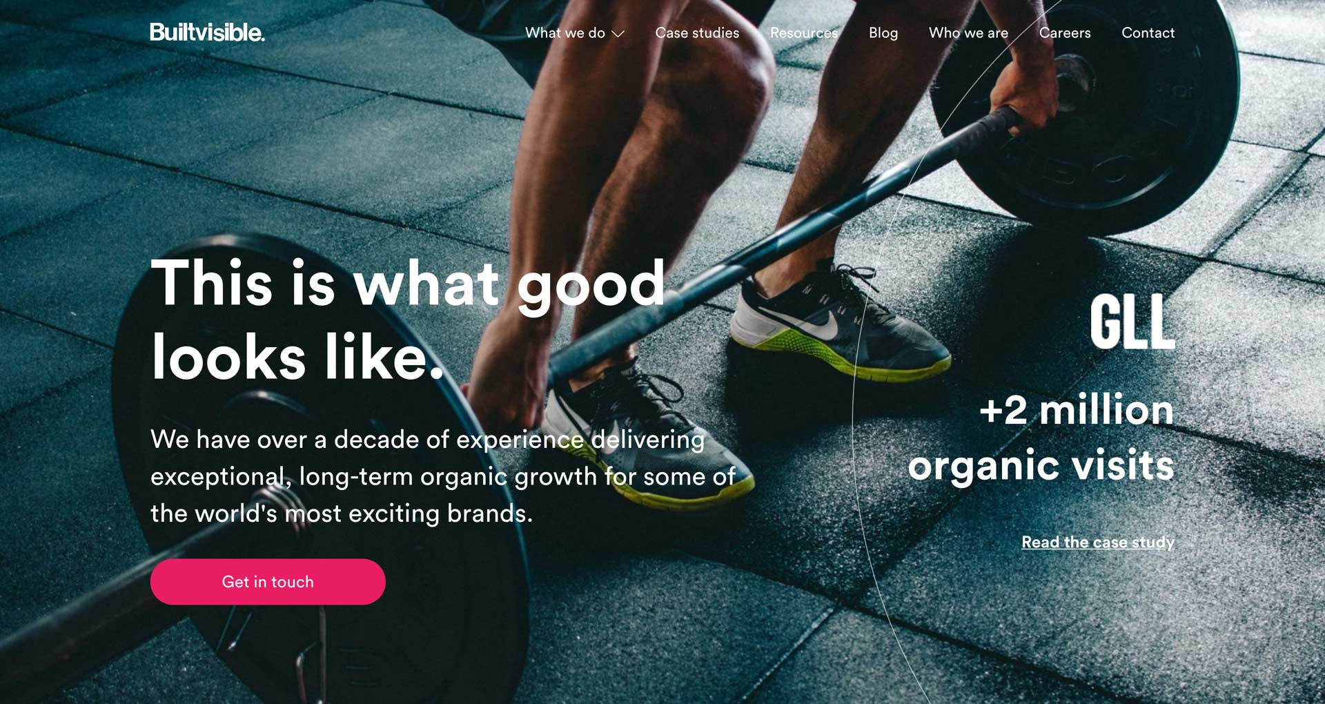
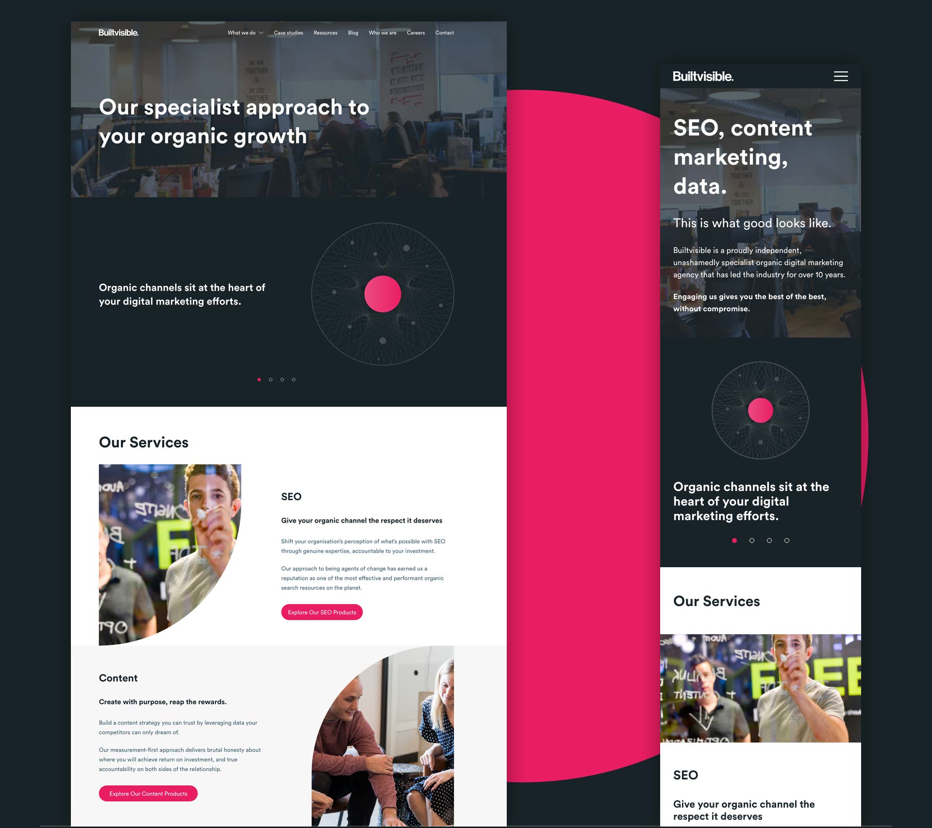
Pink and dark grey became the only primary colours. The new secondary colours have been chosen to complement and enhance the primary palette.
Circular was the only font to be used, with two weights available: Bold and Book. Using only one font ensured consistency in the production of any internal document and optimised our website’s loading time.
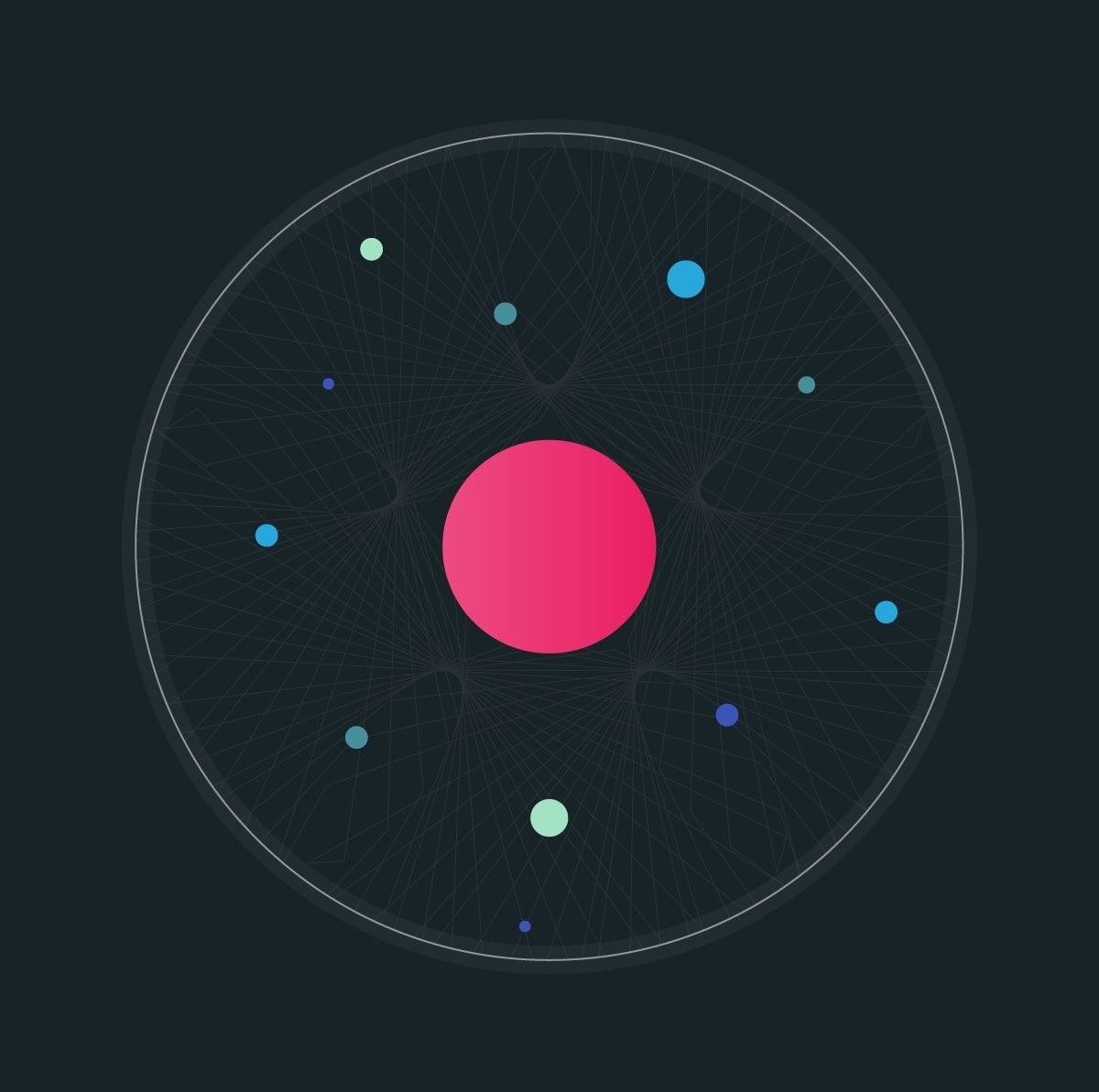
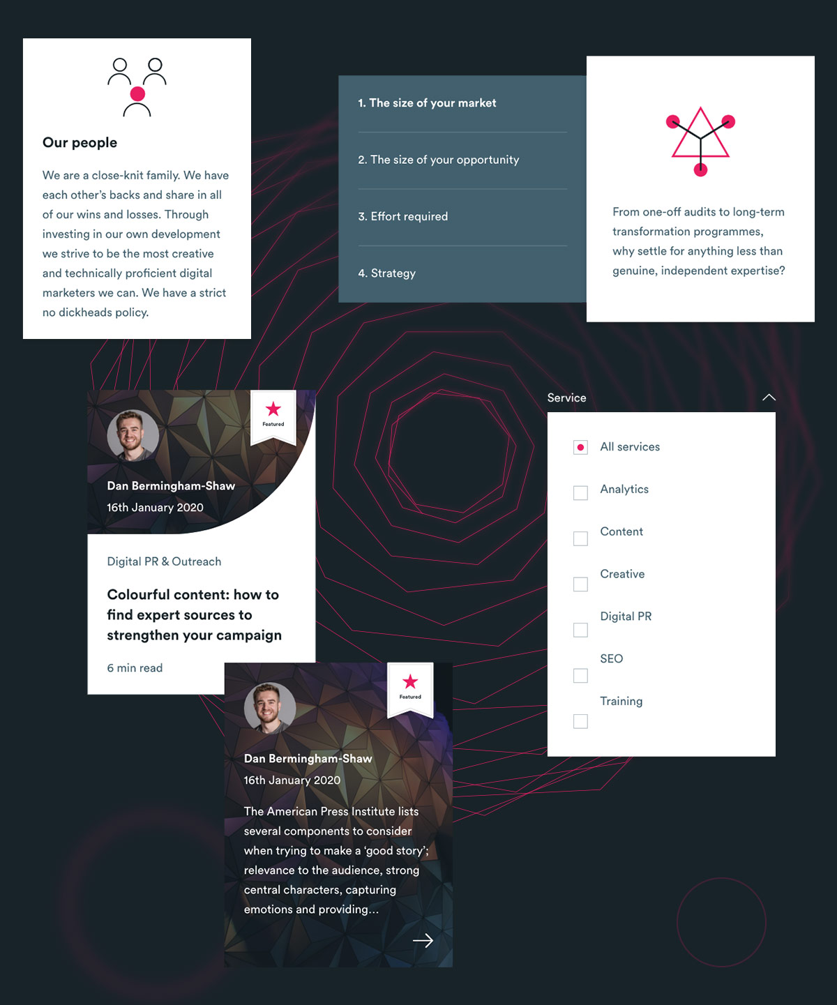
The inspiration for the illustrations came from the geometric works of Emma Kunz. Her precise and yet abstract works encapsulate perfectly the digital nature of the company. I coordinated the work between the design and dev team to create a script able to originate random geometric vector patterns. The script boosted our efficiency quite a bit – it was able to create more than 100 abstract illustrations in less than 2 minutes. Below you can see some of the illustrations we created.


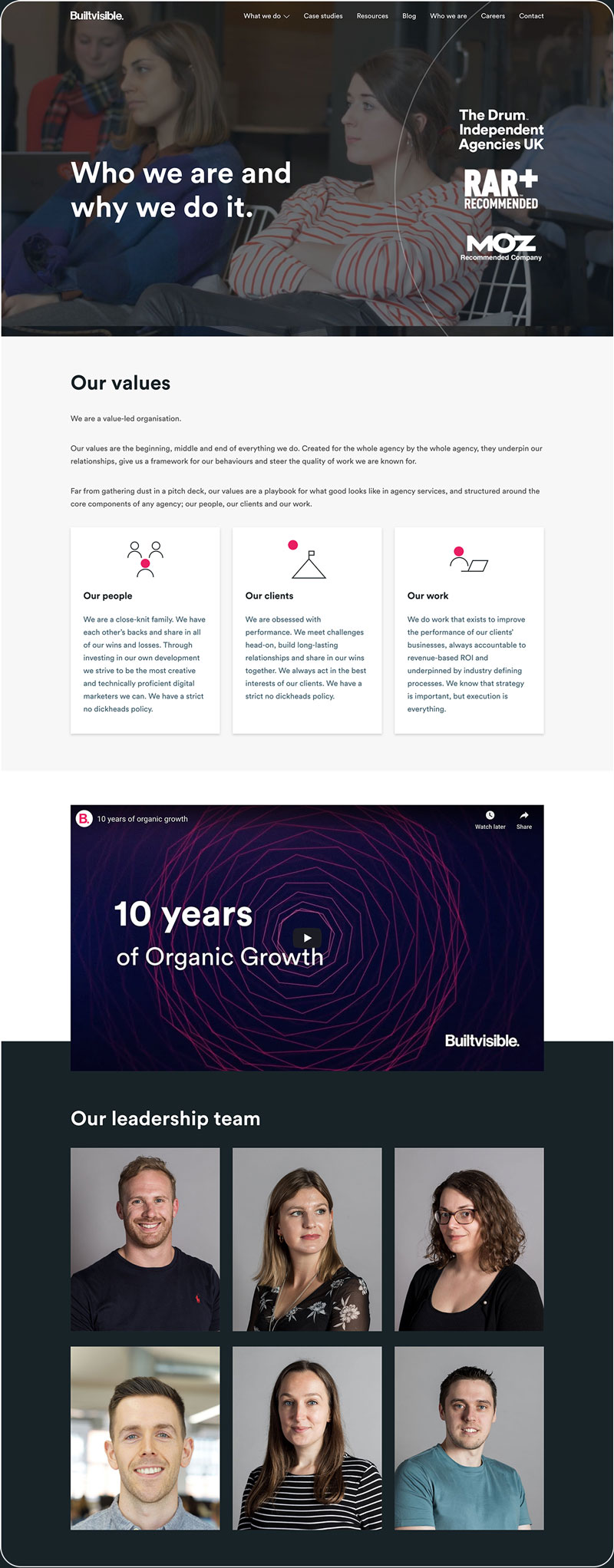
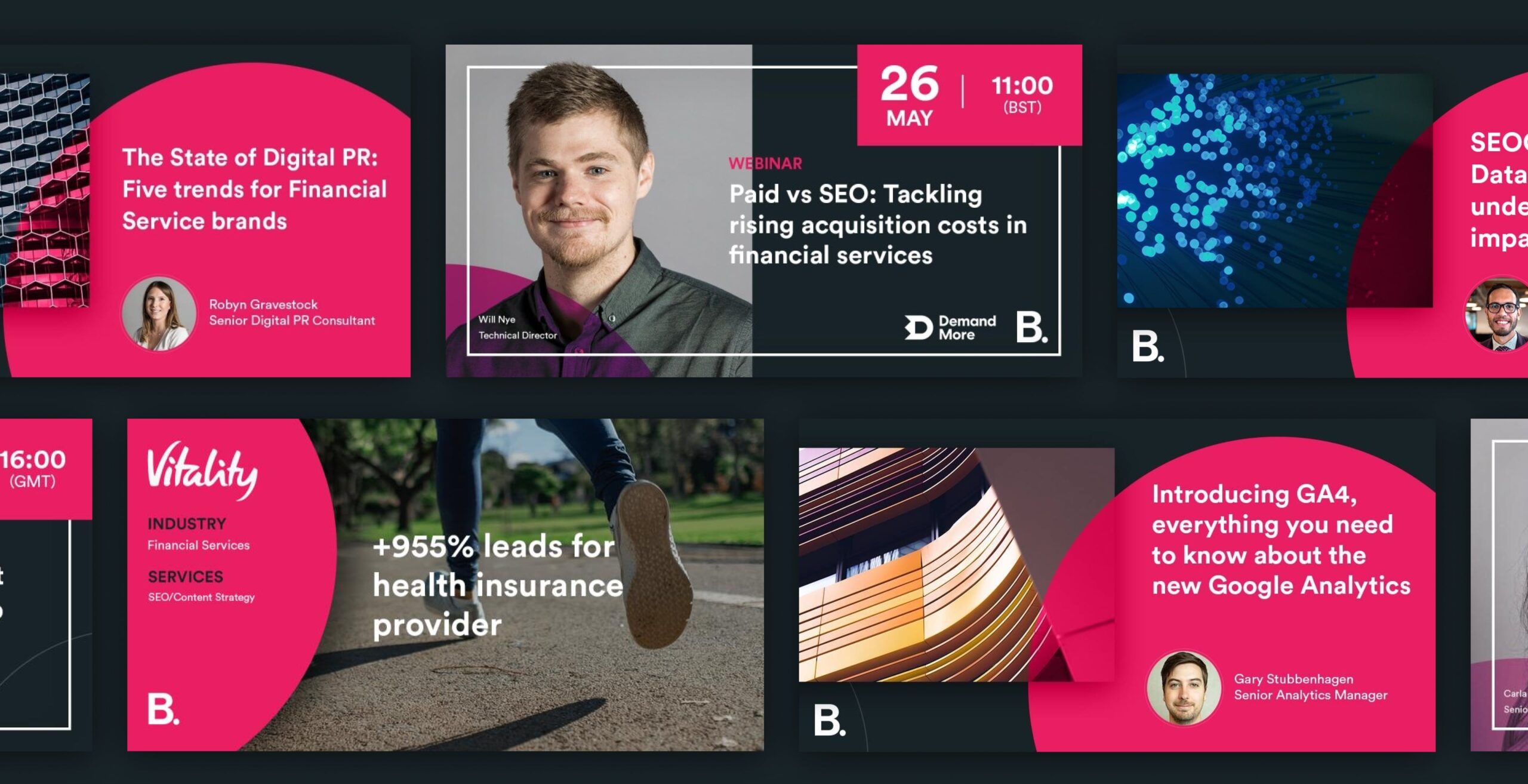
The amazing people at Builtvisible inspired the new photography style. I wanted to pay homage to the talents that make the company unique and add their faces to the products we promote on the website. I worked with the in-house multimedia designer to capture the professional but friendly nature of the company.


All the previous steps were in preparation for the main event: the website redesign. We had the chance to rebuild it from the ground up, and we did that by applying the principles of atomic design. I first defined the atoms, the molecules and organisms. I used these elements to create the main templates that became pages.
The modular approach speeded up the design production and avoided inconsistencies between the pages designed by different designers. The dev team was extremely happy with the well-defined style guide and reusable modules.